一、背景切割
background-clip :border-box | padding-box | content-box
作用:为将背景图片做适当的裁剪,以适应需要。
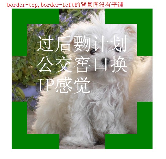
默认格式 background-clip :border-box,border的区域也有背景图,但是背景图图片是从border-top和border-left的位置开始平铺的,所以当背景图片no-repeat的时候,border-top和border-left的背景是背景色不是背景图,只有当背景repeat的时候,border-top和border-left才是背景图,并且border-top和border-left的背景是从图片的下边和右边开始平铺的。
比如:
使用的背景图 bac.jpg

当背景no-repeat的时候:
代码:


 1 <!doctype html>
 2 <html lang="en">
 3 <head>
 4 <meta charset="UTF-8">
 5 <title>Document</title>
 6 <style type="text/css">
 7 .div1{
 8 width: 300px;
 9 height: 300px;
10 border:50px dashed green;
11 font-size: 60px;
12 color: #fff;
13 padding: 30px;
14 margin: 30px;
15 background: #fff url(bac.jpg) 0 0 no-repeat;
16 background-clip: border-box;
17 /*background-clip: padding-box;*/
18 /*background-clip: content-box;*/
19 }
20 </style>
21 </head>
22 <body>
23 <div class="div1">过后覅计划公交窖口换IP感觉</div>
24 </body>
25 </html>
效果一:
当背景repeat的时候:
代码:
 1 <!doctype html>
 2 <html lang="en">
 3 <head>
 4 <meta charset="UTF-8">
 5 <title>Document</title>
 6 <style type="text/css">
 7 .div1{
 8 width: 300px;
 9 height: 300px;
10 border:50px dashed green;
11 font-size: 60px;
12 color: #fff;
13 padding: 30px;
14 margin: 30px;
15 background: #fff url(bac.jpg) 0 0 no-repeat;
16 background-clip: border-box;
17 /*background-clip: padding-box;*/
18 /*background-clip: content-box;*/
19 }
20 </style>
21 </head>
22 <body>
23 <div class="div1">过后覅计划公交窖口换IP感觉</div>
24 </body>
25 </html>
效果二:
二、背景原点
background-origin :border-box | padding-box | content-box
作用:决定图片的原始起始位置
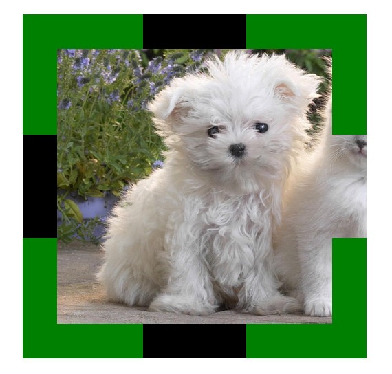
比如上面的效果二,背景图片大于divd的宽高,但是border-top和border-left的背景是背景色是拉伸的,如果想要整个div就是一张图而没有平铺效果,怎么办呢?这就要使用background-origin 的配合,把background-origin 设置成background-origin :border-box即可。background-clip和background-origin 就像一对好基友,一般都配合使用。
代码:
 1 <!doctype html>
 2 <html lang="en">
 3 <head>
 4 <meta charset="UTF-8">
 5 <title>Document</title>
 6 <style type="text/css">
 7 .div1{
 8 width: 300px;
 9 height: 300px;
10 border:50px dashed green;
11 font-size: 60px;
12 color: #fff;
13 padding: 30px;
14 margin: 30px;
15 background: #fff url(bac.jpg) 0 0 no-repeat;
16 background-clip: border-box;
17 /*background-clip: padding-box;*/
18 /*background-clip: content-box;*/
19 background-origin: border-box;
20 }
21 </style>
22 </head>
23 <body>
24 <div class="div1">过后覅计划公交窖口换IP感觉</div>
25 </body>
26 </html>
效果:
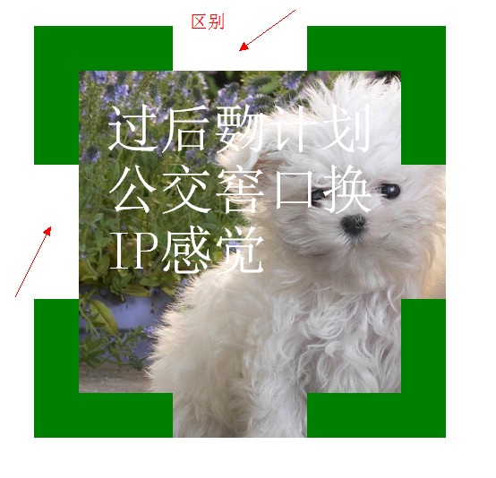
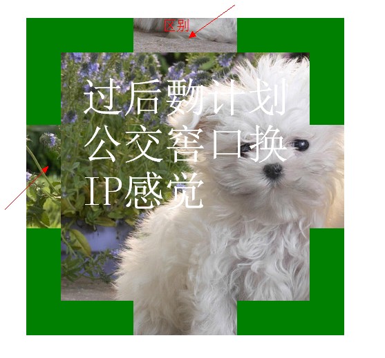
background-clip和background-origin的区别:
background-clip是用来设置div(元素)中背景(包括背景色和背景图)的起始位置,而background-origin是截取的背景图的起始位置。
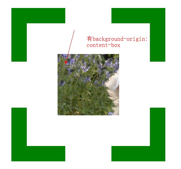
当有background-origin: content-box的时候:
没有background-origin: content-box的时候:
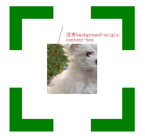
从以上两张图可以明显看到截取的背景图位置不一样,当没有background-origin是背景图默认是从padding-top和padding-left截取的,当有background-origin,背景图截取的位置是有background-origin来决定的。
代码:
 1 <!doctype html>
 2 <html lang="en">
 3 <head>
 4 <meta charset="UTF-8">
 5 <title>Document</title>
 6 <style type="text/css">
 7 .div1{
 8 width: 200px;
 9 height: 200px;
10 border:50px dashed green;
11 font-size: 60px;
12 color: #fff;
13 padding: 100px;
14 margin: 30px;
15 background: #f00 url(bac.jpg) 0 0 no-repeat;
16 background-clip: content-box;
17 background-origin: content-box;
18 }
19 </style>
20 </head>
21 <body>
22 <div class="div1"></div>
23 </body>
24 </html>
三、背景尺寸
background-size :length/
percentage/
auto/
cover/contain
作用:设置背景图的大小。
length: 长度值指定,代为px,接受两个数值如:background-size:400px 400px;,分别为宽、高,也可以设定一个数值,当只有一个数值是,背景长度为此数值,高度等比例伸缩。
percentage: 按背景图的百分比进行伸缩,也可以接受两个或者一个数值如:background-size:100% 100%;
auto: 真实大小如:background-size:auto;
cover:等比缩放到完全覆盖容器,背景图像有可能超出容器
如:background-size:cover;
contain: 将背景图像等比缩放到宽度或高度与容器的宽度或高度相等,背景图像始终被包含在容器内如:background-size:contain;
例子:
 1 <!doctype html>
 2 <html lang="en">
 3 <head>
 4 <meta charset="UTF-8">
 5 <title>Document</title>
 6 <style type="text/css">
 7 .div1{
 8 width: 200px;
 9 height: 200px;
10 border:50px dashed green;
11 padding: 100px;
12 margin: 30px;
13 background: #000 url(bac.jpg) 0 0 no-repeat;
14 /*background-size:400px 400px;*/
15 /*background-size:100% 100%;*/
16 /*background-size:auto;*/
17 background-size:cover;
18 /*background-size:contain;*/
19 }
20 </style>
21 </head>
22 <body>
23 <div class="div1"></div>
24 </body>
25 </html>
效果:
四、透明背景
background:rgba(255,0,0,0.6)
接受四参数,前3个为颜色参数范围0-255,最后一个为透明度范围0-1,数值越到透明度越小。
例子:
 1 <!doctype html>
 2 <html lang="en">
 3 <head>
 4 <meta charset="UTF-8">
 5 <title>Document</title>
 6 <style type="text/css">
 7 body{
 8 color: #fff;
 9 background: #000;
10 }
11 div{
12 color: #fff;
13 font-size: 50px;
14 font-weight: bold;
15 background: rgba(255,255,255,0.5);
16 position: absolute;
17 }
18 </style>
19 </head>
20 <body>
21 <div>会后集合与交通</div>
22 </body>
23 </html>
效果:

五、渐变背景
线性渐变:linear-gradient
径向渐变: radial-gradient
background:-webkit-linear | radial-gradient (水平起点 垂直起点 角度, 颜色1 0%, 颜色2 渐变到的位置百分比%, ... ,颜色N 100%);
如:background: -webkit-gradient(linear,left center,right center,from(yellow),color-stop(0.5,black),color-stop(0.5,#fff),to(blue));
线性渐变例子:
 1 <!doctype html>
 2 <html lang="en">
 3 <head>
 4 <meta charset="UTF-8">
 5 <title>Document</title>
 6 <style type="text/css">
 7 div{
 8 height: 100px;
 9 width: 100px;
10 background: -webkit-gradient(linear,left center,right center,from(yellow),color-stop(0.5,black),color-stop(0.5,#fff),to(blue));
11 }
12 </style>
13 </head>
14 <body>
15 <div></div>
16 </body>
17 </html>
效果:

关于gradient的前缀:
-webkit-:苹果、谷歌
-ms-:ie
-moz-:火狐
-o-:欧朋
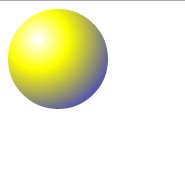
径向渐变例子:
 1 <!doctype html>
 2 <html lang="en">
 3 <head>
 4 <meta charset="UTF-8">
 5 <title>Document</title>
 6 <style type="text/css">
 7 div{
 8 height: 100px;
 9 width: 100px;
10 border-radius: 50px;
11 background: -webkit-gradient(radial,30 30,1,30 30,100,from(#fff),color-stop(0.3,yellow),to(blue));
12 }
13 </style>
14 </head>
15 <body>
16 <div></div>
17 </body>
18 </html>
效果: