WPF系统属性和常用控件
渐变的背景色
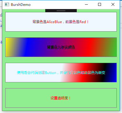
WPF中的前景色和背景色不同于传统Winform的设置,这些属性都是Brush类型的值。在XAML中,当为这些属性设置指定的颜色后将被转换为SolidColorBrush类的调用。所有的控件都提供了背景色和前景色。在WPF中可以设置背景色为线性渐变色。
|
1
2
3
4
5
6
7
8
9
10
11
12
13
14
15
16
17
18
19
20
21
22
23
24
25
26
27
28
29
|
<Window x:Class="WPFDemo.BurshDemo" xmlns="http://schemas.microsoft.com/winfx/2006/xaml/presentation" xmlns:x="http://schemas.microsoft.com/winfx/2006/xaml" xmlns:d="http://schemas.microsoft.com/expression/blend/2008" xmlns:mc="http://schemas.openxmlformats.org/markup-compatibility/2006" xmlns:local="clr-namespace:WPFDemo" mc:Ignorable="d" Title="BurshDemo" Height="300" Width="300"> <Grid Name="grd" Background="LightGreen"> <Grid.RowDefinitions> <RowDefinition /> <RowDefinition /> <RowDefinition /> <RowDefinition /> </Grid.RowDefinitions> <Button Margin="10" Grid.Row="0" Background="AliceBlue" Foreground="Red" Content="背景色是AliceBlue,前景色是Red!"></Button> <Button Margin="10" Grid.Row="1" Content="背景色为渐变颜色"> <Button.Background> <LinearGradientBrush StartPoint="0,0" EndPoint="1,1"> <GradientStop Color="Yellow" Offset="0.0"></GradientStop> <GradientStop Color="Blue" Offset="0.2"></GradientStop> <GradientStop Color="Red" Offset="0.75"></GradientStop> <GradientStop Color="LimeGreen" Offset="1"></GradientStop> </LinearGradientBrush> </Button.Background> </Button> <Button Name="btnOpacity" Margin="10" Grid.Row="3" Background="AliceBlue" Foreground="Red" Content="设置透明度!"></Button> </Grid></Window> |
后台代码:
|
1
2
3
4
5
6
7
8
9
10
11
12
13
14
15
16
17
18
19
20
21
22
23
24
25
26
27
28
29
30
31
32
33
34
35
36
37
38
39
40
41
42
43
44
45
46
47
48
49
50
51
52
53
|
public BurshDemo() { InitializeComponent(); CreateButton(); btnOpacity.Background = new SolidColorBrush(Color.FromArgb(0, 100, 100, 100)); } public void CreateButton() { Button btn = new Button(); btn.Content = "使用后台代码创建Button,并设置背景色和前景色为渐变"; btn.Margin = new Thickness(10); Grid.SetRow(btn, 2); grd.Children.Add(btn); //创建按钮前景渐变色 LinearGradientBrush foreGroundColor = new LinearGradientBrush(); foreGroundColor.StartPoint = new Point(0.5, 0.5); foreGroundColor.EndPoint = new Point(1, 1); foreGroundColor.GradientStops.Add( new GradientStop(Colors.Aqua, 0) ); foreGroundColor.GradientStops.Add( new GradientStop(Colors.Aqua, 0.5) ); foreGroundColor.GradientStops.Add( new GradientStop(Colors.Aqua, 0.75) ); foreGroundColor.GradientStops.Add( new GradientStop(Colors.Aqua, 1) ); btn.Foreground = foreGroundColor; //创建按钮背景渐变颜色 LinearGradientBrush backGroundColor = new LinearGradientBrush(); backGroundColor.StartPoint = new Point(0.5, 0.5); backGroundColor.EndPoint = new Point(1, 1); backGroundColor.GradientStops.Add( new GradientStop(Colors.AliceBlue, 0) ); backGroundColor.GradientStops.Add( new GradientStop(Colors.Red, 0.4) ); backGroundColor.GradientStops.Add( new GradientStop(Colors.Black, 0.75) ); backGroundColor.GradientStops.Add( new GradientStop(Colors.Blue, 1) ); btn.Background = backGroundColor; } |
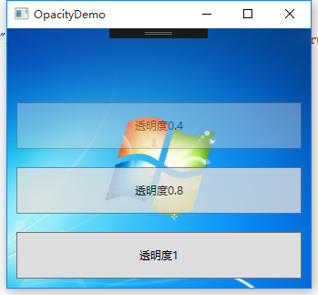
透明度设置
UIElement定义了Opacity属性,使用该属性可以为控件设置透明度。该属性的值在0.0 – 1.0 之间。默认为1.0表示完全不透明,值0.0则表示完全透明。
|
1
2
3
4
5
6
7
8
9
10
11
12
13
14
15
16
17
18
19
20
21
22
23
24
|
<Window x:Class="WPFDemo.OpacityDemo" xmlns="http://schemas.microsoft.com/winfx/2006/xaml/presentation" xmlns:x="http://schemas.microsoft.com/winfx/2006/xaml" xmlns:d="http://schemas.microsoft.com/expression/blend/2008" xmlns:mc="http://schemas.openxmlformats.org/markup-compatibility/2006" xmlns:local="clr-namespace:WPFDemo" mc:Ignorable="d" Title="OpacityDemo" Height="300" Width="300"> <Window.Background> <ImageBrush Stretch="UniformToFill" ImageSource="Images/back.png"></ImageBrush> </Window.Background> <Grid > <Grid.RowDefinitions> <RowDefinition /> <RowDefinition /> <RowDefinition /> <RowDefinition /> </Grid.RowDefinitions> <Button Grid.Row="0" Opacity="0" Margin="10" Content="透明度0"></Button> <Button Grid.Row="1" Opacity="0.4" Margin="10" Content="透明度0.4"></Button> <Button Grid.Row="2" Opacity="0.8" Margin="10" Content="透明度0.8"></Button> <Button Grid.Row="3" Opacity="1" Margin="10" Content="透明度1"></Button> </Grid></Window> |
更改鼠标光标
WPF在FrameworkElement中定义了一个Cursor属性,该属性是System.Windows.Input.Cursor类型的属性值,可以使用该属性来设置和获取鼠标的光标。
Cursor属性所有枚举光标类型:
|
1
2
3
4
5
6
7
8
9
10
11
12
13
14
15
16
17
18
19
20
21
22
23
24
25
26
27
28
29
30
31
32
33
34
35
36
37
38
39
40
41
42
|
<Window x:Class="WPFDemo.CursorDemo" xmlns="http://schemas.microsoft.com/winfx/2006/xaml/presentation" xmlns:x="http://schemas.microsoft.com/winfx/2006/xaml" xmlns:d="http://schemas.microsoft.com/expression/blend/2008" xmlns:mc="http://schemas.openxmlformats.org/markup-compatibility/2006" xmlns:local="clr-namespace:WPFDemo" mc:Ignorable="d" Title="CursorDemo" Height="300" Width="300"> <DockPanel> <TextBlock DockPanel.Dock="Top" Background="LightBlue" Foreground="Red" Margin="0,0,0,10" FontSize="20">常用鼠标光标符号</TextBlock> <UniformGrid Rows="3" Columns="10" > <Button Cursor="AppStarting" Content="AppStarting" Background="LightBlue" ></Button> <Button Cursor="Arrow" Content="Arrow" Background="LightGreen" ></Button> <Button Cursor="ArrowCD" Content="ArrowCD" Background="LightBlue" ></Button> <Button Cursor="Cross" Content="Cross" Background="LightGreen" ></Button> <Button Cursor="Hand" Content="Hand" Background="LightBlue" ></Button> <Button Cursor="Help" Content="Help" Background="LightGreen" ></Button> <Button Cursor="IBeam" Content="IBeam" Background="LightBlue" ></Button> <Button Cursor="No" Content="No" Background="LightGreen" ></Button> <Button Cursor="None" Content="None" Background="LightBlue" ></Button> <Button Cursor="Pen" Content="Pen" Background="LightGreen" ></Button> <Button Cursor="ScrollAll" Content="ScrollAll" Background="LightBlue" ></Button> <Button Cursor="ScrollE" Content="ScrollE" Background="LightGreen" ></Button> <Button Cursor="ScrollN" Content="ScrollN" Background="LightBlue" ></Button> <Button Cursor="ScrollNE" Content="ScrollNE" Background="LightGreen" ></Button> <Button Cursor="ScrollNS" Content="ScrollNS" Background="LightBlue" ></Button> <Button Cursor="ScrollNW" Content="ScrollNW" Background="LightGreen" ></Button> <Button Cursor="ScrollS" Content="ScrollS" Background="LightBlue" ></Button> <Button Cursor="ScrollSE" Content="ScrollSE" Background="LightGreen" ></Button> <Button Cursor="ScrollSW" Content="ScrollSW" Background="LightBlue" ></Button> <Button Cursor="ScrollW" Content="ScrollW" Background="LightGreen" ></Button> <Button Cursor="ScrollWE" Content="ScrollWE" Background="LightBlue" ></Button> <Button Cursor="SizeAll" Content="SizeAll" Background="LightGreen" ></Button> <Button Cursor="SizeNESW" Content="SizeNESW" Background="LightBlue" ></Button> <Button Cursor="SizeNS" Content="SizeNS" Background="LightGreen" ></Button> <Button Cursor="SizeNWSE" Content="SizeNWSE" Background="LightBlue" ></Button> <Button Cursor="SizeWE" Content="SizeWE" Background="LightGreen" ></Button> <Button Cursor="UpArrow" Content="UpArrow" Background="LightBlue" ></Button> <Button Cursor="Wait" Content="Wait" Background="LightGreen" ></Button> </UniformGrid> </DockPanel></Window> |

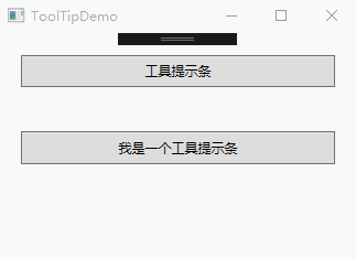
ToolTip提示控件
ToolTip控件又称工具提示控件,是指当素表悬停在某个工具按钮上,显示出来的黄色小窗口。
|
1
2
3
4
5
6
7
8
9
10
11
12
13
14
15
16
17
18
19
20
21
22
23
24
25
|
<Window x:Class="WPFDemo.ToolTipDemo" xmlns="http://schemas.microsoft.com/winfx/2006/xaml/presentation" xmlns:x="http://schemas.microsoft.com/winfx/2006/xaml" xmlns:d="http://schemas.microsoft.com/expression/blend/2008" xmlns:mc="http://schemas.openxmlformats.org/markup-compatibility/2006" xmlns:local="clr-namespace:WPFDemo" mc:Ignorable="d" Title="ToolTipDemo" Height="300" Width="300"> <Grid> <Grid.RowDefinitions> <RowDefinition /> <RowDefinition /> <RowDefinition /> </Grid.RowDefinitions> <Button Grid.Row="0" Content="工具提示条" Margin="20" ToolTip="我是一个简单的工具提示条"/> <Button Grid.Row="1" Margin="20" Content="我是一个工具提示条"> <Button.ToolTip> <StackPanel> <Image Source="Images/toolTip.png" MaxWidth="50" MaxHeight="50"></Image> <TextBlock Text="带图片的工具提示条窗口"></TextBlock> </StackPanel> </Button.ToolTip> </Button> </Grid></Window> |
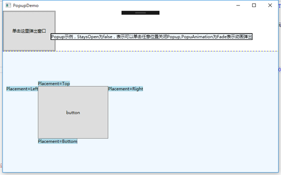
Popup控件
Popup控件使用效果和ToolTip类似,最大的区别在于Popup控件可以接收输入焦点,而ToolTip则不能。不同:
1、 Popup控件不会自动显示,必须设置IsOpen属性来使其显示。
2、 默认情况下,Popup.StaysOpen属性设置为true,因此Popup打开后并不会自动消失,除非开发人员将IsOpen属性设为false。如果设置StaysOpen为false,则用户可单击任何地方来关闭Popup控件。
3、 Popup提供了PopupAnimation属性让开发人员可以控制Popup如何打开,可选的值有None、Fade、Scroll和Slide。其中None代表默认值,不显示动画;Fade表示淡入效果;Scroll表示滚动效果;Slide表示滑动效果。为了让这些动画可以正常运行,必须设置AllowsTransparency属性值为true。
4、 Popup控件可以接收焦点,可以防止一些交互式控件到窗口中。
5、 Popup控件定义在System.Windows.Control.Primitives命名空间中。
|
1
2
3
4
5
6
7
8
9
10
11
12
13
14
15
16
17
18
19
20
21
22
23
24
25
26
27
28
29
30
31
32
33
34
35
36
37
38
39
40
41
42
43
|
<Window x:Class="WPFDemo.PopupDemo" xmlns="http://schemas.microsoft.com/winfx/2006/xaml/presentation" xmlns:x="http://schemas.microsoft.com/winfx/2006/xaml" xmlns:d="http://schemas.microsoft.com/expression/blend/2008" xmlns:mc="http://schemas.openxmlformats.org/markup-compatibility/2006" xmlns:local="clr-namespace:WPFDemo" mc:Ignorable="d" Title="PopupDemo" Height="500" Width="800"> <Grid ShowGridLines="True"> <Grid.RowDefinitions> <RowDefinition /> <RowDefinition Height="3*" /> </Grid.RowDefinitions> <Button HorizontalAlignment="Left" Click="Button_Click" Width="150" Grid.Row="0"> <StackPanel> <TextBlock>单击这里弹出窗口</TextBlock> <Popup Name="myPopup" MaxHeight="200" StaysOpen="False" Placement="Mouse" AllowsTransparency="True" PopupAnimation="Fade"> <Border BorderBrush="Black" BorderThickness="2" Background="AliceBlue"> <TextBlock Name="myPopupText" TextWrapping="Wrap"> Popup示例,StaysOpen为false,表示可以单击任意位置关闭Popup,PopuAnimation为Fade表示动画弹出 </TextBlock> </Border> </Popup> </StackPanel> </Button> <Canvas Background="AliceBlue" Grid.Row="1"> <Button Name="btn1" Margin="100" HorizontalAlignment="Right" VerticalAlignment="Center" Width="200" Height="150">button</Button> <Popup IsOpen="True" PlacementTarget="{Binding ElementName=btn1}" Placement="Bottom"> <TextBlock Background="LightBlue">Placement=Bottom</TextBlock> </Popup> <Popup IsOpen="True" PlacementTarget="{Binding ElementName=btn1}" Placement="Top"> <TextBlock Background="LightBlue">Placement=Top</TextBlock> </Popup> <Popup IsOpen="True" PlacementTarget="{Binding ElementName=btn1}" Placement="Left"> <TextBlock Background="LightBlue">Placement=Left</TextBlock> </Popup> <Popup IsOpen="True" PlacementTarget="{Binding ElementName=btn1}" Placement="Right"> <TextBlock Background="LightBlue">Placement=Right</TextBlock> </Popup> </Canvas> </Grid></Window> |
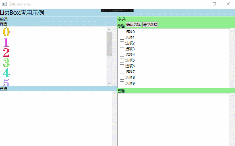
ListBox列表框控件
|
1
2
3
4
5
6
7
8
9
10
11
12
13
14
15
16
17
18
19
20
21
22
23
24
25
26
27
28
29
30
31
32
33
34
35
36
37
38
39
40
41
42
43
44
45
46
47
48
49
50
51
52
53
54
55
56
57
58
59
60
61
62
63
64
65
66
67
68
69
70
71
72
73
74
75
76
77
78
79
80
81
82
83
84
85
86
87
88
89
90
91
92
93
94
95
96
97
98
99
100
101
102
103
104
105
106
107
108
109
110
111
112
113
114
115
116
117
118
119
120
121
122
123
124
125
126
127
128
129
130
131
132
133
134
135
136
137
138
139
140
141
142
143
144
145
146
|
<Window x:Class="WPFDemo.ListBoxDemo" xmlns="http://schemas.microsoft.com/winfx/2006/xaml/presentation" xmlns:x="http://schemas.microsoft.com/winfx/2006/xaml" xmlns:d="http://schemas.microsoft.com/expression/blend/2008" xmlns:mc="http://schemas.openxmlformats.org/markup-compatibility/2006" xmlns:local="clr-namespace:WPFDemo" mc:Ignorable="d" Title="ListBoxDemo" Height="500" Width="800"> <DockPanel> <StackPanel DockPanel.Dock="Top" Background="LightBlue"> <TextBlock FontSize="20"> ListBox应用示例 </TextBlock> </StackPanel> <Grid DockPanel.Dock="Left"> <Grid.ColumnDefinitions> <ColumnDefinition /> <ColumnDefinition/> </Grid.ColumnDefinitions> <StackPanel Background="LightBlue" Grid.Column="0"> <StackPanel> <TextBlock FontSize="14">单选</TextBlock> </StackPanel> <StackPanel> <TextBlock>待选</TextBlock> <ScrollViewer MaxHeight="200" HorizontalScrollBarVisibility="Auto"> <ListBox Name="listBox1" Height="200" SelectionMode="Extended" SelectionChanged="listBox1_SelectionChanged"> <ListBoxItem> <Image Source="Images/0.jpg" Width="30" Height="30"></Image> </ListBoxItem> <ListBoxItem> <StackPanel> <Image Source="Images/1.jpg" Width="30" Height="30"></Image> </StackPanel> </ListBoxItem> <ListBoxItem> <StackPanel> <Image Source="Images/2.jpg" Width="30" Height="30"></Image> </StackPanel> </ListBoxItem> <ListBoxItem> <StackPanel> <Image Source="Images/3.jpg" Width="30" Height="30"></Image> </StackPanel> </ListBoxItem> <ListBoxItem> <StackPanel> <Image Source="Images/4.jpg" Width="30" Height="30"></Image> </StackPanel> </ListBoxItem> <ListBoxItem> <StackPanel> <Image Source="Images/5.jpg" Width="30" Height="30"></Image> </StackPanel> </ListBoxItem> <ListBoxItem> <StackPanel> <Image Source="Images/6.jpg" Width="30" Height="30"></Image> </StackPanel> </ListBoxItem> <ListBoxItem> <StackPanel> <Image Source="Images/7.jpg" Width="30" Height="30"></Image> </StackPanel> </ListBoxItem> <ListBoxItem> <StackPanel> <Image Source="Images/8.jpg" Width="30" Height="30"></Image> </StackPanel> </ListBoxItem> <ListBoxItem> <StackPanel> <Image Source="Images/9.jpg" Width="30" Height="30"></Image> </StackPanel> </ListBoxItem> </ListBox> </ScrollViewer> </StackPanel> <StackPanel> <TextBlock>已选</TextBlock> <ScrollViewer MaxHeight="200" HorizontalScrollBarVisibility="Auto"> <ListBox Name="listBox1_Selected" MaxHeight="200" Height="200" SelectionChanged="listBox1_Selected_SelectionChanged"> </ListBox> </ScrollViewer> </StackPanel> </StackPanel> <StackPanel Background="LightGreen" Grid.Column="1"> <StackPanel> <TextBlock FontSize="14">多选</TextBlock> <TextBlock>待选 <Button Name="btnList2Ok" Click="btnList2Ok_Click">确认选择</Button> <Button Name="btnList2Cancel" Click="btnList2Cancel_Click">清空选择</Button> </TextBlock> <ScrollViewer MaxHeight="200" Height="200" > <ListBox Name="listbox2" > <ListBoxItem> <CheckBox>选项0</CheckBox> </ListBoxItem> <ListBoxItem> <CheckBox>选项1</CheckBox> </ListBoxItem> <ListBoxItem> <CheckBox>选项2</CheckBox> </ListBoxItem> <ListBoxItem> <CheckBox>选项3</CheckBox> </ListBoxItem> <ListBoxItem> <CheckBox>选项4</CheckBox> </ListBoxItem> <ListBoxItem> <CheckBox>选项5</CheckBox> </ListBoxItem> <ListBoxItem> <CheckBox>选项6</CheckBox> </ListBoxItem> <ListBoxItem> <CheckBox>选项7</CheckBox> </ListBoxItem> <ListBoxItem> <CheckBox>选项8</CheckBox> </ListBoxItem> <ListBoxItem> <CheckBox>选项9</CheckBox> </ListBoxItem> </ListBox> </ScrollViewer> <TextBlock>已选</TextBlock> <ScrollViewer MaxHeight="200" Height="200"> <ListBox Name="listbox2_Selected"> </ListBox> </ScrollViewer> </StackPanel> </StackPanel> </Grid> </DockPanel></Window> |
后台代码:
|
1
2
3
4
5
6
7
8
9
10
11
12
13
14
15
16
17
18
19
20
21
22
23
24
25
26
27
28
|
private void listBox1_SelectionChanged(object sender, SelectionChangedEventArgs e) { ListBoxItem item = (sender as ListBox).SelectedItem as ListBoxItem; listBox1.Items.Remove(item); listBox1_Selected.Items.Add(item); } private void listBox1_Selected_SelectionChanged(object sender, SelectionChangedEventArgs e) { ListBoxItem item = (sender as ListBox).SelectedItem as ListBoxItem; listBox1_Selected.Items.Remove(item); listBox1.Items.Add(item); } private void btnList2Ok_Click(object sender, RoutedEventArgs e) { foreach (ListBoxItem item in listbox2.Items) { if ((item.Content as CheckBox).IsChecked == true) { listbox2_Selected.Items.Add((item.Content as CheckBox).Content); } } } private void btnList2Cancel_Click(object sender, RoutedEventArgs e) { listbox2_Selected.Items.Clear(); } |
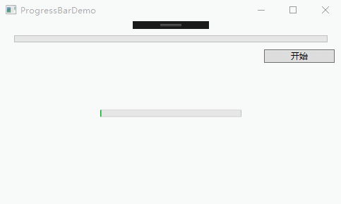
ProgressBar进度条控件
ProgressBar控件默认情况下Minimum属性为0,Maximum为100,Value值可以动态在在最小和最大值之间进行切换。
IsIndeterminate属性可以获取或设置ProgressBar是显示实际值还是显示连续进度动画,如果不知道进度具体的执行细节可以让ProgressBar显示连续的进度动画。
Orientaion属性可以设置ProgressBar的方向。Horizontal表示水平方向,Vertical表示垂直方向。
|
1
2
3
4
5
6
7
8
9
10
11
12
13
14
15
16
|
<Window x:Class="WPFDemo.ProgressBarDemo" xmlns="http://schemas.microsoft.com/winfx/2006/xaml/presentation" xmlns:x="http://schemas.microsoft.com/winfx/2006/xaml" xmlns:d="http://schemas.microsoft.com/expression/blend/2008" xmlns:mc="http://schemas.openxmlformats.org/markup-compatibility/2006" xmlns:local="clr-namespace:WPFDemo" mc:Ignorable="d" Title="ProgressBarDemo" Height="300" Width="500"> <Grid> <ProgressBar Height="10" Width="200" IsIndeterminate="True"></ProgressBar> <StackPanel Grid.Row="1" Margin="10"> <ProgressBar Height="10" Name="prog1" Margin="10"></ProgressBar> <Button Content="开始" Width="100" Click="Button_Click" HorizontalAlignment="Right"></Button> </StackPanel> </Grid></Window> |
后台代码:
|
1
2
3
4
5
6
|
private void Button_Click(object sender, RoutedEventArgs e) { Duration duration = new Duration(TimeSpan.FromMilliseconds(2000)); DoubleAnimation doubleanimation = new DoubleAnimation(100.0, duration); prog1.BeginAnimation(ProgressBar.ValueProperty, doubleanimation); } |
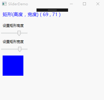
Slider滑动条控件
Slider滑动控件,可以与用户进行交互,允许用户拖动滑块来调整Value的值。
Slider控件属性:
|
属性名称 |
说明 |
|
Delay 和 Interval |
控制滑块的速度,以毫秒为单位。 |
|
TickPlacement |
决定刻度标记显示的显示位置。 |
|
TickFrequency |
获取或设置刻度线之间的间隔。 |
|
Ticks |
获取或设置Slider显示的刻度线的位置。 |
|
IsSnapToTickEnabled |
设置为True,当移动滑块时,将自动与刻度线进行捕捉,并跳转到最近的刻度线。默认为false |
|
IsSelectionRangeEnabled |
设置为true,用户能够在Slider上进行选择一个范围。使用SelectionStart和SelectionEnd方法来选择一个范围。 |
|
AutoToolPlacement |
获取或设置按下滑块时是否显示包含Slider的当前值的工具提示。 |
|
1
2
3
4
5
6
7
8
9
10
11
12
13
14
15
16
17
18
19
20
21
22
23
24
25
26
27
28
29
30
31
32
|
<Window x:Class="WPFDemo.SliderDemo" xmlns="http://schemas.microsoft.com/winfx/2006/xaml/presentation" xmlns:x="http://schemas.microsoft.com/winfx/2006/xaml" xmlns:d="http://schemas.microsoft.com/expression/blend/2008" xmlns:mc="http://schemas.openxmlformats.org/markup-compatibility/2006" xmlns:local="clr-namespace:WPFDemo" mc:Ignorable="d" Title="SliderDemo" Height="300" Width="300"> <StackPanel> <TextBlock Margin="10" Foreground="Blue" FontSize="16"> <TextBlock Text="矩形(高度,宽度)" /> ( <TextBlock Text="{Binding ElementName=RectangleHeight,Path=Value}"></TextBlock> , <TextBlock Text="{Binding ElementName=RectangleWidth,Path=Value}"></TextBlock> ) </TextBlock> <TextBlock Margin="10"> 设置矩形高度 </TextBlock> <Slider Name="RectangleHeight" Width="100" Height="20" Value="30" HorizontalAlignment="Left" IsSnapToTickEnabled="True" Minimum="1" Maximum="100" TickPlacement="BottomRight" TickFrequency="1" AutoToolTipPrecision="2" AutoToolTipPlacement="BottomRight" IsDirectionReversed="False" IsMoveToPointEnabled="False" ></Slider> <TextBlock Margin="10"> 设置矩形宽度 </TextBlock> <Slider Name="RectangleWidth" Width="100" Height="20" Value="50" HorizontalAlignment="Left" IsSnapToTickEnabled="True" Minimum="1" Maximum="100" TickPlacement="BottomRight" AutoToolTipPlacement="BottomRight" AutoToolTipPrecision="2"></Slider> <Rectangle Fill="Blue" HorizontalAlignment="Left" Margin="10" Height="{Binding ElementName=RectangleHeight,Path=Value}" Width="{Binding ElementName=RectangleWidth,Path=Value}"> </Rectangle> </StackPanel></Window> |