WPF内容控件
在WPF中,所有呈现在用户界面上的对象都称为用户界面元素。但是只有派生自System.Windows.Controls.Control类的对象才称为控件。内容控件通常是指具有Content属性的控件,Content属性并非定义在每个控件中,而是定义在基类System.Windows.Controls命名空间的ContentControl类中。注意:Content属性只接收单个内容元素。
WPF内容控件分类
1、 直接继承ContentControl的控件
2、 继承HeaderedContentControl的控件
3、 继承ItemsControl的控件
4、 继承HeaderedItemsControl的控件
直接继承ContentControl的控件
也可以成为单项内容控件,这种控件只能指定一个内容元素。WPF中包含的单项内容控件:
Button:按钮控件
CheckBox:复选框控件
ComboBoxItem:单选框列表项
ContentControl:内容控件的基类
Frame:页框架
GridViewColumnHeader:按钮控件的标题头
GroupItem:组合框的组合项。
Label:标签控件。
ListBoxItem:列表项。
ListViewItem:列表视图项。
NavigationWindow:导航窗口。
RadioButton:单选按钮。
RepeatButton:重复按钮。
ScrollViewer:滚动查看器,或称为滚动面板。
StatusBarItem:状态项。
ToggleButton:选中按钮。
ToolTip:提示控件。
UserControl:用户控件。
Window:WPF窗口
继承HeaderedContentControl的控件
这类控件包含一个标头和一个内容项目。HeaderedContentControl类派生自ContentControl,继承了其Content属性,同时又定了类型Object的Header属性。Header提供了控件的标头。WPF中包含的这类控件有3个:
Exapander:带标题的折叠控件。
GroupBox:组合框控件。
TabItem:这是TabControl控件内的一个Tab项。
继承ItemsControl的控件
这类控件包含一个内容项的集合。例如ListBox控件就是一个典型的ItemsControl控件,该控件具有ListBxItem内容项的集合。
继承HeaderedItemsControl的控件
该类控件包含一个标头和一个内容项的集合。HeaderedItemsControl类继承ItemsControl类。在WPF中有3个这种类型的控件。
MenuItem:菜单项控件。
ToolBar:工具条控件。
TreeviewItem:树状图。
Content属性
WPF中的Content属性可接收的对象分为两大类:
1、 继承自UIElement基类的对象:UIElement定义了WPF中的布局、输入及路由等。是WPF的核心子系统。这种类型的对象具有可视化特性,WPF将使用UIElement.OnRedner方法来显示派生自该类的对象,OnRender方法将生成一个绘图呈现,在需要时进行绘制。
2、 继承自其他类的对象:WPF的处理方法很简单,通过调用该对象的ToString方法来显示一行文本。
内容容器控件
ScrollViewer滚动条控件
|
1
2
3
4
5
6
7
8
9
10
11
12
13
14
15
16
17
18
19
20
21
22
23
24
25
26
27
28
29
30
31
32
33
34
35
36
37
38
39
40
41
42
43
44
45
46
47
48
49
50
51
|
<Window x:Class="WPFDemo.ScrollViewerDemo" xmlns="http://schemas.microsoft.com/winfx/2006/xaml/presentation" xmlns:x="http://schemas.microsoft.com/winfx/2006/xaml" xmlns:d="http://schemas.microsoft.com/expression/blend/2008" xmlns:mc="http://schemas.openxmlformats.org/markup-compatibility/2006" xmlns:local="clr-namespace:WPFDemo" mc:Ignorable="d" WindowStartupLocation="CenterScreen" Title="ScrollViewerDemo" Height="300" Width="300"> <ScrollViewer> <Grid Height="400"> <Grid.RowDefinitions> <RowDefinition /> <RowDefinition /> <RowDefinition /> <RowDefinition /> <RowDefinition /> </Grid.RowDefinitions> <Button Name="button1" Content="button1" Grid.Row="0"></Button> <Button Name="button2" Content="button2" Grid.Row="1"></Button> <Button Name="button3" Content="button3" Grid.Row="2"></Button> <Button Name="button4" Content="button4" Grid.Row="3"></Button> <Button Name="button5" Content="button5" Grid.Row="4"></Button> </Grid> </ScrollViewer></Window> |
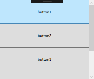
默认情况下ScrollViewer总是显示一个垂直的滚动条。可以通过调整VerticalScrollBarVisibility属性来设置滚动条的显示方式。也可以使用HorizontalScrollBarVisibility属性设置水平滚动条的显示方式。
|
1
2
3
4
5
6
7
8
9
10
11
12
13
14
15
16
17
18
19
20
21
22
23
24
25
26
27
28
29
30
31
|
<ScrollViewer Width="100"> <Grid Height="400"> <Grid.RowDefinitions> <RowDefinition /> <RowDefinition /> <RowDefinition /> <RowDefinition /> <RowDefinition /> </Grid.RowDefinitions> <Button Name="button1" Content="button1" Grid.Row="0" Width="200"></Button> <Button Name="button2" Content="button2" Grid.Row="1" Width="200"></Button> <Button Name="button3" Content="button3" Grid.Row="2" Width="200"></Button> <Button Name="button4" Content="button4" Grid.Row="3" Width="200"></Button> <Button Name="button5" Content="button5" Grid.Row="4" Width="200"></Button> </Grid> </ScrollViewer> |
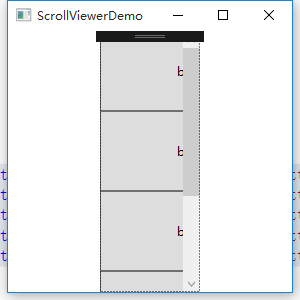
设置横向滚动条显示
|
1
2
3
4
5
6
7
8
9
10
11
12
13
14
15
16
17
18
19
20
21
22
23
24
25
26
27
28
29
30
31
|
<ScrollViewer Width="100" HorizontalScrollBarVisibility="Auto"> <Grid Height="400"> <Grid.RowDefinitions> <RowDefinition /> <RowDefinition /> <RowDefinition /> <RowDefinition /> <RowDefinition /> </Grid.RowDefinitions> <Button Name="button1" Content="button1" Grid.Row="0" Width="200"></Button> <Button Name="button2" Content="button2" Grid.Row="1" Width="200"></Button> <Button Name="button3" Content="button3" Grid.Row="2" Width="200"></Button> <Button Name="button4" Content="button4" Grid.Row="3" Width="200"></Button> <Button Name="button5" Content="button5" Grid.Row="4" Width="200"></Button> </Grid> </ScrollViewer> |

HorizontalScrollBarVisibility属性和VerticalScrollBarVisibility这两个属性都是ScrollBarVisibility枚举类型的值。下表是ScrollBarVisibility枚举值:
|
枚举值 |
描述 |
|
Disabled |
禁止显示滚动条,即使当前视图区域无法显示所有内容,滚动条也不出现 |
|
Auto |
当前视图区域可以容纳所有内容时,不显示滚动条,否则自动显示滚动条。 |
|
Hidden |
隐藏滚动条的显示,但是用户可以通过键盘等进行滚动。该属性主要用于自定义滚动方式。 |
|
Visible |
无论如何滚动条都会显示。 |
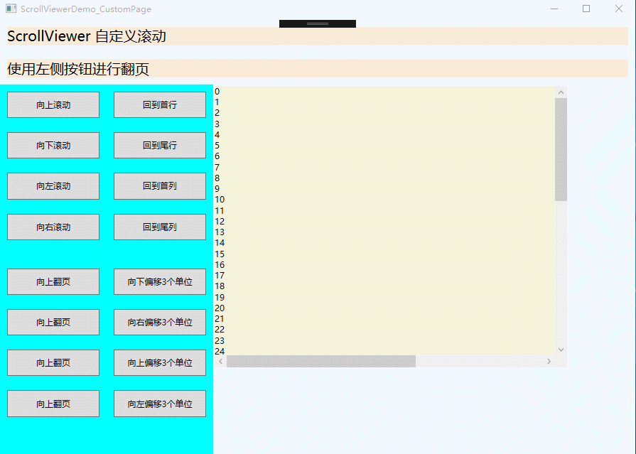
使用下面实例演示ScrollViewer自定义滚动
|
1
2
3
4
5
6
7
8
9
10
11
12
13
14
15
16
17
18
19
20
21
22
23
24
25
26
27
28
29
30
31
32
33
34
35
36
37
38
39
40
41
42
43
44
45
46
47
48
49
50
51
52
53
54
55
56
57
58
59
60
61
62
63
64
65
66
67
68
69
70
71
72
73
74
75
|
<Window x:Class="WPFDemo.ScrollViewerDemo_CustomPage" xmlns="http://schemas.microsoft.com/winfx/2006/xaml/presentation" xmlns:x="http://schemas.microsoft.com/winfx/2006/xaml" xmlns:d="http://schemas.microsoft.com/expression/blend/2008" xmlns:mc="http://schemas.openxmlformats.org/markup-compatibility/2006" xmlns:local="clr-namespace:WPFDemo" mc:Ignorable="d" Title="ScrollViewerDemo_CustomPage" Height="300" Width="300"> <DockPanel Background="AliceBlue"> <TextBlock DockPanel.Dock="Top" Text="ScrollViewer 自定义滚动" FontSize="20" Background="AntiqueWhite" Margin="10"></TextBlock> <TextBlock DockPanel.Dock="Top" Text="使用左侧按钮进行翻页" FontSize="20" Background="AntiqueWhite" Margin="10"></TextBlock> <StackPanel DockPanel.Dock="Left" Width="150" Background="Aqua"> <Button Name="btnLineUp" Content="向上滚动" Margin="10" Padding="10" Click="btnLineUp_Click" /> <Button Name="btnLineDown" Content="向下滚动" Margin="10" Padding="10" Click="btnLineDown_Click" /> <Button Name="btnLineLeft" Content="向左滚动" Margin="10" Padding="10" Click="btnLineLeft_Click" /> <Button Name="btnLineRight" Content="向右滚动" Margin="10" Padding="10" Click="btnLineRight_Click" /> <Button Name="btnPageUp" Content="向上翻页" Margin="10,30,10,10" Padding="10" Click="btnPageUp_Click" /> <Button Name="btnPageDown" Content="向上翻页" Margin="10" Padding="10" Click="btnPageDown_Click" /> <Button Name="btnPageLeft" Content="向左翻页" Margin="10" Padding="10" Click="btnPageLeft_Click" /> <Button Name="btnPageRight" Content="向右翻页" Margin="10" Padding="10" Click="btnPageRight_Click" /> </StackPanel> <StackPanel DockPanel.Dock="Left" Width="150" Background="Aqua"> <Button Name="btnLineHome" Content="回到首行" Margin="10" Padding="10" Click="btnLineHome_Click" /> <Button Name="btnLineEnd" Content="回到尾行" Margin="10" Padding="10" Click="btnLineEnd_Click" /> <Button Name="btnColumnHome" Content="回到首列" Margin="10" Padding="10" Click="btnColumnHome_Click" /> <Button Name="btnColumnEnd" Content="回到尾列" Margin="10" Padding="10" Click="btnColumnEnd_Click" /> <Button Name="btnLineOffsetUp" Content="向下偏移3个单位" Margin="10,30,10,10" Padding="10" Click="btnLineOffsetUp_Click" /> <Button Name="btnColumnOffsetRight" Content="向右偏移3个单位" Margin="10" Padding="10" Click="btnColumnOffsetRight_Click" /> <Button Name="btnLineOffsetDown" Content="向上偏移3个单位" Margin="10" Padding="10" Click="btnLineOffsetDown_Click" /> <Button Name="btnColumnOffsetLeft" Content="向左偏移3个单位" Margin="10" Padding="10" Click="btnColumnOffsetLeft_Click" /> </StackPanel> <Border Width="500" Height="400" BorderThickness="2" Background="Beige" VerticalAlignment="Top" HorizontalAlignment="Left"> <ScrollViewer Name="SVText" HorizontalScrollBarVisibility="Auto" VerticalScrollBarVisibility="Visible"> <TextBlock Name="txtText" Width="800" Height="900" TextWrapping="Wrap"></TextBlock> </ScrollViewer> </Border> </DockPanel></Window> |
添加后台代码
|
1
2
3
4
5
6
7
8
9
10
11
12
13
14
15
16
17
18
19
20
21
22
23
24
25
26
27
28
29
30
31
32
33
34
35
36
37
38
39
40
41
42
43
44
45
46
47
48
49
50
51
52
53
54
55
56
57
58
59
60
61
62
63
64
65
66
67
68
69
70
71
72
73
74
75
76
77
78
79
80
81
82
83
84
85
86
87
88
89
90
91
92
93
94
95
96
97
98
99
100
101
|
namespace WPFDemo{ /// <summary> /// ScrollViewerDemo_CustomPage.xaml 的交互逻辑 /// </summary> public partial class ScrollViewerDemo_CustomPage : Window { public ScrollViewerDemo_CustomPage() { InitializeComponent(); BindText(); } public void BindText() { for (int i = 0; i < 1000; i++) { txtText.Text += i + "
"; } } private void btnLineUp_Click(object sender, RoutedEventArgs e) { SVText.LineUp(); } private void btnLineDown_Click(object sender, RoutedEventArgs e) { SVText.LineDown(); } private void btnLineLeft_Click(object sender, RoutedEventArgs e) { SVText.LineLeft(); } private void btnLineRight_Click(object sender, RoutedEventArgs e) { SVText.LineRight(); } private void btnPageUp_Click(object sender, RoutedEventArgs e) { SVText.PageUp(); } private void btnPageDown_Click(object sender, RoutedEventArgs e) { SVText.PageDown(); } private void btnPageLeft_Click(object sender, RoutedEventArgs e) { SVText.PageLeft(); } private void btnPageRight_Click(object sender, RoutedEventArgs e) { SVText.PageRight(); } private void btnLineHome_Click(object sender, RoutedEventArgs e) { SVText.ScrollToHome(); } private void btnLineEnd_Click(object sender, RoutedEventArgs e) { SVText.ScrollToEnd(); } private void btnColumnHome_Click(object sender, RoutedEventArgs e) { SVText.ScrollToLeftEnd(); } private void btnColumnEnd_Click(object sender, RoutedEventArgs e) { SVText.ScrollToRightEnd(); } private void btnLineOffsetUp_Click(object sender, RoutedEventArgs e) { SVText.ScrollToVerticalOffset(SVText.VerticalOffset + 3); } private void btnColumnOffsetRight_Click(object sender, RoutedEventArgs e) { SVText.ScrollToHorizontalOffset(SVText.HorizontalOffset + 3); } private void btnLineOffsetDown_Click(object sender, RoutedEventArgs e) { SVText.ScrollToVerticalOffset(SVText.VerticalOffset - 3); } private void btnColumnOffsetLeft_Click(object sender, RoutedEventArgs e) { SVText.ScrollToHorizontalOffset(SVText.HorizontalOffset - 3); } }} |
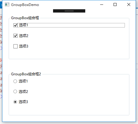
GroupBox组合框
|
1
2
3
4
5
6
7
8
9
10
11
12
13
14
15
16
17
18
19
20
21
22
23
24
25
26
27
28
29
30
31
32
33
34
35
36
37
38
39
40
41
42
43
44
45
46
47
48
49
50
51
52
53
54
55
56
57
|
<Window x:Class="WPFDemo.GroupBoxDemo" xmlns="http://schemas.microsoft.com/winfx/2006/xaml/presentation" xmlns:x="http://schemas.microsoft.com/winfx/2006/xaml" xmlns:d="http://schemas.microsoft.com/expression/blend/2008" xmlns:mc="http://schemas.openxmlformats.org/markup-compatibility/2006" xmlns:local="clr-namespace:WPFDemo" mc:Ignorable="d" Title="GroupBoxDemo" Height="300" Width="300"> <Grid> <Grid.RowDefinitions> <RowDefinition /> <RowDefinition /> </Grid.RowDefinitions> <GroupBox Header="GroupBox组合框" Grid.Row="0" Margin="20"> <StackPanel> <CheckBox Margin="10">选项1</CheckBox> <CheckBox Margin="10">选项2</CheckBox> <CheckBox Margin="10">选项3</CheckBox> </StackPanel> </GroupBox> <GroupBox Header="GroupBox组合框2" Grid.Row="1" Margin="20"> <StackPanel> <RadioButton Margin="10">选项1</RadioButton> <RadioButton Margin="10">选项2</RadioButton> <RadioButton Margin="10">选项3</RadioButton> </StackPanel> </GroupBox> </Grid></Window> |
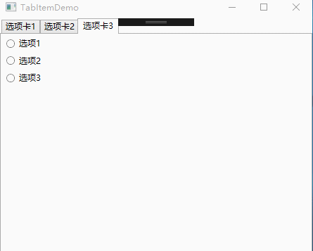
TabItem标签页控件
|
1
2
3
4
5
6
7
8
9
10
11
12
13
14
15
16
17
18
19
20
21
22
23
24
25
26
27
28
29
30
31
32
33
34
35
36
37
38
39
40
41
42
43
44
45
46
47
48
49
50
51
52
53
54
55
56
57
58
59
60
61
62
63
64
65
66
67
68
69
70
71
72
73
74
75
76
77
78
79
80
81
82
83
84
85
86
87
88
89
90
91
92
93
94
95
96
97
|
<Window x:Class="WPFDemo.TabItemDemo" xmlns="http://schemas.microsoft.com/winfx/2006/xaml/presentation" xmlns:x="http://schemas.microsoft.com/winfx/2006/xaml" xmlns:d="http://schemas.microsoft.com/expression/blend/2008" xmlns:mc="http://schemas.openxmlformats.org/markup-compatibility/2006" xmlns:local="clr-namespace:WPFDemo" mc:Ignorable="d" Title="TabItemDemo" Height="300" Width="300"> <Grid> <TabControl> <TabItem Header="选项卡1"> <StackPanel> <CheckBox Margin="5">选项1</CheckBox> <CheckBox Margin="5">选项2</CheckBox> <CheckBox Margin="5">选项3</CheckBox> </StackPanel> </TabItem> <TabItem Header="选项卡2" IsSelected="True"> <Grid> <Grid.RowDefinitions> <RowDefinition/> <RowDefinition/> </Grid.RowDefinitions> <GroupBox Header="GroupBox1" Margin="10" Grid.Row="0"> <StackPanel> <CheckBox Margin="5">选项1</CheckBox> <CheckBox Margin="5">选项2</CheckBox> <CheckBox Margin="5">选项3</CheckBox> </StackPanel> </GroupBox> <GroupBox Header="GroupBox2" Margin="10" Grid.Row="1"> <StackPanel> <RadioButton Margin="5">选项1</RadioButton> <RadioButton Margin="5">选项2</RadioButton> <RadioButton Margin="5">选项3</RadioButton> </StackPanel> </GroupBox> </Grid> </TabItem> <TabItem Header="选项卡3"> <StackPanel> <RadioButton Margin="5">选项1</RadioButton> <RadioButton Margin="5">选项2</RadioButton> <RadioButton Margin="5">选项3</RadioButton> </StackPanel> </TabItem> </TabControl> </Grid></Window> |
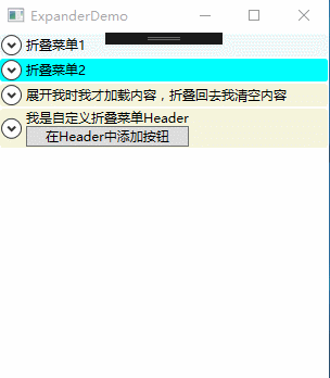
Expander可折叠控件
属性:
IsExpanded:获取和设置Expander控件的折叠状态。
ExpandDirection:获取或设置Expander控件内容展开的方向。枚举值:包含Up、Down、Left、Right,分别为上下左右。
事件:
Collapsed:当Expander折叠时,在内容实际被收起前触发该事件。
Expanded:当Expander展开时,在内容实际被显示前触发该事件。
|
1
2
3
4
5
6
7
8
9
10
11
12
13
14
15
16
17
18
19
20
21
22
23
24
25
26
27
28
29
30
31
32
33
34
35
36
37
38
39
40
41
42
43
44
45
46
47
48
49
50
51
52
53
54
55
56
57
58
59
60
61
62
63
64
65
66
67
68
69
70
71
72
73
74
75
76
77
78
79
80
81
82
83
84
85
86
87
88
89
90
91
92
93
94
95
96
97
|
<Window x:Class="WPFDemo.ExpanderDemo" xmlns="http://schemas.microsoft.com/winfx/2006/xaml/presentation" xmlns:x="http://schemas.microsoft.com/winfx/2006/xaml" xmlns:d="http://schemas.microsoft.com/expression/blend/2008" xmlns:mc="http://schemas.openxmlformats.org/markup-compatibility/2006" xmlns:local="clr-namespace:WPFDemo" mc:Ignorable="d" Title="ExpanderDemo" Height="300" Width="300"> <Grid> <Grid.RowDefinitions> <RowDefinition Height="Auto"/> <RowDefinition Height="Auto"/> <RowDefinition Height="Auto"/> <RowDefinition Height="Auto"/> </Grid.RowDefinitions> <Expander Header="折叠菜单1" Grid.Row="0" Background="AliceBlue" > <StackPanel> <CheckBox Margin="5">选项1</CheckBox> <CheckBox Margin="5">选项2</CheckBox> <CheckBox Margin="5">选项3</CheckBox> </StackPanel> </Expander> <Expander Header="折叠菜单2" Grid.Row="1" Background="Aqua" IsExpanded="True"> <StackPanel> <CheckBox Margin="5">选项1</CheckBox> <CheckBox Margin="5">选项2</CheckBox> <CheckBox Margin="5">选项3</CheckBox> </StackPanel> </Expander> <Expander Header="展开我时我才加载内容,折叠回去我清空内容" Grid.Row="2" Background="Beige" Collapsed="Expander_Collapsed" Expanded="Expander_Expanded"> <ScrollViewer MaxHeight="120" HorizontalScrollBarVisibility="Disabled"> <TextBlock Name="txtText"></TextBlock> </ScrollViewer> </Expander> <Expander Grid.Row="3" Background="Beige" > <Expander.Header> <StackPanel> <TextBlock>我是自定义折叠菜单Header</TextBlock> <Button>在Header中添加按钮</Button> </StackPanel> </Expander.Header> <StackPanel> <CheckBox Margin="5">选项1</CheckBox> <CheckBox Margin="5">选项2</CheckBox> <CheckBox Margin="5">选项3</CheckBox> </StackPanel> </Expander> </Grid></Window> |