最近疫情,直播的项目增多,直播的话 就需要有视频区域展示,在移动端上,除去聊天互动,点赞,刷礼物等内容,视频区域展示内容相对来说较小。
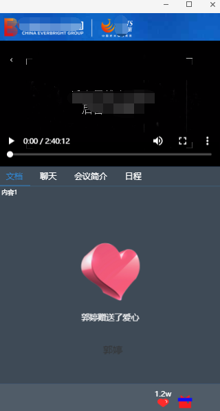
一般情况下,video设置controls 会有一个全屏显示的按钮,可以进行切换,
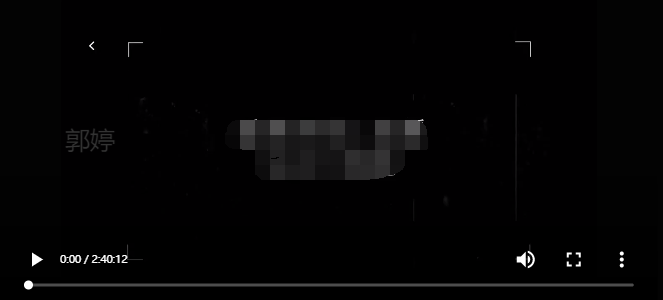
现在产品需要在不点击video提供的全屏切换按钮的情况下,(以防用户无意间手机横屏,导致样式不好看的问题)也将视频全屏展示
1.css 解决方案:
orientation:portrait(指定输出设备中的页面可见区域高度大于或等于宽度)|landscape(除了portrait的情况)

// 横屏
@media screen and (orientation:landscape){
除了视频区域以外的内容都隐藏
  .top-cont-fixed,.tab-content,.bottom-navbar{
    display: none
  }
//视频区域在横屏中,按照高度将视频展示出来 其余地方用黑色背景填充
 .video-box{
   top: 0;
   height: 100%;
 }
 video{
   height: 100%;
 }
//如果背景图片存在的情况下,在切换浏览器全屏展示的时候 会在切换中露出一瞬间背景图 ,所以尽量见背景图node掉
 body{
  background: none
 }
 }
 @media screen and (orientation:portrait){ //竖屏 恢复正常
  .top-cont-fixed,.tab-content,.bottom-navbar{
    display: block
  }
 .video-box{
   top: 2.0235rem;
   height: 9.0525rem;
 }
 video{
   height: auto;
 }
 body{
  background: #386eb7 url(../img/bg.png) no-repeat top;
 }
 }
2.js:解决
利用js写 比较好的一点是 可以动态更改数据
js 版本监听 并修改数据
    window.onorientationchange = function () {
        switch (window.orientation) {
            case -90:
            case 90:
                alert("横屏:" + window.orientation);
                $('.top-cont-fixed').hide();
                $('.tab-content').hide();
                $('.bottom-navbar').hide();
                $('.video-box').css({
                    top: 0,
                    // bottom:0,
                    height: "100%"
                })
                $('video').height('100%')
                $('body').css('background: none')
                break;
            case 0:
            case 180:

                alert("竖屏:" + window.orientation);
                $('.top-cont-fixed').show();
                $('.tab-content').show();
                $('.bottom-navbar').show();
                $('.video-box').css({
                    top: "2.0235rem",
                    height: "9.0525rem"
                })
                $('video').height('auto')
                $('body').css('background: #386eb7 url(../img/bg.png) no-repeat top;')
                break;
        }
    }
效果图:
2020/12/16
补充检测横竖屏的方法:
3.window.matchMedia()
经过实践检验,css 中的 orientation 在某些安卓手机上没有识别到,所以利用window.matchMedia来进行监听,并成功监听.
matchMedia() 方法的值可以是任何一个 媒体查询的特性, 如 min-height, min-width, orientation 等,利用这个 我们可以监听到orientation 的值


 var flag= window.matchMedia("(orientation: portrait)");
    function onMatchMeidaChange(flag) {
        if (mql.matches) {
            // 竖屏
            alert('竖屏');

        } else {
            // 横屏
            alert('横屏');
         //在这里用js秀爱样式 达到效果
        }
    }
    onMatchMeidaChange(flag);
    flag.addListener(onMatchMeidaChange);
在移动端支持良好,可以用这个解决兼容性的问题。
4.判断浏览器宽高来确定是横屏竖屏
最基本的方法
通过监听浏览器resize,来判断宽高,从而确定横屏竖屏
function windowResize() {
            if (window.innerHeight >= window.innerWidth) {
                // 竖屏
                alert('竖屏')
            } else {
                // 横屏
                 alert('横屏')
            }
        }
        windowResize();
        window.addEventListener('resize', windowResize);