The Control Template defines the visual appearance of a control. All of the UI elements have some kind of appearance as well as behavior, e.g., Button has an appearance and behavior. Click event or mouse hover event are the behaviors which are fired in response to a click and hover and there is also a default appearance of button which can be changed by the Control template.
<Window.Resources>
<ControlTemplate x:Key="ButtonTemplate" TargetType="Button">
<Grid>
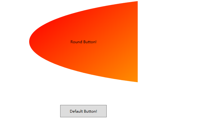
<Ellipse x:Name="ButtonEllipse" Height="300" Width="1350">
<Ellipse.Fill>
<LinearGradientBrush StartPoint="0,0.2" EndPoint="0.2,1.4">
<GradientStop Offset="0" Color="Red"/>
<GradientStop Offset="1" Color="Orange"/>
</LinearGradientBrush>
</Ellipse.Fill>
</Ellipse>
<ContentPresenter Content="{TemplateBinding Content}" HorizontalAlignment="Center" VerticalAlignment="Center"/>
</Grid>
<ControlTemplate.Triggers>
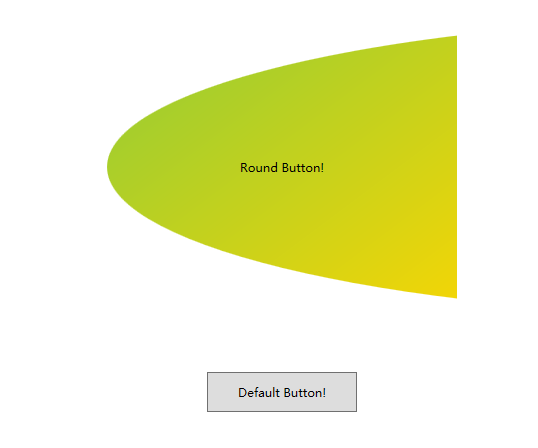
<Trigger Property="IsMouseOver" Value="True">
<Setter TargetName="ButtonEllipse" Property="Fill">
<Setter.Value>
<LinearGradientBrush StartPoint="0,0.2" EndPoint="0.2,1.4">
<GradientStop Offset="0" Color="YellowGreen"/>
<GradientStop Offset="1" Color="Gold"/>
</LinearGradientBrush>
</Setter.Value>
</Setter>
</Trigger>
<Trigger Property="IsPressed" Value="True">
<Setter Property="RenderTransform">
<Setter.Value>
<ScaleTransform ScaleX="0.8" ScaleY="0.8" CenterX="0" CenterY="0"/>
</Setter.Value>
</Setter>
<Setter Property="RenderTransformOrigin" Value="0.5,0.5"/>
</Trigger>
</ControlTemplate.Triggers>
</ControlTemplate>
</Window.Resources>
<StackPanel>
<Button Content="Round Button!" Template="{StaticResource ButtonTemplate}" Width="350" Margin="50"/>
<Button Content="Default Button!" Height="40" Width="150" Margin="5"/>
</StackPanel>
Data Template
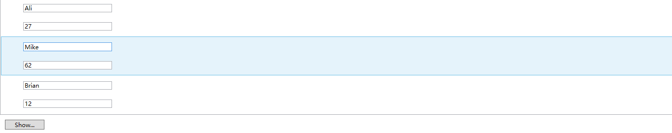
A Data Template defines and specifies the appearance and structure of a collection of data. It provides the flexibility to format and define the presentation of the data on any UI element. It is mostly used on data related Item controls such as ComboBox, ListBox, etc.
<Window.Resources>
<DataTemplate DataType="{x:Type local:Person}">
<Grid>
<Grid.RowDefinitions>
<RowDefinition Height="Auto"/>
<RowDefinition Height="Auto"/>
</Grid.RowDefinitions>
<Grid.ColumnDefinitions>
<ColumnDefinition Width="Auto"/>
<ColumnDefinition Width="200"/>
</Grid.ColumnDefinitions>
<Label Name="nameLabel" Margin="10"/>
<TextBox Name="nameText" Grid.Column="1" Margin="10" Text="{Binding Name}"/>
<Label Name="ageLabel" Margin="10" Grid.Row="1"/>
<TextBox Name="ageText" Grid.Column="1" Grid.Row="1" Margin="10" Text="{Binding Age}"/>
</Grid>
</DataTemplate>
</Window.Resources>
<Grid>
<Grid.RowDefinitions>
<RowDefinition Height="Auto"/>
<RowDefinition Height="*"/>
</Grid.RowDefinitions>
<ListBox ItemsSource="{Binding}"/>
<StackPanel Grid.Row="1">
<Button Content="Show..." Click="Button_Click" Width="80" HorizontalAlignment="Left" Margin="10"/>
</StackPanel>
</Grid>
</Window>
public partial class MainWindow : Window
{
Person person = new Person { Name = "Ali", Age = 27 };
List<Person> personList = new List<Person>();
public MainWindow()
{
InitializeComponent();
personList.Add(person);
personList.Add(new Person { Name = "Mike", Age = 62 });
personList.Add(new Person { Name = "Brian", Age = 12 });
this.DataContext = personList;
}
private void Button_Click(object sender, RoutedEventArgs e)
{
string message = person.Name + " is " + person.Age;
MessageBox.Show(message);
}
}
public class Person
{
private string nameValue;
public string Name
{
get
{
return nameValue;
}
set
{
nameValue = value;
}
}
private double ageValue;
public double Age
{
get
{
return ageValue;
}
set
{
if(value!=ageValue)
{
ageValue = value;
}
}
}
}