效果图:
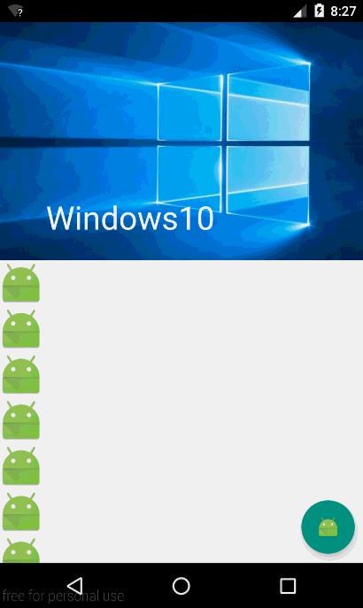
上面的这个图有两个效果是,一个是顶部的图片,在上滑之后会隐藏起来并且显示出一个ToolBar(ToolBar类似于ActionBar,但是只有ToolBar是兼容Material Desig的库)。另一个是底部的这个按钮,这个按钮点击之后会出现一个SnackBar(比Toast要强大,因为可以设定点击的监听事件),在按钮点击之后SnackBar出现之后按钮会自动的向上移动避免被遮挡,这是CoordinatorLayout的一个功能。
Android Design Support Library是一个谷歌提供的用来实现Material Design(以下简称MD)的一个兼容库,它实现的效果不单单可以在android5.0以上的设备运行,本实例用到了其中的一些控件,比如SnackBar、FloatingActionButton等等
先贴一下布局再来解释:
 1 <?xml version="1.0" encoding="utf-8"?>
 2 <android.support.design.widget.CoordinatorLayout
 3     android:id="@+id/root"
 4     xmlns:android="http://schemas.android.com/apk/res/android"
 5     xmlns:app="http://schemas.android.com/apk/res-auto"
 6     android:layout_width="match_parent"
 7     android:layout_height="match_parent">
 8
 9
10     <android.support.v4.widget.NestedScrollView
11         android:layout_width="match_parent"
12         android:layout_height="match_parent"
13         app:layout_behavior="@string/appbar_scrolling_view_behavior">
14
15         <LinearLayout
16             android:layout_width="match_parent"
17             android:layout_height="match_parent"
18             android:orientation="vertical">
19
20             <!-- 这里为了实现能拖动可以添加多个ImageView,省略...-->
21         </LinearLayout>
22
23     </android.support.v4.widget.NestedScrollView>
24
25     <android.support.design.widget.AppBarLayout
26         android:layout_width="match_parent"
27         android:layout_height="250dp"
28         android:theme="@style/ThemeOverlay.AppCompat.Dark.ActionBar">
29
30         <android.support.design.widget.CollapsingToolbarLayout
31             android:id="@+id/collapsingtoolbarlayout"
32             android:layout_width="match_parent"
33             android:layout_height="match_parent"
34             app:contentScrim="#636EEE"
35             app:title="Windows10"
36             app:expandedTitleMarginStart="50dp"
37             app:layout_scrollFlags="scroll|exitUntilCollapsed">
38
39             <ImageView
40                 android:layout_width="match_parent"
41                 android:layout_height="match_parent"
42                 android:scaleType="fitXY"
43                 android:src="@drawable/my"
44                 app:layout_collapseMode="parallax"/>
45
46
47             <android.support.v7.widget.Toolbar
48                 android:id="@+id/toolbar"
49                 android:layout_width="match_parent"
50                 android:layout_height="?attr/actionBarSize"
51                 android:minHeight="20dp"
52                 app:layout_collapseMode="pin"
53                 app:popupTheme="@style/Theme.AppCompat.Light"
54                 app:theme="@style/ThemeOverlay.AppCompat.Dark.ActionBar"
55                 />
56         </android.support.design.widget.CollapsingToolbarLayout>
57
58     </android.support.design.widget.AppBarLayout>
59
60     <android.support.design.widget.FloatingActionButton
61         android:id="@+id/fab_btn"
62         android:layout_width="wrap_content"
63         android:layout_height="wrap_content"
64         android:layout_gravity="bottom|right"
65         android:layout_margin="10dp"
66         android:src="@mipmap/ic_launcher"
67         app:fabSize="normal"/>
68
69 </android.support.design.widget.CoordinatorLayout>
在最外层使用一个CoordinatorLayout来做主布局,在布局中生命使用命名空间名为app,这个布局是一个功能强大的FrameLayout,就是这个布局的作用下我们才能做到上面的效果。可以看到代码的最后我们放了一个FloatingActiongButton,因为这个控件放在这个布局中,所以如果我们给它设定点击事件并让它弹出一个SnackBar,就能做到上面的这个效果了。
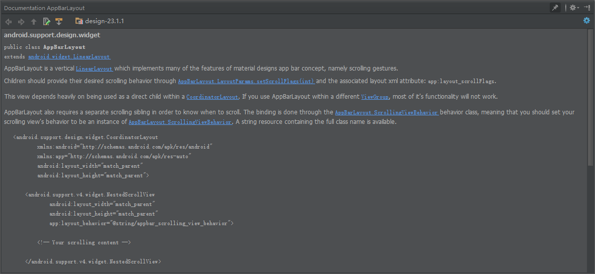
接下来是做图片滑动的这个效果,在最外层使用一个AppBarLayout,这个布局是一个特殊的LinearLayout,是为了兼容MD而设计的一个布局,在CoordinatorLayout中使用它就能做到一些协调的效果,根据API可以看到它的用法如下:
能FQ的就看:http://developer.android.com/reference/android/support/design/widget/AppBarLayout.html

这里已经给出了整个效果实现的框架了,接下来我们要在ToolBarLayout中添加一个CollapsingToolBarLayout,这个布局是名称翻译是“崩溃的工具栏布局”?莫名喜感哈哈!这里使用它的目的就是实现图片滑动消失,然后显示ToolBar,这个类的描述:

app:contentScrim="#636EEE"
app:title="Windows10"
app:expandedTitleMarginStart="50dp"
app:layout_scrollFlags="scroll|exitUntilCollapsed"
这个布局的四个属性分别是收缩后的颜色,标题文字,打开后的标题距离以及图片的收缩效果,每一个是什么可以自己尝试一下。
最后是在这个布局中添加一个ImageView和一个ToolBar就可以了,至于滑动的效果就可以自己设置一下,API是可以看到的。
再贴一下Activity的代码:
public class CoordinatorLayoutActivity extends AppCompatActivity {
    private FloatingActionButton ftb_btn;
    private CoordinatorLayout root;
    private Toolbar toolbar;
    private CollapsingToolbarLayout collapsingToolbarLayout;

    @Override
    protected void onCreate(@Nullable Bundle savedInstanceState) {
        super.onCreate(savedInstanceState);
        setContentView(R.layout.activity_coordinatorlayout);
        ftb_btn = (FloatingActionButton) findViewById(R.id.fab_btn);
        root = (CoordinatorLayout) findViewById(R.id.root);
        toolbar = (Toolbar) findViewById(R.id.toolbar);
        collapsingToolbarLayout = (CollapsingToolbarLayout) findViewById(R.id.collapsingtoolbarlayout);
        setSupportActionBar(toolbar);

        ftb_btn.setOnClickListener(new View.OnClickListener() {
            @Override
            public void onClick(View v) {
                Snackbar.make(root,"我是一个Snackbar",Snackbar.LENGTH_LONG).setAction("我知道了", new View.OnClickListener() {
                    @Override
                    public void onClick(View v) {

                    }
                }).show();
            }
        });
    }
}
最后说明:这些效果的实现都用了一些看起来比较新的布局和控件,但是实际上这些控件都是我们平常使用到的,其实只是把旧的东西封装了加入了一些新的属性,然后系统已经帮我们在底层实现了一些动画效果。另外,在CoordinatorLayout中使用的各种控件协调动画效果都需要一些经过适配的控件或者是布局来兼容这种新的设计语言,所以旧的就不合适了。