效果地址:https://codepen.io/flyingliao/pen/QPKQjB?editors=1100
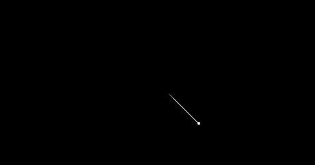
效果图:
HTML code:
<div class="sky">
  <span></span>
</div>
CSS code:
html,body{
  margin: 0;
  padding: 0;
}
*{
  /* 设置所有元素的width、height包括其内边距、边框、内容 */
  box-sizing: border-box;
}
body{
  height: 100vh;
  /* border: 1px solid white; */
  display: flex;
  justify-content: center;
  align-items: center;
  background-color: black;
}
/* 设置sky的样式 */
.sky{
  position: relative;
  width: 80vh;
  height: 80vh;
  /* border: 3px solid white; */
  /* 设置span水平垂直居中 */
  display: flex;
  justify-content: center;
  align-items: center;
  /* 溢出隐藏 */
  overflow: hidden;
}
.sky span{
  position: relative;
  display: inline-block;
  width: 4px;
  height: 4px;
  border-radius: 50%;
  background-color: white;
  /* transform-origin: right; */
  animation: across 1s linear infinite;
}
@keyframes across{
  to{
    margin-top: 100vh;
    margin-left: 100vh;
  }
}
/* 利用伪元素::before加尾巴 */
.sky span::before{
  content:'';
  width: 60px;
  border: 0.5px solid white;
  border-radius: 50% 0 0 50%;
  position: absolute;
  top: 1px;
  left: -60px;
  /* 设置尾巴以右为旋转定点 */
  transform-origin: right;
  /* 设置尾巴线的方向与移动方向一致 */
  transform: rotate(45deg);
}