整个网页的html
首先,忽略我的网页比较丑,主要是ps功底不太好,
其次这个网页是利用了全屏插件:jquery.fullPage.js。需要事先导入相应的js文件
js文件下载地址:http://www.dowebok.com/77.html
js文件网页中有使用教程和一些小案例
整个案例运用了交集选择器
  1 <!DOCTYPE html>
  2 <html lang="en">
  3 <head>
  4     <meta charset="UTF-8">
  5     <title>Title</title>
  6     <link href="../css/360.css" rel="stylesheet">
  7     <link rel="stylesheet" href="../css/jquery.fullPage.css">
  8     <script src="../js/jquery-1.8.3.min.js"></script>
  9     <script src="../js/jquery.fullPage.js"></script>
 10     <script src="../js/jquery.fullPage.min.js"></script>
 11     <style>
 12
 13     </style>
 14 </head>
 15 <body>
 16 <div id="360Page">
 17     <div class="section first">
 18         <div class="logo">
 19             <img src="static/images/logo.jpg" alt="">
 20         </div>
 21         <ul class="text1">
 22             <li>4</li>
 23             <li>亿</li>
 24             <li>网</li>
 25             <li>友</li>
 26             <li>共</li>
 27             <li>同</li>
 28             <li>信</li>
 29             <li>赖</li>
 30         </ul>
 31         <div class="text2">
 32             更安全,更爽快,更智能,更时尚
 33         </div>
 34     </div>
 35     <div class="section second">
 36         <div class="shield">
 37             <img src="../img/dp1.png" alt="">
 38             <img src="../img/dp2.png" alt="">
 39             <img src="../img/dp3.png" alt="">
 40             <img src="../img/dp4.png" alt="">
 41             <img src="../img/dp5.png" alt="">
 42             <img src="../img/dp6.png" alt="">
 43             <img src="../img/dp7.png" alt="">
 44             <img src="../img/dp8.png" alt="">
 45         </div>
 46         <div class="info"></div>
 47     </div>
 48     <div class="section third">
 49         <div class="info"></div>
 50         <div class="circle">
 51             <div class="rocket"></div>
 52         </div>
 53     </div>
 54     <div class="section fourth">
 55         <div class="search">
 56             <div class="searchBar"></div>
 57             <div class="searchText"></div>
 58             <div class="searchResult"></div>
 59         </div>
 60         <div class="info"></div>
 61     </div>
 62     <div class="section fifth">
 63         <div class="info"></div>
 64         <div class="subject">
 65             <div class="topBorder"></div>
 66             <div class="bottomBorder"></div>
 67             <div class="leftBorder"></div>
 68             <div class="rightBorder"></div>
 69             <div class="nav">
 70                 <div class="icon"></div>
 71                 <div class="navHead">
 72                     <div class="info"></div>
 73                     <div class="minimum"></div>
 74                     <div class="maximum"></div>
 75                     <div class="close"></div>
 76                 </div>
 77                 <div class="Address-bar">
 78                     <div class="return"></div>
 79                     <div class="refresh"></div>
 80                     <div class="homepage"></div>
 81                     <div class="url">
 82                         <div class="quickness"></div>
 83                     </div>
 84                     <div class="list"></div>
 85                     <div class="search-box">
 86                         <div class="search"></div>
 87                     </div>
 88                 </div>
 89             </div>
 90         </div>
 91     </div>
 92 </div>
 93 <script>
 94     $(function(){
 95         $('#360Page').fullpage({
 96             sectionsColor:['#65FFDD',"#77ff2b","#ff7319","#ccbea9","#65ffdd"],
 97             afterLoad:function (anchorLink,index) {
 98                 $(".section").removeClass("current");
 99                 setTimeout(function () {
100                     $(".section").eq(index-1).addClass("current");
101                 },10);
102             }
103         });
104     });
105     $(function () {
106         setTimeout(function () {
107             $(".first").addClass("current");
108         },500);
109     });
110 </script>
111 </body>
112 </html>
页面基本样式:
1 body,div,img,ul,li{
2     margin: 0;
3     padding: 0;
4 }
5 .section{
6     overflow: hidden;
7 }
第一屏最简单:难点就是进入网页的一瞬间中间的(4亿网友共同信赖)是间距从大到小变化,到指定的·点停止。同时透明度慢慢缩小
前:
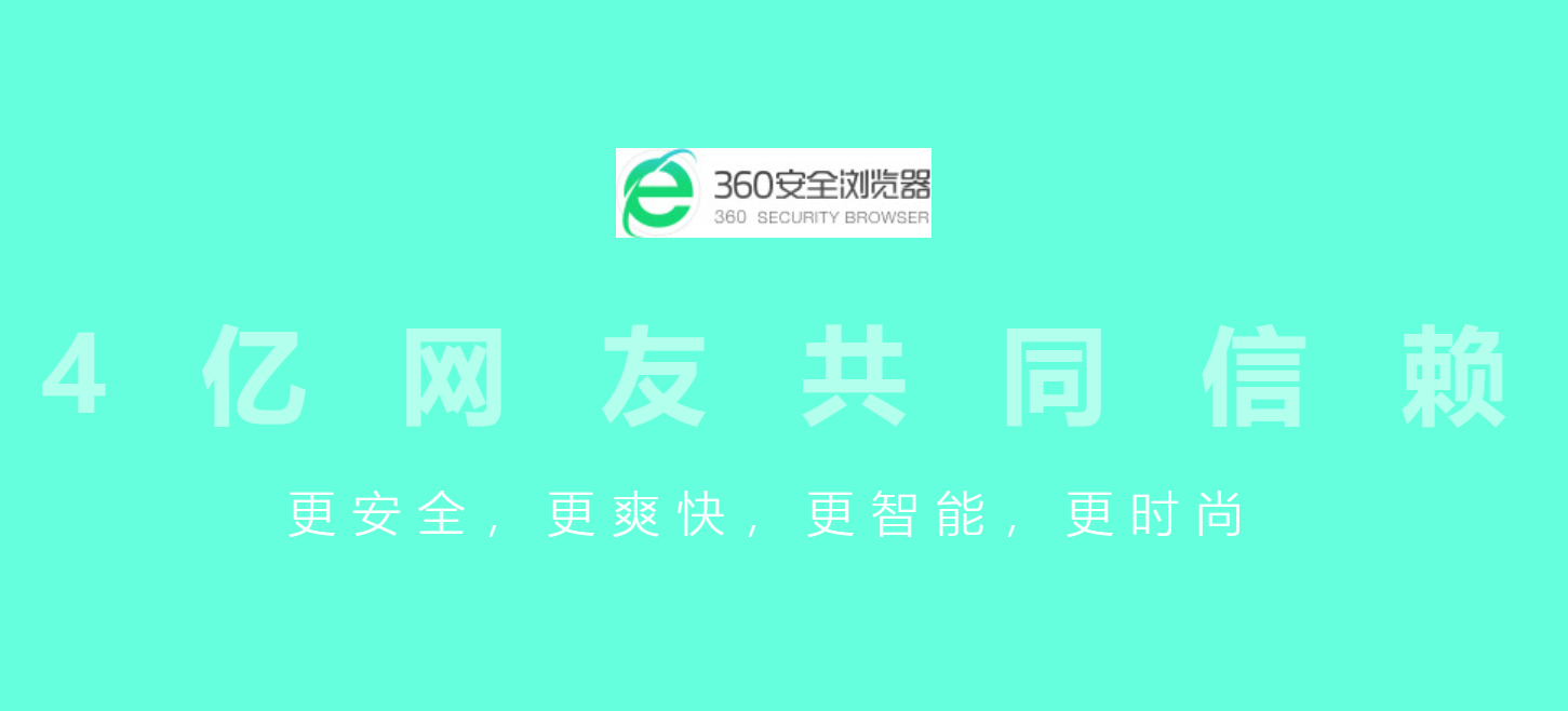
后:

第一页的css代码:
 1 .first  .logo{
 2     width: 390px;
 3     height: 110px;
 4     margin: 100px auto;
 5 }
 6 .first  .logo > img{
 7     width: 100%;
 8     height: 100%;
 9 }
10 .first   .text1{
11     width: 100%;
12     height: 150px;
13     line-height: 130px;
14     text-align: center;
15     font-size: 130px;
16     font-weight:bold;
17     color: #fff;
18 }
19 .first   .text1 > li{
20     display:inline;
21     list-style: none;
22     margin: 0 40px;
23     opacity: 0.5;
24     transition: margin 1s,opacity 1s;
25
26 }
27 .first   .text2{
28     width: 100%;
29     height: 60px;
30     line-height: 60px;
31     text-align: center;
32     font-size: 60px;
33     font-weight:200;
34     letter-spacing:20px;
35     color: #fff;
36     margin-top: 60px;
37
38 }
39 .first.current   .text1 > li{
40     margin: 0 5px;
41     opacity: 1;
42 }
第二屏:主要的难点在transform的运用,进入第二屏的时候开始把一个碎了的盾牌拼凑成一个完整的盾牌
前:
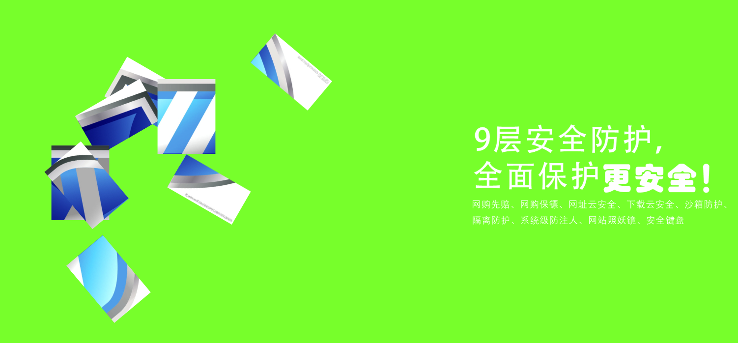
后:
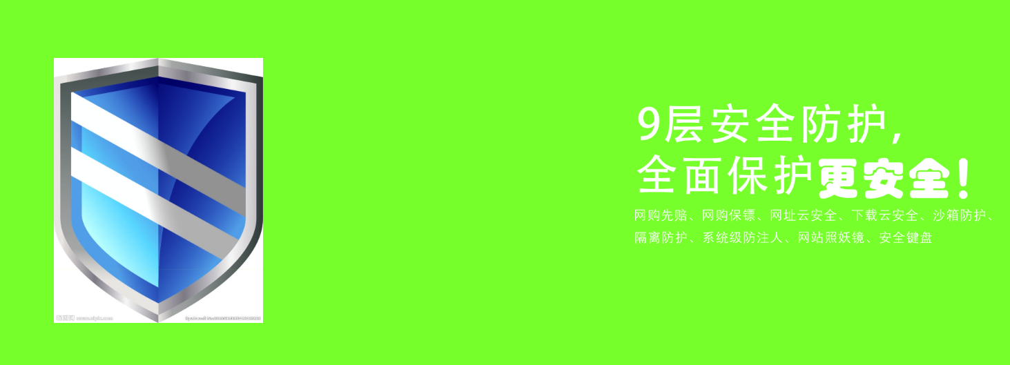
 1 .second > div{
 2     display: flex;
 3     justify-content: space-around;
 4     align-items: center;
 5 }
 6 .second .shield{
 7     width: 404px;
 8     height: 512px;
 9     font-size: 1px;
10     position: relative;
11 }
12 .second .shield>img{
13     width: 100%;
14     height: 100%;
15     position: absolute;
16     top: 0;
17     left: 0;
18     transition: transform 1s;
19 }
20
21 .second .info{
22     width: 800px;
23     height: 350px;
24     background: url("../img/info.png");
25 }
26 .second .shield > img:nth-of-type(1){
27     transform: translate(30px,-30px) rotate(30deg);
28 }
29 .second .shield > img:nth-of-type(2){
30     transform: translate(-30px,30px) rotate(-30deg);
31 }
32 .second .shield > img:nth-of-type(3){
33     transform: translate(90px,-90px) rotate(90deg);
34 }
35 .second .shield > img:nth-of-type(4){
36     transform: translate(-90px,90px) rotate(-90deg);
37 }
38 .second .shield > img:nth-of-type(5){
39     transform: translate(-200px,230px) rotate(230deg);
40 }
41 .second .shield > img:nth-of-type(6){
42     transform: translate(-130px,130px) rotate(-130deg);
43 }
44 .second .shield > img:nth-of-type(7){
45     transform: translate(220px,-220px) rotate(220deg);
46 }
47 .second .shield > img:nth-of-type(8){
48     transform: translate(220px,-220px) rotate(30deg);
49 }
50 .second.current .shield > img{
51     transform: none;
52 }
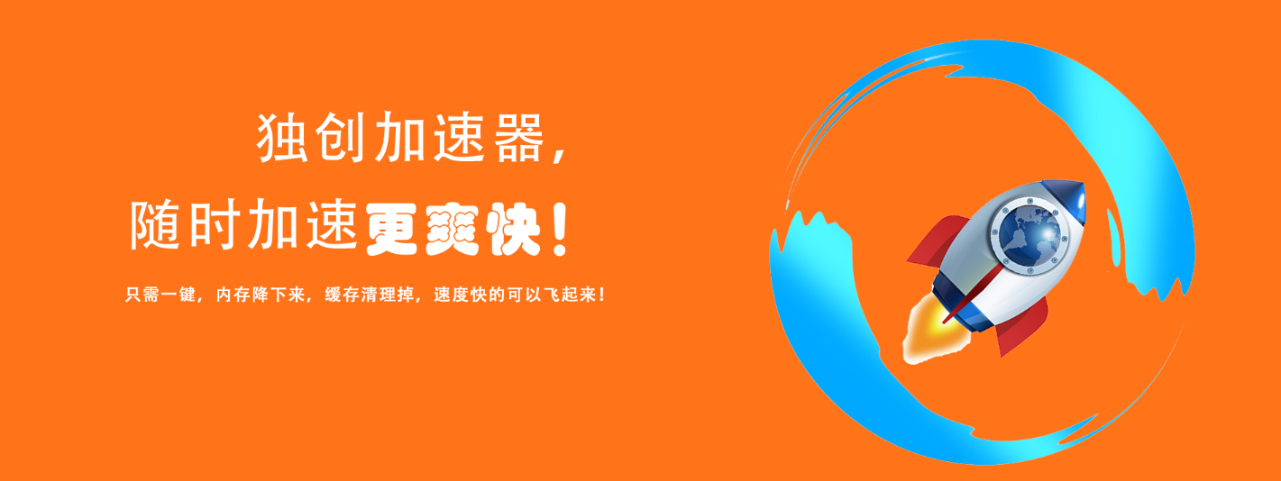
第三屏:跟第二屏效果差不大多,只是动画从左边变到右边,一个小火箭从左下角飞入,刚进入第三屏的时候是看不见小火箭
前:

后:
第三屏css代码
 1 .third{
 2     position: relative;
 3 }
 4 .third .info{
 5     height: 500px;
 6     width: 800px;
 7     background: url("../img/info2.png");
 8     position: absolute;
 9     left: 50%;
10     top: 50%;
11     transform: translate(-100%,-50%);
12 }
13 .third .circle{
14     height: 651px;
15     width: 650px;
16     background: url("../img/circle.png");
17     position: absolute;
18     right: 50%;
19     top: 50%;
20     transform: translate(130%,-50%);
21 }
22
23 .third .circle > .rocket{
24     height: 500px;
25     width: 500px;
26     background: url("../img/rocket.png");
27     position: absolute;
28     left: -1000px;
29     top: 1000px;
30     transition: top 1s,left 1s;
31 }
32 .third.current .circle > .rocket{
33     top: 40px;
34     left: 130px;
35 }
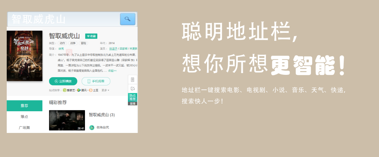
第四屏:难点在左侧的动画分三步完成
第一步:搜座框从左侧进入
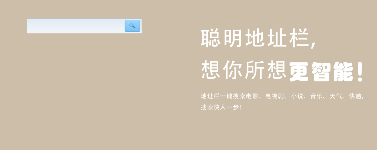
第二步:输入框出现字体,出现效果像打字一样一个字一个字的出现
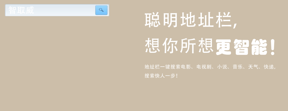
第三步:搜索结果从上到下慢慢显示出来
第四屏css:
 1 /*第四屏样式*/
 2 .fourth{
 3     position: relative;
 4 }
 5 .fourth .search{
 6     width: 595px;
 7     height: 552px;
 8     position: absolute;
 9     top: 50%;
10     left: 50%;
11     transform: translate(-130%,-50%);
12     overflow: hidden;
13 }
14 .fourth .search > .searchBar{
15     width: 595px;
16     height: 70px;
17     background: url("../img/searchBar.png");
18     transform: translateX(-100%);
19 }
20 .fourth .search > .searchResult{
21     width: 595px;
22     height: 0px;
23     background: url("../img/searchResult.png");
24 }
25 .fourth .search > .searchText{
26     width: 0px;
27     height: 70px;
28     background: url("../img/searchText.png");
29     position: absolute;
30     top: 0;
31     left: 0;
32 }
33 .fourth  .info{
34     width: 800px;
35     height: 800px;
36     background: url("../img/info3.png");
37     position: absolute;
38     top: 50%;
39     right: 50%;
40     transform: translate(100%,-50%);
41 }
42 .fourth.current .search > .searchBar{
43     transform: translateX(0);
44     transition: transform 1s;
45 }
46 .fourth.current .search > .searchText{
47     width: 280px;
48     transition: width 1s 1s steps(5);
49 }
50 .fourth.current .search > .searchResult{
51     height: 485px;
52     transition: height 1s 2s;
53 }
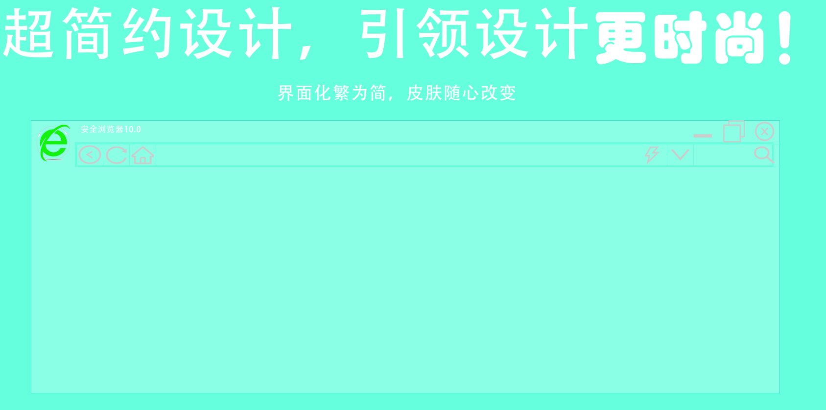
第五屏:是最难的一屏,也不能说难,只要是元素表较多,整个页面就是拼凑出来的
其实页面上的图标应该用字体图标的,当时脑子一热就都用图片代替了
主要难点就在整个页面的布局和四个边框的动画
前:四条边框是从四个不同方向进入到边框的位置,主体页面透明

后:不透明,边框复位
第五屏css
  1 .fifth{
  2     position: relative;
  3 }
  4 .fifth .info{
  5     width: 1924px;
  6     height: 300px;
  7     background: url("../img/info4.png");
  8     margin: 0 auto;
  9     top: 0;
 10 }
 11 .fifth .subject{
 12     width: 1700px;
 13     height: 620px;
 14     background: url("../img/subject.png");
 15     margin: 0 auto;
 16     position: relative;
 17 }
 18 .fifth .subject > .topBorder{
 19     width: 1700px;
 20     height: 1px;
 21     background: url("../img/Top and bottom border.png");
 22     position: absolute;
 23     top: 0;
 24     left: 100%;
 25 }
 26 .fifth.current .subject > .topBorder{
 27     left:  0%;
 28     transition: left 2s;
 29 }
 30 .fifth .subject > .bottomBorder{
 31     width: 1700px;
 32     height: 1px;
 33     background: url("../img/Top and bottom border.png");
 34     position: absolute;
 35     bottom: 0;
 36     right: 100%;
 37 }
 38 .fifth.current .subject > .bottomBorder{
 39     right:  0%;
 40     transition: right 2s;
 41 }
 42 .fifth .subject > .leftBorder{
 43      width: 1px;
 44      height: 620px;
 45      background: url("../img/Left and right borders.png");
 46      position: absolute;
 47      left: 0;
 48      bottom: 100%;
 49  }
 50 .fifth.current .subject > .leftBorder{
 51     bottom: 0%;
 52     transition: bottom 2s;
 53 }
 54 .fifth .subject > .rightBorder{
 55     width: 1px;
 56     height: 620px;
 57     background: url("../img/Left and right borders.png");
 58     position: absolute;
 59     right: 0;
 60     top: 100%;
 61 }
 62 .fifth.current .subject > .rightBorder{
 63     top: 0%;
 64     transition: top 2s;
 65 }
 66 .fifth .subject > .nav{
 67     width: 100%;
 68     height: 100px;
 69 }
 70 .fifth .subject > .nav > .icon{
 71     width: 100px;
 72     height: 100px;
 73     background: url("../img/icon.png");
 74     float: left;
 75 }
 76 .fifth .subject > .nav > .navHead{
 77     width: 1600px;
 78     height: 50%;
 79     float: left;
 80     position: relative;
 81 }
 82
 83 .fifth .subject > .nav > .navHead > .info{
 84     width: 200px;
 85     height: 40px;
 86     background: url("../img/aqllq.png");
 87     float: left;
 88 }
 89 .fifth .subject > .nav > .navHead > .close{
 90     width: 50px;
 91     height: 50px;
 92     background: url("../img/x.png");
 93     position: absolute;
 94     right: 10px;
 95 }
 96 .fifth .subject > .nav > .navHead > .maximum{
 97     width: 50px;
 98     height: 50px;
 99     background: url("../img/zuidahua.png");
100     position: absolute;
101     right: 80px;
102 }
103 .fifth .subject > .nav > .navHead > .minimum{
104     width: 50px;
105     height: 50px;
106     background: url("../img/zuixiaohua.png");
107     position: absolute;
108     right: 150px;
109 }
110 .fifth .subject >.nav > .Address-bar{
111     width: 1580px;
112     height: 50%;
113     border: 3px solid #65ffdd;
114     float: left;
115     position: relative;
116 }
117 .return,.refresh,.homepage,.list{
118     width: 60px;
119     height: 100%;
120     border: 1px solid #65ffdd;
121     position: absolute;
122 }
123 .fifth .subject >.nav > .Address-bar > .return{
124     left: 0;
125     background: url("../img/zuojiantou.png") round;
126 }
127 .fifth .subject >.nav > .Address-bar > .refresh{
128     left: 60px;
129     background: url("../img/shuaxin.png") round;
130 }
131 .fifth .subject >.nav > .Address-bar > .homepage{
132     left: 120px;
133     background: url("../img/fangzi.png") round;
134 }
135 .fifth .subject >.nav > .Address-bar > .url{
136     width: 1160px;
137     height: 100%;
138     border: 1px solid #65ffdd;
139     position: absolute;
140     left: 180px;
141 }
142 .fifth .subject >.nav > .Address-bar > .url > .quickness{
143     width: 60px;
144     height: 100%;
145     position: absolute;
146     right: 0;
147     background: url("../img/shandian.png");
148 }
149 .fifth .subject >.nav > .Address-bar > .list{
150     left: 1340px;
151     background: url("../img/xiajiantou.png") round;
152 }
153 .fifth .subject >.nav > .Address-bar > .search-box{
154     width: 200px;
155     height: 100%;
156     border: 1px solid #65ffdd;
157     position: absolute;
158     left: 1400px;
159 }
160 .fifth .subject >.nav > .Address-bar > .search-box > .search{
161     width: 60px;
162     height: 100%;
163     position: absolute;
164     right: 10px;
165     background: url("../img/fangdajing.png") round;
166 }
167 .fifth .subject > .nav{
168     opacity:0.1;
169 }
170 .fifth.current .subject > .nav{
171     opacity:1;
172     transition: opacity 3s;
173 }