效果图如下:
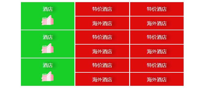
<body>
    <div class="nav">
        <div class="row">
            <div class="col1">
                <a href="#">
                    <em>酒店</em>
                    <i></i>
                </a>
            </div>
            <div class="col2">
                <a href="#"><em>特价酒店</em></a>
                <a href="#"><em>海外酒店</em></a>
            </div>
            <div class="col3">
                <a href="#"><em>特价酒店</em></a>
                <a href="#"><em>海外酒店</em></a>
            </div>
        </div>
        <div class="row">
                <div class="col1">
                    <a href="#">
                        <em>酒店</em>
                        <i></i>
                    </a>
                </div>
                <div class="col2">
                    <a href="#"><em>特价酒店</em></a>
                    <a href="#"><em>海外酒店</em></a>
                </div>
                <div class="col3">
                    <a href="#"><em>特价酒店</em></a>
                    <a href="#"><em>海外酒店</em></a>
                </div>
            </div>
            <div class="row">
                    <div class="col1">
                        <a href="#">
                            <em>酒店</em>
                            <i></i>
                        </a>
                    </div>
                    <div class="col2">
                        <a href="#"><em>特价酒店</em></a>
                        <a href="#"><em>海外酒店</em></a>
                    </div>
                    <div class="col3">
                        <a href="#"><em>特价酒店</em></a>
                        <a href="#"><em>海外酒店</em></a>
                    </div>
                </div>
    </div>
</body>
        html,bidy{
            margin: 0;
            padding: 0;
            box-sizing: border-box;/* css3盒子模型 */
        }
        a{
            text-decoration: none;
            color: #fff;
            text-shadow: 10px 0 10px rgba(0,0,0,0.6);/* 文字阴影 */
        }
        .row{
            width: 532px;
            height: 90px;
            margin: 0 auto;
            display: flex;/* 父元素flex布局 */
            overflow: hidden;
            margin-bottom: 2px;
        }
        .row .col1, .row .col2, .row .col3{
            height: 100%;
            margin-right: 3px;
            flex: 1;
        }
        .row .col1{
            position: relative;
            background: rgb(24, 207, 40);
        }
        .col1 em{
            width: 100%;
            height: 45px;
            line-height: 45px;
            text-align: center;
            font-style: normal;
            display: block;
            position: absolute;
            left: 0;
            top: 0;
        }
        .col1 i{
            display: block;
            width: 43px;
            height: 43px;
            position: absolute;
            left: 50%;
            bottom: 10px;
            transform: translateX(-50%);
            background: url(ctrip.png) no-repeat 0 -124px;
            background-size: 104px auto;/* 背景图缩放 */
        }
        .col2 em, .col3 em{
            width: 100%;
            height: 45px;
            line-height: 45px;
            text-align: center;
            font-style: normal;
            display: block;
            background: rgb(223, 12, 12);
            margin-bottom: 2px;
        }