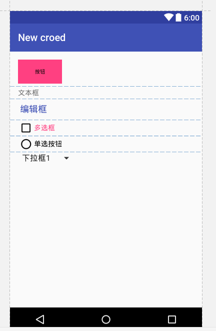
android:background="@color/colorAccent" //背景颜色
android:textSize="10sp" //字体大小,以sp为单位
android:textColor="#000" //字体颜色,以RGB为单位
android:id="@+id/btn_show" //按钮的id名
//按钮的 宽/高 度,wrap_content(随内容的大小)、match_parent(占满父容器的宽度)
android:layout_width="wrap_content"
android:layout_height="wrap_content"/>
android:textColor="@color/colorPrimary"
android:background="@color/colorPrimary"
android:layout_width="wrap_content"
android:layout_height="wrap_content"/>
可以输入内容,能显示提示信息,在输入内容后提示信息会消失但清除输入的内容提示会再次显示
android:textColorHint="@color/colorPrimary" //对提示信息设置字体颜色
android:layout_width="wrap_content"
android:layout_height="wrap_content"/>
android:textColor="@color/colorAccent"
android:layout_width="wrap_content"
android:layout_height="wrap_content"/>
单独使用这个组件不能有单选的效果,必须配合<RadioGroup></RadioGroup>标签一起使用
android:layout_width="wrap_content"
android:layout_height="wrap_content"/>
android:layout_width="wrap_content"
android:layout_height="wrap_content">
下拉列表选项,这里的只是静态设置,一般都是放在values/strings.xml文件中