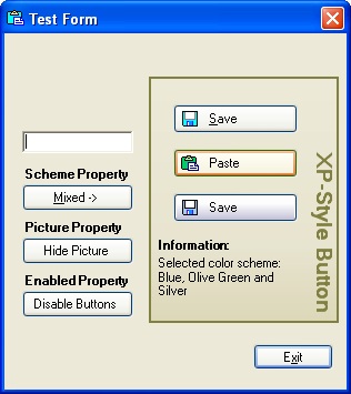
介绍
XP风格的按钮提供了带有Windows XP三种内置配色方案中的任何一种按钮的外观和感觉,还可以在Windows早期版本中使用,如果您使用的是Windows XP,也可以使用配色方案。你根本不用担心这个按钮在不同版本的Windows上看起来会是什么样子——它看起来总是一样的。
特性
- 按钮的大小对外观不起作用
- 按钮支持图像和文本属性,这是可选的
- 在设计和运行时向窗体添加按钮并设置属性的可能性
- 按Tab顺序,按Tab键,向上,向下,向左,向右导航。如果按钮有一个输入焦点,返回和& lt; Space>工作就像鼠标左键点击。
- 访问键-可能通过结合按下ALT键和预定义键来触发控制的单击事件。
- 表单上的Accept按钮(如果没有其他按钮或捕捉回车键的任何其他控件有焦点,则在用户按回车键时单击的按钮)或Cancel按钮(当用户按ESC键时单击的按钮)。
- 工具提示允许用一行代码设置提示。
- 当DefaultScheme属性设置为false时,按钮总是具有您选择的Windows XP颜色方案,无论Windows XP的版本或当前的Windows XP视觉样式。
- 在一个窗体上,你可能有不同配色方案的按钮:)
公共属性
scheme允许您从三种Windows XP色彩方案中选择一种,用于在Windows和Windows XP早期版本下运行的应用程序。将DefaultScheme属性设置为false允许您在一个窗体上显示三种视觉样式(蓝色、橄榄绿和银色)中的任何一种按钮。默认的配色方案是蓝色。如果defaultscheme为真,则使用默认的Windows XP颜色方案(仅适用于Windows XP,对早期版本的Windows忽略)。dialogresult获取或设置一个值,该值在单击按钮时返回给父窗体(如果父窗体通过ShowDialog方法显示)。获取或设置按钮的位图图像。获取或设置按钮的文本。获取或设置文本的颜色。获取或设置工具提示字符串。在设置工具提示字符串时,删除当前与控件关联的字符串。视觉设计
1. 设置控制区域
每个使用Windows XP的人可能都注意到按钮有圆角。按钮的图形形状是这样的:

因此,我们将为按钮创建这样一个区域(图形形状的内部)。
int X = this.Width;
int Y = this.Height;
Point[] points = {    new Point(1, 0),
                      new Point(X-1, 0),
                      new Point(X-1, 1),
                      new Point(X, 1),
                      new Point(X, Y-1),
                      new Point(X-1, Y-1),
                      new Point(X-1, Y),
                      new Point(1, Y),
                      new Point(1, Y-1),
                      new Point(0, Y-1),
                      new Point(0, 1),
                      new Point(1, 1)}
GraphicsPath path = new GraphicsPath();
path.AddLines(points);
this.Region = new Region(path);
正如您可能已经猜到的,该区域对于绘制不规则形状的控件至关重要。
2. 跟踪鼠标移动
为了完成按钮在鼠标移动时的视觉交互,我们将重写OnMouseEnter、OnMouseLeave、OnMouseDown和OnMouseUp方法,以便根据按钮状态以不同的方式绘制按钮。
的控制:
private Rectangle bounds;
this.bounds = new Rectangle(0, 0, this.Width, this.Height);
可能的状态:
public enum States
{
    Normal,
    MouseOver,
    Pushed
}
所以:
 ,复制代码
,复制代码protected override void OnMouseEnter (System.Windows.Forms.MouseEventArgs e) { state = States.MouseOver; this.Invalidate(bounds); base.OnMouseEnter(e); } protected override void OnMouseLeave(System.EventArgs e) { state = States.Normal; this.Invalidate(bounds); base.OnMouseLeave(e); } protected override void OnMouseDown (System.Windows.Forms.MouseEventArgs e) { // do nothing if pressed not the left button of mouse if ((e.Button & MouseButtons.Left) != MouseButtons.Left) return; if (bounds.Contains(e.X, e.Y)) { state = States.Pushed; // button receives an imput focus this.Focus(; } else state = States.Normal; this.Invalidate(bounds); base.OnMouseDown(e); } protected override void OnMouseUp (System.Windows.Forms.MouseEventArgs e) { if ((e.Button & MouseButtons.Left) == MouseButtons.Left) state = States.Normal; this.Invalidate(bounds); base.OnMouseUp(e); }
3.默认按钮
我们现在缺少的是在正常状态下跟踪和绘制按钮,但是当它是默认按钮时(边框内的蓝色矩形,用于蓝色和银色配色方案,边框内的绿色矩形,用于橄榄绿配色方案)。我们将声明一个布尔变量isDefault,以知道按钮何时为默认值。父窗体调用NotifyDefault方法使控件默认为按钮:
public void NotifyDefault(bool value)
{
    this.isDefault = value;
    this.Invalidate();
}
现在,当我们绘制按钮的正常状态时,我们应该检查它是否是活动的,并根据isDefault执行绘制。
4. 填充按钮与线性渐变画笔
当看起来我们已经跟踪了所有可能的按钮状态时,我们可以开始绘制控件。Windows XP中的按钮填充线性渐变颜色。GDI+提供了两种渐变笔刷:LinearGradientBrush和PathGradientBrush。我们需要第一个。创建LinearGradientBrush时,我们应该:
- 指向它的位置(3,3)
- 大小(这一点。宽度-6,this.Height-5)矩形区域的渐变(注意,你不需要绘制整个渐变区域)
- 渐变的开始颜色
- 渐变的结束颜色
- 定义梯度方向的角度(角度,从x轴顺时针方向)(我们需要垂直梯度,所以我们使用90.0f)
silverBrush07 = new LinearGradientBrush(new Rectangle(3, 3, X-6, Y-7),
     Color.FromArgb(253, 253, 253),
     Color.FromArgb(201, 200, 220), 90.0f);
但银色的配色方案与蓝色和橄榄绿不同:按钮更“大”。为了完成这个效果,我们将调整颜色从渐变的一边到另一边的变化方式,设置LinearGradientBrush对象的混合属性。
// color is much more intensive in the bottom part of the button
// first 32 % of height we'll fill with
// intensity 0.8 % from starting color:
float[] relativeIntensities = {0.0f, 0.008f, 1.0f};
float[] relativePositions = {0.0f, 0.32f, 1.0f};

// create a Blend object and assign it to silverBrush07
Blend blend = new Blend();
blend.Factors = relativeIntensities;
blend.Positions = relativePositions;
silverBrush07.Blend = blend;

// fill the necessary shape:
e.Graphics.FillRectangle(silverBrush07, 3, 4,
                   this.Width-6, this.Height-8);
silverBrush07.Dispose();
画好边线和角后,结果为:
向表单添加按钮
当组件准备好后,我们可以将其添加到表单中(不要忘记包含PinkieControls名称空间)。这个过程非常简单,最重要的是不要忘记设置Scheme属性。
,复制代码using System.Resources; using System.Reflection; using PinkieControls; private PinkieControls.ButtonXP buttonXP3; static ResourceManager rm; public Form1() { rm = new ResourceManager("TestApp.Images", Assembly.GetCallingAssembly()); InitializeComponent(); // If to add lines below in InitializeComponent() // we'll see the button at the design time // (doing so, don't forget to set _Image // and Image properties in null this.buttonXP3 = new PinkieControls.ButtonXP(); this.buttonXP3._Image = GetImage("_Save"); this.buttonXP3.Image = GetImage("Save2"); this.buttonXP3.Text = @"Save"; this.buttonXP3.Location = new System.Drawing.Point(152, 144); this.buttonXP3.Name = "buttonXP3"; this.buttonXP3.Scheme = PinkieControls.ButtonXP.Schemes.Silver; this.buttonXP3.Size = new System.Drawing.Size(112, 26); this.buttonXP3.TabIndex = 3; this.buttonXP3.Click += new System.EventHandler(this.buttonXP3Click); this.Controls.Add(this.buttonXP3); } private void buttonXP3Click(object sender, System.EventArgs e) { MessageBox.Show("Hello, World :)") }
为Windows XP设置默认的颜色方案
如果我们想在当前的Windows XP颜色方案中绘制一个按钮,只需要将布尔属性DefaultScheme设置为true(默认情况下为false)就足够了。例如:
myButton.Scheme = PinkieControls.ButtonXP.Schemes.Silver;
myButton.DefaultScheme = true;
在这种情况下,早期版本的Windows将使用银色按钮。对于Windows XP(主题开启),按钮将有当前的配色方案。
创建访问键
用户可以通过结合按ALT键和预定义的访问键来触发控制的单击事件。通常,我们在要作为访问密钥的字母前添加一个&;ProcessMnemonic方法调用给控制机会来处理一个助记字符:
protected override bool ProcessMnemonic(char charCode)
{
    // determine if the given character matches
    // a mnemonic in the control's text
    if (Control.IsMnemonic(charCode, base.Text))
    {
        this.PerformClick();
    return true;
    }
    return base.ProcessMnemonic(charCode);
}
现在,如果我们将Text属性设置为一个字符串在字母前包含一个&号,这将是一个快捷方式
buttonExit.Text = "E&xit";
我们可以通过按ALT + x来运行与exit按钮相关的命令,它将关闭表单。
当窗体加载时,如何删除缓慢绘制的效果
从PinkieControls.FormEx派生窗体。表单包含计时器,用于加载具有淡出效果的表单。定时器的间隔是默认设置在这样的小值,我们的眼睛没有注意到的形式淡入,而加载。你可以改变FadeTime属性。
谢谢大家的评论和批评。欢迎提出新的建议和想法。享受;o)
历史
- 28.05.2003 修正了添加DefaultScheme属性访问键的错误
- 04.06.2003 访问键实现由Wes Haggard(又名puzzlehacker)实现IButtonControl接口由Wes Haggard(又名puzzlehacker)绘画聚焦按钮(焦点周围的矩形按钮)由Wes Haggard(又名puzzlehacker)笔和画笔包装在单独的类源代码和演示项目下载更新
- 08.08.2003 第一次加载表单时删除了按钮缓慢绘制的效果(用白色矩形代替按钮),将名称空间的名称从WiB.Pinkie改变。控件添加TextColor和Hint属性的按钮控件的所有实现是在一个单独的ButtonBase类中拉出来的,它允许轻松地重用代码和实现自己的时尚按钮。创建圆形按钮
许可证
本文没有附带明确的许可,但可能包含文章文本或下载文件本身的使用条款。如果有疑问,请通过下面的讨论区联系作者。
可以在这里找到作者可能使用的许可证列表。
本文转载于:http://www.diyabc.com/frontweb/news14625.html