介绍
本文介绍了一个简单的WPF双状态滑块按钮。每个状态显示的文本和滑块按钮的大小都可以从XAML中配置。
滑块按钮是使用依赖项属性和模板资源的组合配置的。示例代码包括三个模板资源,允许您创建以下内容:
- 一个两端为圆形、按钮为圆形和标签的滑块控件一个末端为圆形、按钮为圆形和标签的滑块控件一个末端为方形、按钮为方形和标签的滑块控件
背景
我们的产品需要一个简单的滑块按钮,由于微软没有提供一个标准的滑块按钮,我不得不编写一个自定义控件。网上有很多例子,但大多数如果不是全部趋向于硬编码的外观。因此颜色是固定的,文本是固定的,或者大小是固定的。更灵活的往往是相当复杂的。我们想要更灵活的外观,包括由XAML代码中的属性控制的大小(宽度和高度)。一个关键的需求是代码要尽可能简单,这确保了它容易理解,并且在需要时易于扩展以满足您自己的需要。我本可以使它更加灵活,但当前的版本可以满足我的所有要求。
理想情况下,您应该熟悉依赖项属性、资源字典和控制模板的基础知识。然而,即使您的知识有限,您也应该能够弄清楚如何使用代码,并且能够做出简单的更改来满足您自己的需求。
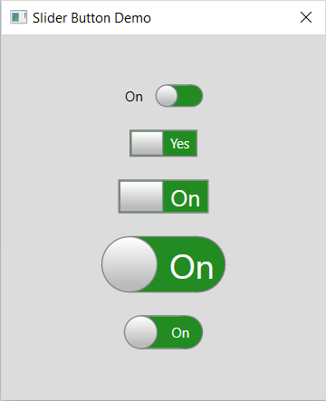
截图
演示应用程序包括所有三种风格的示例:

使用的代码
SliderControl派生自标准的WPF ToggleButton类。它添加了三个依赖属性:
按钮宽度滑块按钮的宽度当按钮被设置为on位置时要显示的文本将按钮设置为off位置时要显示的文本加贴标签按钮的整体宽度由基控件的width属性控制。高度由ButtonWidth自定义属性控制。
有三种样式,定义了三种形式的滑块按钮:
左边有标签的滑块按钮一个带有圆形按钮的滑块按钮一个带有矩形按钮的滑块按钮每个滑块按钮样式都定义一个模板,该模板覆盖控件的外观。每个滑块按钮都由使用网格控件对齐的椭圆、边框和标签控件组合而成。触发器用于在按钮被选中和未选中时显示和隐藏组件控件。
SliderButton类
SliderButton类派生自标准的ToggleButton类,并添加了三个依赖属性:
 ,复制代码
,复制代码namespace WpfSliderButtonDemo.View { public class SliderButton : System.Windows.Controls.Primitives.ToggleButton { public double ButtonWidth { get { return (double)GetValue(ButtonWidthProperty); } set { SetValue(ButtonWidthProperty, value); } } public static readonly System.Windows.DependencyProperty ButtonWidthProperty = System.Windows.DependencyProperty.Register("ButtonWidth", typeof(double), typeof(SliderButton), new System.Windows.PropertyMetadata(0.0)); public string OnLabel { get { return (string)GetValue(OnLabelProperty); } set { SetValue(OnLabelProperty, value); } } public static readonly System.Windows.DependencyProperty OnLabelProperty = System.Windows.DependencyProperty.Register ("OnLabel", typeof(string), typeof(SliderButton), new System.Windows.PropertyMetadata("")); public string OffLabel { get { return (string)GetValue(OffLabelProperty); } set { SetValue(OffLabelProperty, value); } } public static readonly System.Windows.DependencyProperty OffLabelProperty = System.Windows.DependencyProperty.Register("OffLabel", typeof(string), typeof(SliderButton), new System.Windows.PropertyMetadata("")); } }
styleSliderButton风格
styleSliderButton样式定义了一个带有圆形按钮的滑块按钮和滑块轨迹上的标签:
,复制代码<Stylex:Key="styleSliderButton"TargetType="{x:Type local:SliderButton}"> <SetterProperty="Template"> <Setter.Value> <ControlTemplateTargetType="{x:Type local:SliderButton}"> <Gridx:Name="mainGrid"> <Grid.ColumnDefinitions> <ColumnDefinitionWidth="Auto"/> </Grid.ColumnDefinitions> <BorderGrid.Column="0"Name="_borderOn"Background="Transparent"Width="{TemplateBinding Width}"> <Grid> <Grid.RowDefinitions> <RowDefinitionHeight="Auto"/> </Grid.RowDefinitions> <Grid.ColumnDefinitions> <ColumnDefinitionWidth="Auto"/> <ColumnDefinitionWidth="Auto"/> <ColumnDefinitionWidth="*"/> <ColumnDefinitionWidth="Auto"/> <ColumnDefinitionWidth="Auto"/> </Grid.ColumnDefinitions> <EllipseGrid.Row="0"Grid.RowSpan="1"Grid.Column="0"Grid.ColumnSpan="2"Width="{TemplateBinding ButtonWidth}"Height="{TemplateBinding ButtonWidth}"Style="{StaticResource styleEllipseGreyButton}"Panel.ZIndex="3"/> <BorderGrid.Row="0"Grid.RowSpan="1"Grid.Column="1"Grid.ColumnSpan="3"Background="ForestGreen"BorderBrush="Gray"BorderThickness="0,1,0,1"Panel.ZIndex="1"/> <LabelGrid.Row="0"Grid.RowSpan="1"Grid.Column="2"Grid.ColumnSpan="3"Name="_labelOn"Content="{TemplateBinding OnLabel}"SPanel.ZIndextyle= "{StaticResource styleSliderButtonLabel}"="2"/> <EllipseGrid.Row="0"Grid.RowSpan="1"Grid.Column="3"Grid.ColumnSpan="2"Width="{TemplateBinding ButtonWidth}"Height="{TemplateBinding ButtonWidth}"Style="{StaticResource styleEllipseButton}"Fill="ForestGreen"Panel.ZIndex="0"/> </Grid> </Border> <BorderGrid.Column="0"Name="_borderOff"Background="Transparent"Width="{TemplateBinding Width}"> <Grid> <Grid.RowDefinitions> <RowDefinitionHeight="Auto"/> </Grid.RowDefinitions> <Grid.ColumnDefinitions> <ColumnDefinitionWidth="Auto"/> <ColumnDefinitionWidth="Auto"/> <ColumnDefinitionWidth="*"/> <ColumnDefinitionWidth="Auto"/> <ColumnDefinitionWidth="Auto"/> </Grid.ColumnDefinitions> <EllipseGrid.Row="0"Grid.RowSpan="1"Grid.Column="0"Grid.ColumnSpan="2"Width="{TemplateBinding ButtonWidth}"Height="{TemplateBinding ButtonWidth}"VerticalAlignment="Stretch"Fill="Crimson"Stroke="Gray"Panel.ZIndex="0"/> <LabelGrid.Row="0"Grid.RowSpan="1"Grid.Column="0"Grid.ColumnSpan="3"Name="_labelOff"Content="{TemplateBinding OffLabel}"Style="{StaticResource styleSliderButtonLabel}"Panel.ZIndex="2"/> <BorderGrid.Row="0"Grid.RowSpan="1"Grid.Column="1"Grid.ColumnSpan="3"Background="Crimson"BorderBrush="Gray"BorderThickness="0,1,0,1"Panel.ZIndex="1"/> <EllipseGrid.Row="0"Grid.RowSpan="1"Grid.Column="3"Grid.ColumnSpan="2"Width="{TemplateBinding ButtonWidth}"Height="{TemplateBinding ButtonWidth}"Style="{StaticResource styleEllipseGreyButton}"Panel.ZIndex="3"/> </Grid> </Border> </Grid> <!-- triggers toggle visual appearance --> <ControlTemplate.Triggers> <TriggerProperty="IsChecked"Value="True"> <SetterTargetName="_borderOff"Property="Visibility"Value="Collapsed"/> <SetterTargetName="_borderOn"Property="Visibility"Value="Visible"/> </Trigger> <TriggerProperty="IsChecked"Value="False"> <SetterTargetName="_borderOff"Property="Visibility"Value="Visible"/> <SetterTargetName="_borderOn"Property="Visibility"Value="Collapsed"/> </Trigger> </ControlTemplate.Triggers> </ControlTemplate> </Setter.Value> </Setter> </Style>
样式覆盖定义控件的外观和行为的Template属性。控件由包含两个复合元素的网格构造,其中一个元素在选中控件时显示,另一个元素在选中控件时显示。每个复合元素由带有椭圆、边框和标签子元素的网格组成,这些子元素共同创建了滑块控件的外观。
注意面板的使用。附加属性以允许滑块按钮椭圆出现在轨道前面,而轨道出现在表示轨道末端的椭圆前面。
还要注意TemplateBinding标记扩展的使用,它允许模板中的元素使用在模板化控件上定义的属性,即。包括在ToggleButton控件类上定义的属性。
滑块按钮是使用一个带有styleEllipseGreyButton样式的椭圆元素创建的:
<Stylex:Key="styleEllipseGreyButton"TargetType="{x:Type Ellipse}"BasedOn="{StaticResource styleEllipseButton}">
    <SetterProperty="Fill">
        <Setter.Value>
            <LinearGradientBrushEndPoint="0.504,1.5"StartPoint="0.504,0.03">
                <GradientStopColor="#FFFFFF"Offset="0"/>
                <GradientStopColor="#BBBBBB"Offset="0.567"/>
            </LinearGradientBrush>
        </Setter.Value>
    </Setter>
</Style>
标签文本的外观使用styleSliderButtonLabel样式定义:
<Stylex:Key="styleSliderButtonLabel"TargetType="{x:Type Label}">
    <SetterProperty="Background"Value="Transparent"/>
    <SetterProperty="Foreground"Value="White"/>
    <SetterProperty="BorderThickness"Value="1"/>
    <SetterProperty="VerticalAlignment"Value="Center"/>
    <SetterProperty="HorizontalAlignment"Value="Center"/>
    <SetterProperty="HorizontalContentAlignment"Value="Center"/>
    <SetterProperty="Padding"Value="0"/>
</Style>
使用控制
添加自定义滑块控件到一个视图非常容易:
<view:SliderButtonGrid.Row="7"Grid.Column="1"OnLabel="On"OffLabel="Off"Width="110"ButtonWidth="50"Style="{StaticResource styleSliderButton}"HorizontalAlignment="Center"IsChecked="{Binding IsEnabled}"FontSize="30"/>
样例应用程序
我提供了一个简单的演示应用程序,您可以下载。它包括滑块按钮的代码,以及一个主窗口,其中包含使用所提供的样式的大量示例滑块按钮。
进一步增强
未来的增强包括创建垂直滑块按钮,以及添加依赖属性来控制两种状态的背景颜色。这些任务留给读者作为练习。
错误
我无法使标签文本垂直居中。这并不明显,但理想情况下应该得到解决。
的兴趣点
WPF非常灵活,有很多方法可以使用标准控件创建切换按钮的错觉。
历史
- 2019年4月24日:第一版
本文转载于:http://www.diyabc.com/frontweb/news13544.html