display所有可选值:
- none
- block
- inline
- inline-block
- inherit
- initial
- unset
- compact & marker
- list-item
- run-in
- table inline-table table-cell table-row table-row-group table-column table-column-group table-header-group table-footer-group table-caption
- ruby
- flow-root (css3)
- contents (css3)
- box & flexbox(css3 盒子模型的过渡产物已被flex取代)
- flex (css3)
- grid(css3)
none:
元素不显示,同时不占据空间,width和height无效。visible=false,会占据空间也不显示。
block:
块级元素的默认显示方式。此元素前后会有换行符。独立占据一行。width和height有效。
inline:
内联元素的默认显示方式。此元素前后没有换行符。width和height无效,left和right有效,top/bottom无效。
inline-block:
css2.1 添加样式,结合内联和块级元素。没有换行符,但是width和height有效。类似于float。
float会使得父元素的高度塌陷,需要clear:both,来清除这种影响,元素不在文档流中,不过可以居左居右。
inline-block:内容还在文档流中,不会使得父元素高度塌陷。但元素只能从左到右排列,元素之间会有小间隙(空白符),
通过设置font-size:0;可消除间隙。
inherit:
集成父元素的显示方式。
initial:
恢复到浏览器最初始的display状态。
unset:
不设定,即如果有父元素集成父元素,没有则使用initial。
compact & marker:
css2.1将其删除,支持面不够。
list-item:
li 元素的默认表示形式。列表项呈现的方式。可用于任何元素。一旦元素使用此list-item则可以使用列表样式list-style属性。
.item{
    display:list-item;
    list-style-type: circle;
    margin-left:5px;
 }

<div style="margin-left:5px;">
    <div class="item">1</div>
    <div class="item">2</div>
    <div class="item">3</div>
    <div class="item">4</div>
</div>
run-in:
字面意思是跑进,即如果后面紧接着的元素是块级元素(display:block),则此元素会变为内联元素,嵌入到后面元素中呈现,否则还是块级元素。
因firefox和chrome等都已不再支持,因此建议不要使用。
table:
inline-table:不设置换行符,其它和table一致。
table家族的这些属性对应了我们table元素的内容。
- table { display: table }
- tr { display: table-row }
- thead { display: table-header-group }
- tbody { display: table-row-group }
- tfoot { display: table-footer-group }
- col { display: table-column }
- colgroup { display: table-column-group }
- td, th { display: table-cell }
- caption { display: table-caption }
当我们不用table元素而使用div+css时,可使用table属性来达到表样式。
display: table时padding会失效
display: table-row时margin、padding同时失效
display: table-cell时margin会失效

多用场景为垂直居中:
.cell{
    display: table-cell;
    vertical-align:middle;
    text-align:center;
}

 .table{
    display: table;
    100%;
    height:80px;
 }
<div class="table">
    <div class="cell">1</div>
</div>
标签页设计,内部元素平均分配空间,而不需要设置百分比:
.cell{
    display: table-cell;
    vertical-align:middle;
    text-align:center;
}

 .table{
    display: table;
    60%;
    height:80px;
 }

<ul class="table">
    <li class="cell">1</li>
    <li class="cell">2</li>
    <li class="cell">3</li>
    <li class="cell">4</li>
</ul>
table所有元素使用,展现表格:
.table{
    display:table;
    100%;
    border-collapse: collapse;
 }

 .table .theader{
    display: table-header-group;
 }
 .table .caption{
    display: table-caption;
 }
  .table .tcolumn{
    display: table-column-group;
 }
 .table .column{
    display:table-column;
 }
 .table .tbody{
    display: table-row-group;
 }
 .table .row{
    display:table-row;
 }
  .table .cell{
    border: 1px solid black;
    display:table-cell;
 }
 .table .tfooter{
  display:table-footer-group;
 }
 .table .tfooter{
  display:table-foot;
 }


</style>
<div class="table">
    <div class="theader">
        <div class="caption">我是Title</div>
    </div>
    <div class="tcolumn">
        <div class="column"></div>
        <div class="column"></div>
        <div class="column"></div>
        <div class="column"></div>
        <div class="column"></div>
    </div>
    <div class="tbody">
        <div class="row">
            <div class="cell">1</div>
            <div class="cell">2</div>
            <div class="cell">3</div>
            <div class="cell">4</div>
            <div class="cell">5</div>
        </div>
    </div>
    <div class="tfooter">
        <div class="footer">zhongguogosssss</div>
    </div>
</div>
ruby:
亚洲文字用格局,支持不太好,除了firefox其它浏览器不支持。
float-root:
之前对于float元素,我们都会在最后天剑clear:both来消除父元素高度塌陷的问题。有了float-root后,可直接给父元素设置display:float-root;父元素就不会高度塌陷了。
.divF{
    background-color:#3355FF;
    100%;
    display:flow-root;
}
.flow{
    background-color:#ff5533;
    50%;
    height:80px;
    flow:left;
}

<div class="divF">sfsfsfsfsf
    <div class="flow">
    flow
    </div>
</div>
对于老版本不兼容css3的页面,可用css的条件判断@supports():
 .divF{
    background-color:#3355FF;
    100%;
}
.flow{
    background-color:#ff5533;
    50%;
    height:80px;
    flow:left;
}

/**
 * 支持flowroot情况
 */
@supports(display:flow-root){
    .divF{
        display:flow-root;
    }
}

/**
 * 不支持flowroot情况
 */
@supports not(display:flow-root){
    .divF{
        display:block;
    }
    .divF::after{
        content:'',
        display:block;
        clear:both;
    }
}
contents:
css3新加入内容,将会成为下一代html的默认display。moz引擎已经支持,Blink引擎和WebKit引擎开始支持,edge不支持。
display:contents 元素本身不产生任何边界框,但是子元素和伪元素可设置边框。同时在这个元素中的css属性样式,将会影响到子元素。
即仅保留内容,自身不做参与,自身的css会影响到子元素,不会在自己身上起作用。
.contents{
    display:contents;
    font-size:10em;
    border:1px solid black;
}

<div class="contents">
    <div class="flow">
    flow242342
    </div>
</div>
以上代码中font-size会对子元素产生影响,但border不会对自身产生影响,即border无效。
box & flexbox:
css3新内容,盒子模型,之前我们要让多个div排列使用flow或inner-block来实现,盒子模型可以解决这个问题。
display:-webkit-box;display:-moz-box;display:box;
是盒子模型的过渡产物,现在都以flex来代替。因此不做介绍。
flex:
弹性盒子模型,将彻底取代float,实现局部内容页面的排列。小范围内布局,grid是大范围页面框架的布局。
flex为了兼容safari要设置为-webkit-flex;ie10及以上支持。
flex中的子元素成为项目item。flex分为main主轴,和cross纵轴。主轴的开始位置(与边框的交叉点)叫做main start,结束位置叫做main end;交叉轴的开始位置叫做cross start,结束位置叫做cross end。项目默认沿主轴排列。单个项目占据的主轴空间叫做main size,占据的交叉轴空间叫做cross size。
flex-direction | -webkit-flex-direction: row(默认值)横向排列,row-reverse 反向横向。 column 纵向排列,column-reverse反纵向排序。
flex-wrap:nowrap(不换行,默认值),wrap(换行),wrap-reverse(反向换行)
flex-flow:是flex-direction和flex-wrap的结合体。
比如:
flex-direction: row;flex-wrap:wrap; ==== flex-flow:row wrap;
justify-content: 项目在主轴上的排列方式。
flex-start (左对齐,默认值)| flex-end(右对齐) | center(居中) | space-between(两端对齐)
| space-around(项目间隔平均分配,项目与项目间隔相等,比项目与边框间隔大一倍,如同每个项目有个相等的margin)
align-items:项目在交叉轴对齐方式
flex-start(上对齐) | flex-end(下对齐) | center(居中) | baseline(项目的第一行文字作为基线,对齐)
| stretch(拉伸,默认值,项目未有高度或高度为auto时,占据整个高度)
align-content: 多根交叉轴线对齐方式,单轴线不起作用。
align-content: flex-start | flex-end | center | space-between | space-around | stretch(默认值);
内部item项目属性:
order : integer; 排序,数值越小越靠前。
flex-grow: number; 放大比例,默认值为0,不放大。即在有多余空间时,是否将当前项目扩展,填充剩余空间。
flex-shrink:number;缩小比例,默认值为1,缩小。为0时不缩小。
flex-basis:length| auto(默认值); 在分配多余空间之前,项目占据的主轴空间,相当于div margin一样,比如width=300px; flex-basis:350px;就相当于margin:0px 25px;
flex:是前3个属性的合体。flex: 0 1 auto;
align-self: 允许单个项目有与其他项目不一样的对齐方式,相当于覆盖父类的align-items。默认值为auto,即按照父类来。
align-self: auto | flex-start | flex-end | center | baseline | stretch;
相当于我们可以让部分项目上对齐,但是个别项目下对齐。
grid:
grid网格布局,控制整体页面布局用。将页面分为列和行,有点类似于html最初的table作为布局一样。但是是div来实现的。IE10要附带-ms。
grid引入一个新的单位 fr :fraction( 分数)。还有斜杠 / ,斜杠在此表示从第几个开始到第几个结束(不包括结束)。
vh视口。将窗体大小为100vh = screenHeight。内容相对于窗体大小的高度。
grid-template-columns:1fr 1fr 2fr 1fr 1fr; 指定列和列宽,总共分5个列,中间列占据2/6的宽度,其它各占据1/6的宽度。
grid-template-rows:50vh 50vh; 指定行和行高,总共分2行,各行占据屏幕一半高度。
  grid-template-columns:1fr 1fr;
  grid-template-rows:50vh 50vh;
结果如上图所示。
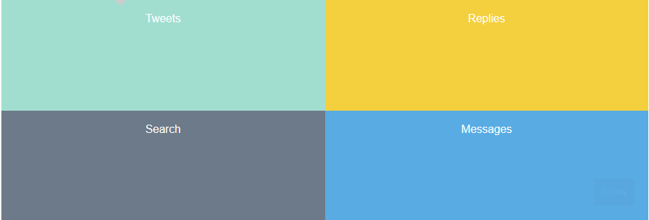
被设为display:grid;为网格容器;网格容器的子元素为网格项。网格之间为网格线,网格占据空间为网格区域。
以上图为例:
网格项:就是上面的4个模块。
网格线:横向有3个,纵向有3个。line1-line3.
可通过网格来设置模块所在的位置,以及所跨度的位置,就如同row-span和column-span一样。
  .Search{

          grid-column-start:1;

             grid-column-end:2;

             grid-row:2/3;

     }
也可通过斜杠来设置,可设置跨行跨列:
grid-column:1/2;
如果只有1行的情况可设置为 grid-row:1;没有跨度的也可以直接用数字,
比如:
.search{ grid-column:1;grid-row:2; }
也可通过在网络容器中通过网格区域设置:
 grid-template-areas : "A B C D";
 .search{
  grid-area:A;
}
以下为一个例子:
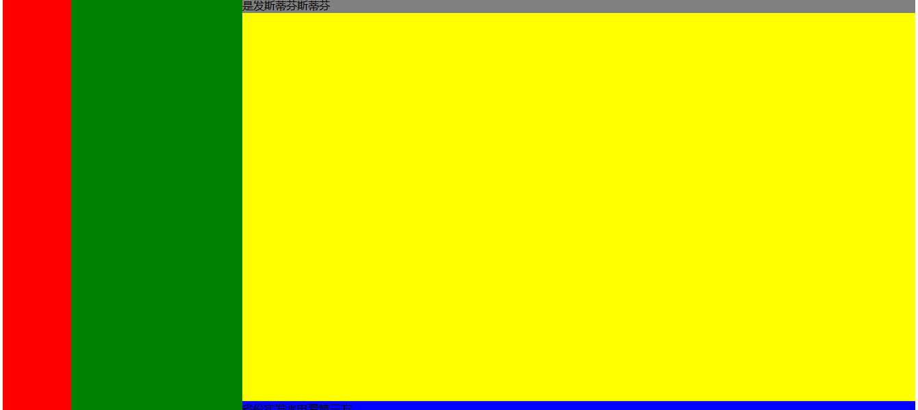
.container{
    display:grid;
     height: 100vh;
    grid-template-columns:100px 250px 1fr;
    grid-template-rows:auto 1fr auto;
}
.team{
    grid-column:1;
    grid-row:1/4;
    background-color:red;
}
.channel{
    grid-column:2;
    grid-row:1/4;
    background-color:green;
}
.header{
    grid-column:3;
    grid-row:1;
    background-color:gray;
}
.content{
    grid-column:3;
    grid-row:2;
    background-color:yellow;
}
.footer{
    grid-column:3;
    grid-row:3;
    background-color:blue;
}
</style>


<div class="container">
    <div class="team"></div>
    <div class="channel"></div>
    <div class="header"></div>
    <div class="content"></div>
    <div class="footer"></div>
</div>
布局结果: