CSS flex 是一种伸缩布局,之前块级元素布局在同一行,可以通过display或position或float来实现,而本篇介绍一个新的方法——flex(弹性布局)。
flex 为和模型布局提供了极大地灵活性,所谓弹性布局即可根据大小判定自动伸缩。
flex相关的各个属性如下:
1、display:flex;在父盒子定义flex,子盒子才能使用flex属性
2、flex:none |flex-grow flex-shrink flex-basis 设置子盒子的缩放比例,可以一起指定也可以单独指定。(均不可为负数)
(1)none 相当于 flex: 0 0 auto;
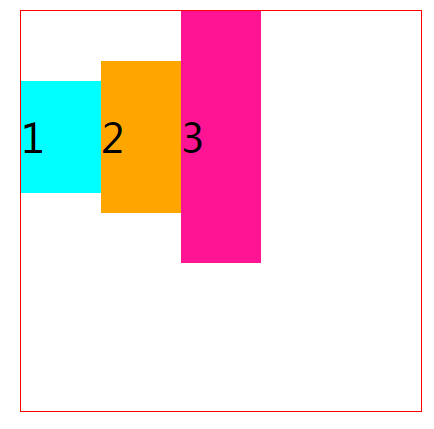
(2)flex-grow 用来规定盒子的扩展比率,即盒子相对于其他盒子能够分配到的空间的比值,没有指定flex的不参与分配。


<!DOCTYPE html>
<html lang="en">

<head>
    <meta charset="UTF-8">
    <meta name="viewport" content="width=device-width, initial-scale=1.0">
    <meta http-equiv="X-UA-Compatible" content="ie=edge">
    <title>Document</title>
    <style>
        .fa {
            width: 800px;
            height: 400px;
            border: 2px solid red;
            display: flex;
            margin: 200px auto;
        }

        .son1 {
            background-color: aqua;
            width: 200px;
        }

        .son2 {
            background-color: green;
            flex-grow: 1;
            width: 50px;
        }

        .son3 {
            background-color: blue;
            flex-grow: 2;
            width: 30px;
        }

        .son4 {
            background-color: orange;
            flex-grow: 3;
            width: 80px;
        }
    </style>
</head>

<body>
    <div class="fa">
        <div class="son1">1</div>
        <div class="son2">2</div>
        <div class="son3">3</div>
        <div class="son4">4</div>
    </div>
</body>

</html>
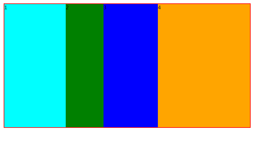
上面图中子盒子所占大小的计算方法为:
a、.son1 没有指定flex 因此不参与分配大小为固定的200px;
b、剩下的空间需要减去盒子固有的宽度来继续分配,即可分配空间为
600-50-30-80=440px
c、指定分配的比率为1:2:3 所以各自能分配到的大小为440*(1/6),440*(2/6),440*(3/6)
d、最后可得出各个盒子的大小
.son2: 440*(1/6)+50=123.3px
.son3: 440*(2/6)+30=176.7px
.son4: 440*(3/6)+80=300px
(3)、flex-shrink 规定盒子收缩率,一般是在子盒子总体大小超过父盒子情况下,确定各个盒子的缩小比例。
<!DOCTYPE html>
<html lang="en">

<head>
    <meta charset="UTF-8">
    <meta name="viewport" content="width=device-width, initial-scale=1.0">
    <meta http-equiv="X-UA-Compatible" content="ie=edge">
    <title>Document</title>
    <style>
        .fa {
            width: 400px;
            height: 400px;
            border: 2px solid red;
            display: flex;
            margin: 200px auto;
        }

        .son1 {
            width: 100px;
            flex-shrink: 1;
            background-color: aqua;
        }

        .son2 {
            width: 200px;
            flex-shrink: 2;
            background-color: orange;
        }

        .son3 {
            width: 300px;
            flex-shrink: 3;
            background-color: deeppink;
        }
    </style>
</head>

<body>
    <div class="fa">
        <div class="son1">1</div>
        <div class="son2">2</div>
        <div class="son3">3</div>
    </div>
</body>

</html>
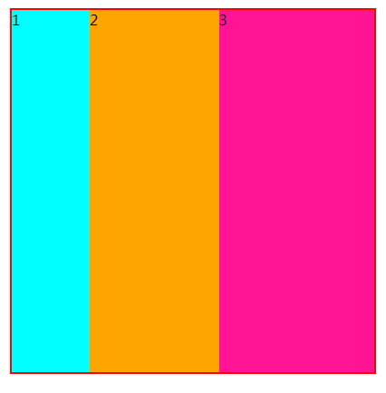
上面图中子盒子所占大小的计算方法为:
a、子盒子总体宽度大小为:100+200+300=600px
b、超过父盒子 600-400=200px
c、收缩比率为:1:2:3 ,则对收缩大小进行加权求值,求出收缩大小
.son1: 200*[100*1/(1*100+2*200+3*300)]=14px
.son2: 200*[200*2/(1*100+2*200+3*300)]=57px
.son1: 200*[300*3/(1*100+2*200+3*300)]=129px
d、最终各个盒子大小为
.son1: 100-14=86px;
.son2: 200-57=143px;
.son3: 300-129=171px;
(4)、flex-basis:长度 |百分比
<!DOCTYPE html>
<html lang="en">

<head>
    <meta charset="UTF-8">
    <meta name="viewport" content="width=device-width, initial-scale=1.0">
    <meta http-equiv="X-UA-Compatible" content="ie=edge">
    <title>Document</title>
    <style>
        /* 超过按照比例划分 */

        .fa {
            width: 400px;
            height: 400px;
            border: 2px solid red;
            display: flex;
            margin: 200px auto;
        }

        .son1 {
            width: 100px;
            flex-basis: 35%;
            background-color: aqua;
        }

        .son2 {
            width: 200px;
            flex-basis: 30%;
            background-color: orange;
        }

        .son3 {
            width: 300px;
            flex-basis: 50%;
            background-color: deeppink;
        }
    </style>
</head>

<body>
    <div class="fa">
        <div class="son1">1</div>
        <div class="son2">2</div>
        <div class="son3">3</div>
    </div>
</body>

</html>
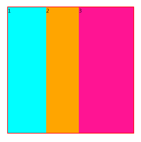
一般设置不超过盒子大小或者不超过100%,超过100%则按比例分配空间。
如上图按7:6:10 来分配,设置为auto,则以自身大小来分配。
(5)、常用复合属性
flex:1相当于 flex:1 1 0%;
flex:auto 相当于 flex:1 1 auto;
flex:none 相当于 flex:0 0 auto;
flex:0 none 或flex:initial 相当于 flex:0 1 auto;
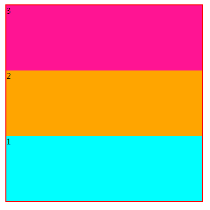
3、flex-direction:row | row-reverse | column | column-reverse 调整株洲方向,即合适是水平分布还是垂直分布的,默认是水平方向。
上面四个值分别是,水平| 水平反向| 垂直| 垂直反向
反向的意思是,盒子顺序是相反的。
<!DOCTYPE html>
<html lang="en">

<head>
    <meta charset="UTF-8">
    <meta name="viewport" content="width=device-width, initial-scale=1.0">
    <meta http-equiv="X-UA-Compatible" content="ie=edge">
    <title>Document</title>
    <style>
        .fa {
            width: 400px;
            height: 400px;
            border: 2px solid red;
            display: flex;
            margin: 200px auto;
            flex-direction: column-reverse;
        }

        .son1 {
            flex: 1;
            background-color: aqua;
        }

        .son2 {
            flex: 1;
            background-color: orange;
        }

        .son3 {
            flex: 1;
            background-color: deeppink;
        }
    </style>
</head>

<body>
    <div class="fa">
        <div class="son1">1</div>
        <div class="son2">2</div>
        <div class="son3">3</div>
    </div>
</body>

</html>
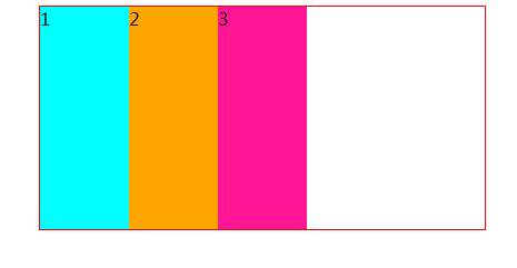
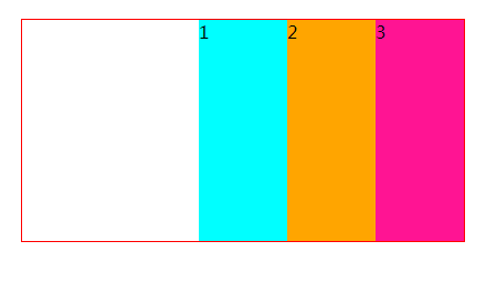
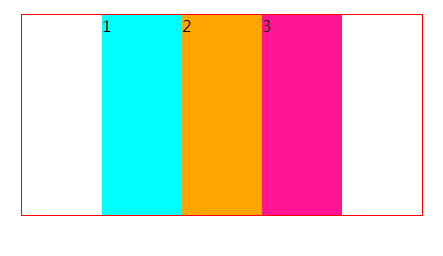
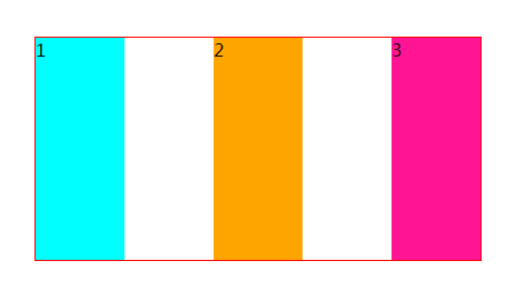
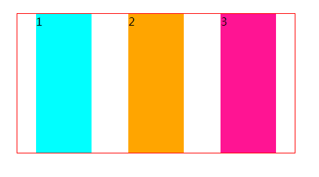
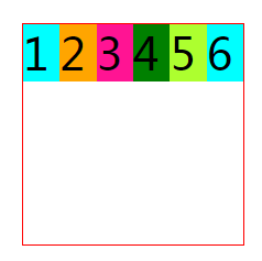
4、justify-content: flex-start | flex-end | center | space-between | space-around 子盒子在父盒子中的水平对齐方式。
<!DOCTYPE html>
<html lang="en">

<head>
    <meta charset="UTF-8">
    <meta name="viewport" content="width=device-width, initial-scale=1.0">
    <meta http-equiv="X-UA-Compatible" content="ie=edge">
    <title>Document</title>
    <style>
        .fa {
            width: 400px;
            height: 200px;
            border: 1px solid red;
            display: flex;
            margin: 100px auto;
            justify-content: flex-start;
        }

        .son {
            flex: 0 0 20%;
            background-color: aqua;
        }

        .son:nth-child(2) {
            background-color: orange;
        }

        .son:nth-child(3) {
            background-color: deeppink;
        }
    </style>
</head>

<body>
    <div class="fa">
        <div class="son">1</div>
        <div class="son">2</div>
        <div class="son">3</div>
    </div>
</body>

</html>
接下来只将justify-content 值改变,就不重复写代码了,只给出结果图
<!DOCTYPE html>
<html lang="en">

<head>
    <meta charset="UTF-8">
    <meta name="viewport" content="width=device-width, initial-scale=1.0">
    <meta http-equiv="X-UA-Compatible" content="ie=edge">
    <title>Document</title>
    <style>
        .fa {
            width: 400px;
            height: 400px;
            border: 1px solid red;
            display: flex;
            margin: 100px auto;
            align-items: stretch;
        }

        .son {
            flex: 0 0 20%;
            padding: 30px 0;
            background-color: aqua;
            font-size: 40px;
        }

        .son:nth-child(2) {
            padding: 50px 0;
            background-color: orange;
        }

        .son:nth-child(3) {
            padding: 100px 0;
            background-color: deeppink;
        }
    </style>
</head>

<body>
    <div class="fa">
        <div class="son">1</div>
        <div class="son">2</div>
        <div class="son">3</div>
    </div>
</body>

</html>

同样接下来几种只给出效果图
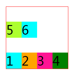
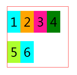
<!DOCTYPE html>
<html lang="en">

<head>
    <meta charset="UTF-8">
    <meta name="viewport" content="width=device-width, initial-scale=1.0">
    <meta http-equiv="X-UA-Compatible" content="ie=edge">
    <title>Document</title>
    <style>
        .fa {
            width: 200px;
            height: 200px;
            border: 1px solid red;
            display: flex;
            margin: 100px auto;
            align-items: baseline;
            flex-wrap: nowrap;
        }

        .son {
            width: 50px;
            background-color: aqua;
            font-size: 40px;
        }

        .son:nth-child(2) {
            background-color: orange;
        }

        .son:nth-child(3) {
            background-color: deeppink;
        }

        .son:nth-child(4) {
            background-color: green;
        }

        .son:nth-child(5) {
            background-color: greenyellow;
        }
    </style>
</head>

<body>
    <div class="fa">
        <div class="son">1</div>
        <div class="son">2</div>
        <div class="son">3</div>
        <div class="son">4</div>
        <div class="son">5</div>
        <div class="son">6</div>
    </div>
</body>

</html>
wrap:换行显示。
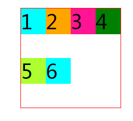
wrap-reverse:换行且倒着显示
7、flex-flow: flex-direction flex-wrap; flex-flow 是flex-direction 和 flex-wrap 的简写,默认值是flex-flow: row wrap
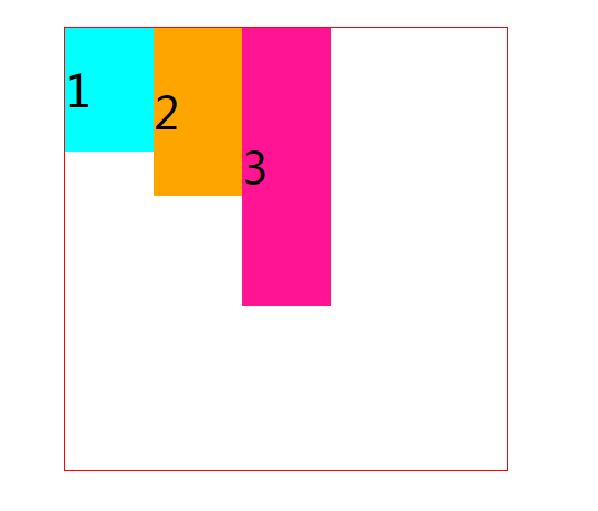
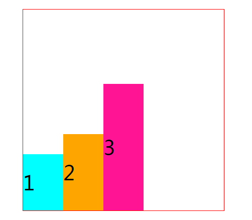
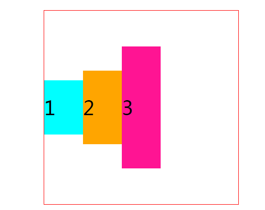
8、align-content:flex-start | flex-end | center | space-between | space-around | stretch 容器中多行的对齐方式
<!DOCTYPE html>
<html lang="en">

<head>
    <meta charset="UTF-8">
    <meta name="viewport" content="width=device-width, initial-scale=1.0">
    <meta http-equiv="X-UA-Compatible" content="ie=edge">
    <title>Document</title>
    <style>
        .fa {
            width: 200px;
            height: 200px;
            border: 1px solid red;
            display: flex;
            margin: 100px auto;
            flex-wrap: wrap;
            align-content: stretch;
        }

        .son {
            /*  50px; */
            padding: 10px;
            background-color: aqua;
            font-size: 40px;
        }

        .son:nth-child(2) {
            background-color: orange;
        }

        .son:nth-child(3) {
            background-color: deeppink;
        }

        .son:nth-child(4) {
            background-color: green;
        }

        .son:nth-child(5) {
            background-color: greenyellow;
        }
    </style>
</head>

<body>
    <div class="fa">
        <div class="son">1</div>
        <div class="son">2</div>
        <div class="son">3</div>
        <div class="son">4</div>
        <div class="son">5</div>
        <div class="son">6</div>
    </div>
</body>

</html>
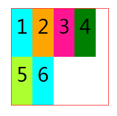
flex-start:上对齐
flex-end:下对齐
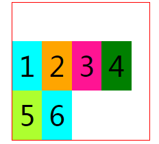
center:居中对齐
space-between :与justify-content中的 space-between类似 最上一行 顶对齐,最下一行 底对齐

space-around:与justify-content中的 space-around类似 各个行上下有空隙,且空隙距离相同(相当于每行上下给了一个相同的margin值)
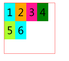
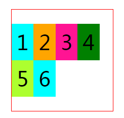
9、order:设置子盒子显示顺序。值取整数,可以为负数,数值越小的排列方向越靠前。
<!DOCTYPE html>
<html lang="en">

<head>
    <meta charset="UTF-8">
    <meta name="viewport" content="width=device-width, initial-scale=1.0">
    <meta http-equiv="X-UA-Compatible" content="ie=edge">
    <title>Document</title>
    <style>
        .fa {
            width: 200px;
            height: 200px;
            border: 1px solid red;
            display: flex;
            margin: 100px auto;
            flex-wrap: wrap;
            align-content: space-between;
        }

        .son {
            /*  50px; */
            padding: 10px;
            background-color: aqua;
            font-size: 40px;
        }

        .son:nth-child(2) {
            background-color: orange;
            order: -2;
        }

        .son:nth-child(3) {
            background-color: deeppink;
        }

        .son:nth-child(4) {
            background-color: green;
            order: 3;
        }

        .son:nth-child(5) {
            order: 2;
            background-color: greenyellow;
        }
    </style>
</head>

<body>
    <div class="fa">
        <div class="son">1</div>
        <div class="son">2</div>
        <div class="son">3</div>
        <div class="son">4</div>
        <div class="son">5</div>
        <div class="son">6</div>
    </div>
</body>

</html>

注意事项:
上述的9个属性,其中1、3、4、5、6、7、8是放在容器(父盒子)的属性
而2、9是项目(子盒子)的属性