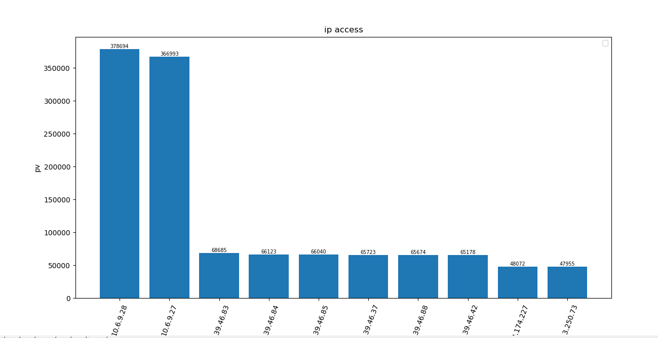
脚本内容:
    import matplotlib.pyplot as plt
#
nginx_file = '10.6.11.91_access.log-2018-12-27'

ip = {}
#筛选nginx日志文件中的IP
with open(nginx_file) as f:
	for i in f.readlines():
		s = i.strip().split()[0]
		lengh = len(ip.keys())

		#统计每个IP的访问以字典存储
		if s in ip.keys():
			ip[s] = ip[s] + 1
		else:
			ip[s] = 1

#以IP出现的次数排序返回对象为list
ip = sorted(ip.items(), key=lambda e:e[1], reverse=True)

#取列表前十
newip = ip[0:10:1]
tu = dict(newip)

x = []
y = []
for k in tu:
	x.append(k)
	y.append(tu[k])
plt.title('ip access')
plt.xlabel('ip address')
plt.ylabel('pv')

#X 轴项的翻转角度
plt.xticks(rotation=70)

#显示每个柱状图的值
for a,b in zip(x,y):
	plt.text(a, b, '%.0f' % b, ha='center', va= 'bottom',fontsize=7)

plt.bar(x,y)
plt.legend()
plt.show()
效果: