In this lesson, we explore creating the Egghead Shell with CSS. We explore how different properties allow us to create different shapes and how we can use our developer tools to adjust and tweak style values.
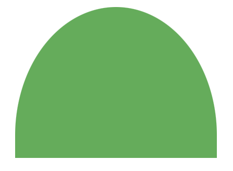
*,
*:before,
*:after {
  box-sizing: border-box;
}
:root {
  --bg: #ffd500;
  --shell: #fff;
  --shell-outline: #666;
  --size: 50;
  --unit: calc((var(--size) / 769) * 1vmin);
}

body {
  background-color: var(--bg);
  min-height: 100vh;
}

img {
  opacity: 0.5;
}

.egg {
  background-color: hsla(0, 100%, 50%, 0.2);
}

img,
.egg {
  height: calc(769 * var(--unit));
  width: calc(742 * var(--unit));
  position: fixed;
  top: 50%;
  left: 50%;
  transform: translate(-50%, -50%);
}

.shell {
  height: 95%;
  width: 74%;
  position: absolute;
  top: 50%;
  left: 50%;
  transform: translate(-50%, -50%);
}

.shell__piece--top {
  height: 108%;
  width: 106%;
  border-radius: 50% 50% 0 0 / 85% 85% 0 0;
  top: 0;
  clip-path: inset(0 0 70% 0);
}

.shell__piece--middle {
  height: 100%;
  width: 98%;
  border-radius: 50% 50% 0 0 / 85% 85% 0 0;
  clip-path: inset(32% 0 40% 0);
}

.shell__piece--bottom {
  bottom: 0;
  border-radius: 50% / 62% 62% 38% 38%;
  width: 100%;
  height: 100%;
  clip-path: inset(58% 0 0 0);
}

.shell__piece {
  background-color: var(--shell);
  border: calc(26 * var(--unit)) solid var(--shell-outline);
  position: absolute;
  left: 50%;
  transform: translate(-50%, 0);
}
border-radius:
border-radius: 50% 50% 0 0 / 85% 85% 0 0;
first (50% + 85%)
x: top-left, move right 50%
y: top-left, move down 85%
second (50% + 85%)
x: top-right, move left 50%
y: top-right, move down 85%
first and second (0 0)
no changes
clip-path:
Image:
before:

after clip:

clip-path: inset(87% 45% 5% 46%);