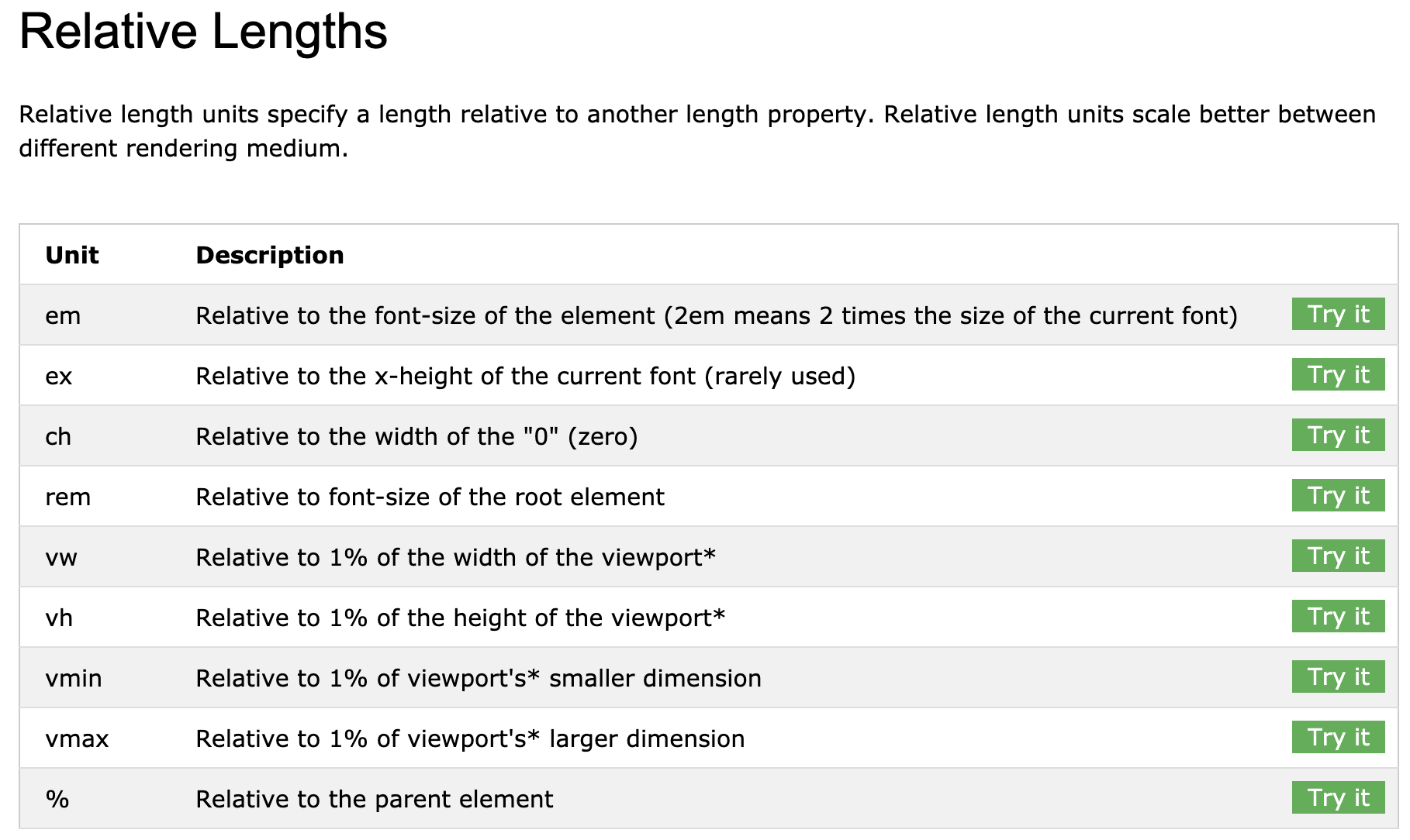
https://www.w3schools.com/cssref/css_units.asp

In this lesson, we lay the foundations for creating a CSS illustration of the Egghead logo using the "tracing" technique.
We walk through positioning an image and container whilst making them both responsively sized. We use the images' intrinsic dimensions to size our illustration using a custom unit. This custom unit is calculated from our images' intrinsic dimensions and the desired size of our illustration.
This results in us having a responsive container for us to create our CSS illustration in that will scale with our browser window.
*,
*:before,
*:after {
  box-sizing: border-box;
}
:root {
  --bg: #ffd500;
  --size: 50;
  --unit: calc((var(--size) / 769) * 1vmin);
}

body {
  background-color: var(--bg);
  min-height: 100vh;
}
/* Image height will responsive to container height, width will change accordingly to its height%*/
img {
  opacity: 0.5;
}

.egg {
  background-color: hsla(0, 100%, 50%, 0.2);
}

img,
.egg {
  height: calc(769 * var(--unit));
   calc(742 * var(--unit));
  position: fixed;
  top: 50%;
  left: 50%;
  transform: translate(-50%, -50%);
}
<html>
  <head>
    <link rel="stylesheet" href="./index.css" />
  </head>
  <body>
    <img src='egghead.png'/>
    <div class='egg'></div>
  </body>
</html>