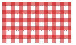
只使用一个渐变时,我们能创建的图案并不多,当我们把多个渐变图案组合起来,让他们透过彼此的透明区域显现时,神奇的事情就发生了!我们首先想到的是把水平和水质条纹叠加起来,就可以得到各种各样的网格。
1. 网格背景
html
<div class="stripe"></div>
css
.stripe{
  width: 250px;
  height: 150px;
  margin: 50px;
  background: linear-gradient(90deg,rgba(200,0,0,.5) 50%,transparent 0),
              linear-gradient(rgba(200,0,0,.5) 50%,transparent 0);
  background-size: 30px 30px;
}
效果图
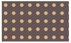
2.波点背景
css
.stripe{
  width: 250px;
  height: 150px;
  margin: 50px;
  background-color: #655;
  background-image: radial-gradient(tan 30%,transparent 0);
  background-size: 30px 30px;
}
效果图
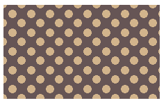
当然,这个不是我们想要的图案,其实,我们可以生成两层圆点阵列图案,并把他们的背景定位错开,这样就可以得到真正的波点阵列了。
css
.stripe{
  width: 250px;
  height: 150px;
  margin: 50px;
  background-color: #655;
  background-image: radial-gradient(tan 30%,transparent 0),
                    radial-gradient(tan 30%,transparent 0);
  background-size: 30px 30px;
  background-position: 0 0,15px 15px;
}
效果图
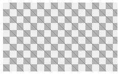
3. 棋盘背景
css
.stripe{
  width: 250px;
  height: 150px;
  margin: 50px;
  background-image: linear-gradient(45deg,rgba(0,0,0,.25) 25%,transparent 0,transparent 75%,rgba(0,0,0,.25) 0),
                    linear-gradient(45deg,rgba(0,0,0,.25) 25%,transparent 0,transparent 75%,rgba(0,0,0,.25) 0);
  background-color: #eee;
  background-size: 30px 30px;
  background-position: 0 0,15px 15px;
}
效果图
了解更多关于径向渐变https://www.w3cplus.com/content/css3-gradient