一、 水平条纹
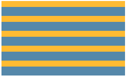
1. 两种颜色:
html
<div class="stripe"></div>
css
.stripe{
  width: 250px;
  height: 150px;
  margin: 50px;
  background: linear-gradient(#fb3 50%,#58a 50%);
  background-size: 100% 30px;
}
效果图
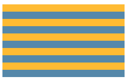
2. 不等宽的条纹背景
css
.stripe{
  width: 250px;
  height: 150px;
  margin: 50px;
  background: linear-gradient(#fb3 40%,#58a 0);
  background-size: 100% 30px;
}
效果图
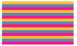
3. 三列条纹背景
css
.stripe{
  width: 250px;
  height: 150px;
  margin: 50px;
  background: linear-gradient(#fb3 33.3%,#58a 0,#58a 66.6%,deeppink 0);
  background-size: 100% 30px;
}
效果图
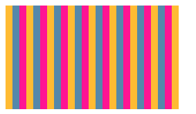
二、垂直条纹
css
.stripe{
  width: 250px;
  height: 150px;
  margin: 50px;
  background: linear-gradient(to right,#fb3 33.3%,#58a 0,#58a 66.6%,deeppink 0);/*或者90deg*/
  background-size: 30px 100%;
}
效果图
三、斜向条纹
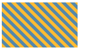
1. 45度角的斜向条纹
css
.stripe{
  width: 250px;
  height: 150px;
  margin: 50px;
  background: linear-gradient(45deg,#fb3 25%,#58a 0,
                                    #58a 50%,#fb3 0,
                                    #fb3 75%,#58a 0);
  background-size: 30px 30px;
}
效果图
2. 其他角度的斜向条纹
css
.stripe{
  width: 250px;
  height: 150px;
  margin: 50px;
  background: repeating-linear-gradient(120deg,#fb3 0,#fb3 15px,#58a 0,#58a 30px);
}
效果图
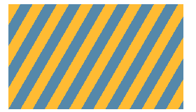
说明:黄色条纹从0到15px线性渐变,蓝色条纹从15px到30px线性渐变。
四、结合半透明实现同色系条纹
css
.stripe{
  width: 250px;
  height: 150px;
  margin: 50px;
  background-image: repeating-linear-gradient(30deg,hsla(0,0%,100%,.1),hsla(0,0%,100%,.1) 15px,
                    transparent 0,transparent 30px);
  background: #58a;
}
参考网址https://www.w3cplus.com/css3/do-you-really-understand-css-linear-gradients.html
https://www.w3cplus.com/content/css3-background-size