'''
【课程3.13】  表格样式创建

表格视觉样式:Dataframe.style → 返回pandas.Styler对象的属性,具有格式化和显示Dataframe的有用方法

样式创建:
① Styler.applymap:elementwise → 按元素方式处理Dataframe
② Styler.apply:column- / row- / table-wise → 按行/列处理Dataframe

'''
import numpy as np
import pandas as pd
import matplotlib.pyplot as plt
% matplotlib inline
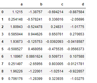
# 样式

df = pd.DataFrame(np.random.randn(10,4),columns=['a','b','c','d'])
sty = df.style
print(sty,type(sty))
# 查看样式类型

sty
# 显示样式
输出:
<pandas.formats.style.Styler object at 0x0000000009789CF8> <class 'pandas.formats.style.Styler'>
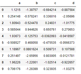
# 按元素处理样式:style.applymap()

def color_neg_red(val):
    if val < 0:
        color = 'red'
    else:
        color = 'black'
    return('color:%s' % color)
df.style.applymap(color_neg_red)
# 创建样式方法,使得小于0的数变成红色
# style.applymap() → 自动调用其中的函数
输出:
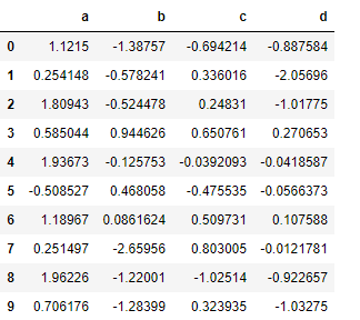
# 按行/列处理样式:style.apply()

def highlight_max(s):
    is_max = s == s.max()
    #print(is_max)
    lst = []
    for v in is_max:
        if v:
            lst.append('background-color: yellow')
        else:
            lst.append('')
    return(lst)
df.style.apply(highlight_max, axis = 0, subset = ['b','c'])
# 创建样式方法,每列最大值填充黄色
# axis:0为列,1为行,默认为0
# subset:索引
输出:

# 样式索引、切片

df.style.apply(highlight_max, axis = 1,
               subset = pd.IndexSlice[2:5,['b', 'd']])
# 通过pd.IndexSlice[]调用切片
# 也可:df[2:5].style.apply(highlight_max, subset = ['b', 'd']) → 先索引行再做样式
输出:
'''
【课程3.14】  表格显示控制

df.style.format()

'''
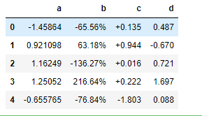
# 按照百分数显示

df = pd.DataFrame(np.random.randn(10,4),columns=['a','b','c','d'])
print(df.head())
df.head().style.format("{:.2%}")
输出:
          a         b         c         d
0 -1.458644 -0.655620  0.134962  0.487259
1  0.921098  0.631805  0.943667 -0.669659
2  1.162486 -1.362738  0.015851  0.720793
3  1.250515  2.166381  0.222424  1.696663
4 -0.655765 -0.768403 -1.802734  0.087619
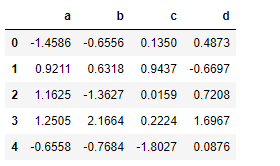
# 显示小数点数

df.head().style.format("{:.4f}")
输出:
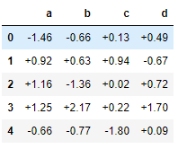
# 显示正负数

df.head().style.format("{:+.2f}")
输出:
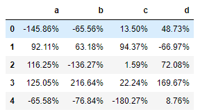
# 分列显示

df.head().style.format({'b':"{:.2%}", 'c':"{:+.3f}", 'd':"{:.3f}"})
输出:
'''
【课程3.15】  表格样式调用

Styler内置样式调用

'''
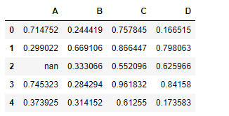
# 定位空值

df = pd.DataFrame(np.random.rand(5,4),columns = list('ABCD'))
df['A'][2] = np.nan
df.style.highlight_null(null_color='red')
输出:
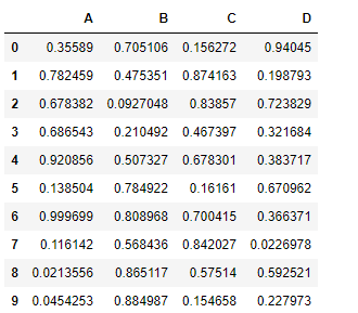
# 色彩映射

df = pd.DataFrame(np.random.rand(10,4),columns = list('ABCD'))
df.style.background_gradient(cmap='Greens',axis =1,low=0,high=1)
# cmap:颜色
# axis:映射参考,0为行,1以列
输出:
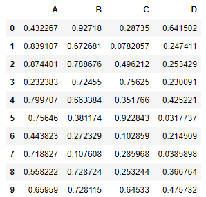
# 条形图

df = pd.DataFrame(np.random.rand(10,4),columns = list('ABCD'))
df.style.bar(subset=['A', 'B'], color='#d65f5f', width=100)
# width:最长长度在格子的占比。效果图和截图并不一样。
输出:
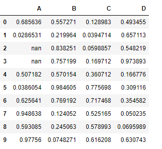
# 分段式构建样式

df = pd.DataFrame(np.random.rand(10,4),columns = list('ABCD'))
df['A'][[3,2]] = np.nan
df.style.
    bar(subset=['A', 'B'], color='#d65f5f', width=100).
    highlight_null(null_color='yellow')
输出: