百度云盘 传送门 密码:zb1c
圆形多选菜单选项效果:
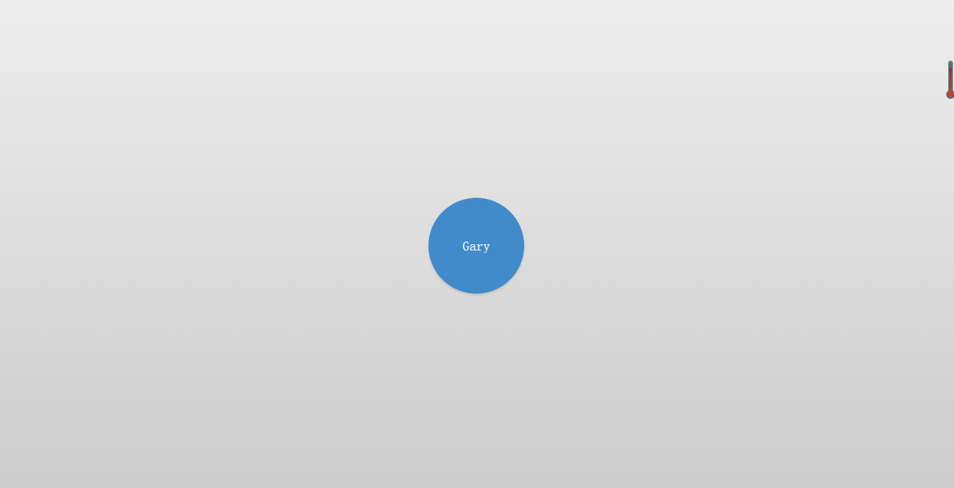


<!DOCTYPE html>
<html lang="en" >
<head>
<meta charset="UTF-8">
<title>jQuery圆形多选菜单选项DEMO演示</title>
<link rel="stylesheet" href="css/style.css">
</head>

<body>


<div class='selector'>
  <ul>
    <li>
      <input id='1' type='checkbox'>
      <label for='1'>1</label>
    </li>
    <li>
      <input id='2' type='checkbox'>
      <label for='2'>2</label>
    </li>
    <li>
      <input id='3' type='checkbox'>
      <label for='3'>3</label>
    </li>
    <li>
      <input id='4' type='checkbox'>
      <label for='4'>4</label>
    </li>
    <li>
      <input id='5' type='checkbox'>
      <label for='5'>5</label>
    </li>
    <li>
      <input id='6' type='checkbox'>
      <label for='6'>6</label>
    </li>
    <li>
      <input id='7' type='checkbox'>
      <label for='7'>7</label>
    </li>
    <li>
      <input id='8' type='checkbox'>
      <label for='8'>8</label>
    </li>
  </ul>
  <button>Gary</button>
</div>
<script src="http://www.jq22.com/jquery/jquery-1.10.2.js"></script>
<script  src="js/index.js"></script>
</body>
</html>
var angleStart = -360;


function rotate(li,d) {
    $({d:angleStart}).animate({d:d}, {
        step: function(now) {
            $(li)
               .css({ transform: 'rotate('+now+'deg)' })
               .find('label')
                  .css({ transform: 'rotate('+(-now)+'deg)' });
        }, duration: 0
    });
}


function toggleOptions(s) {
    $(s).toggleClass('open');
    var li = $(s).find('li');
    var deg = $(s).hasClass('half') ? 180/(li.length-1) : 360/li.length;
    for(var i=0; i<li.length; i++) {
        var d = $(s).hasClass('half') ? (i*deg)-90 : i*deg;
        $(s).hasClass('open') ? rotate(li[i],d) : rotate(li[i],angleStart);
    }
}

$('.selector button').click(function(e) {
    toggleOptions($(this).parent());
});

setTimeout(function() { toggleOptions('.selector'); }, 100);
html, body {
  height: 100%;
}

body {
  margin: 0;
  background: linear-gradient(#eee, #ccc);
  overflow: hidden;
}


.selector {
  position: absolute;
  left: 50%;
  top: 50%;
   140px;
  height: 140px;
  margin-top: -70px;
  margin-left: -70px;
}

.selector, .selector button {
  font-family: 'Oswald', sans-serif;
  font-weight: 300;
}

.selector button {
  position: relative;
   100%;
  height: 100%;
  padding: 10px;
  background: #428bca;
  border-radius: 50%;
  border: 0;
  color: white;
  font-size: 20px;
  cursor: pointer;
  box-shadow: 0 3px 3px rgba(0, 0, 0, 0.1);
  transition: all .1s;
}

.selector button:hover {
  background: #3071a9;
}

.selector button:focus {
  outline: none;
}

.selector ul {
  position: absolute;
  list-style: none;
  padding: 0;
  margin: 0;
  top: -20px;
  right: -20px;
  bottom: -20px;
  left: -20px;
}

.selector li {
  position: absolute;
   0;
  height: 100%;
  margin: 0 50%;
  -webkit-transform: rotate(-360deg);
  transition: all 0.8s ease-in-out;
}

.selector li input {
  display: none;
}

.selector li input + label {
  position: absolute;
  left: 50%;
  bottom: 100%;
   0;
  height: 0;
  line-height: 1px;
  margin-left: 0;
  background: #fff;
  border-radius: 50%;
  text-align: center;
  font-size: 1px;
  overflow: hidden;
  cursor: pointer;
  box-shadow: none;
  transition: all 0.8s ease-in-out, color 0.1s, background 0.1s;
}

.selector li input + label:hover {
  background: #f0f0f0;
}

.selector li input:checked + label {
  background: #5cb85c;
  color: white;
}

.selector li input:checked + label:hover {
  background: #449d44;
}

.selector.open li input + label {
   80px;
  height: 80px;
  line-height: 80px;
  margin-left: -40px;
  box-shadow: 0 3px 3px rgba(0, 0, 0, 0.1);
  font-size: 14px;
}
实现过程
CSS
选择 按钮
.selector button {
  position: relative;
   100%;
  height: 100%;
  padding: 10px;
  background: #428bca;
  border-radius: 50%;
  border: 0;
  color: white;
  font-size: 20px;
  cursor: pointer;
  box-shadow: 0 3px 3px rgba(0, 0, 0, 0.1);
  transition: all .1s;
}
cursor 属性规定要显示的光标的类型(pointer 光标呈现为指示链接的指针)
选择 标签
.selector li {
  position: absolute;
   0;
  height: 100%;
  margin: 0 50%;
  -webkit-transform: rotate(-360deg);
  transition: all 0.8s ease-in-out;
}
transition-property 属性规定应用过渡效果的 CSS 属性的名称
all 所有属性都将获得过渡效果
0.8s 属性过渡时间
ease-in-out 规定以慢速开始和结束的过渡效果
鼠标触碰按钮时变化颜色
.selector button:hover {
  background: #3071a9;
}
子标签初始化旋转效果
.selector li input + label {
  position: absolute;
  left: 50%;
  bottom: 100%;
   0;
  height: 0;
  line-height: 1px;
  margin-left: 0;
  background: #fff;
  border-radius: 50%;
  text-align: center;
  font-size: 1px;
  overflow: hidden;
  cursor: pointer;
  box-shadow: none;
  transition: all 0.8s ease-in-out, color 0.1s, background 0.1s;
}
鼠标触碰子标签时显示的颜色
.selector li input + label:hover {
  background: #f0f0f0;
}
子标签的颜色
.selector li input:checked + label:hover {
  background: #449d44;
}
子标签文字的颜色
.selector li input:checked + label {
  background: #5cb85c;
  color: white;
}
JS
设置标签旋转度数
var angleStart = -360;
多选菜单旋转动画
function rotate(li,d) {
    $({d:angleStart}).animate({d:d}, {
        step: function(now) {
            $(li)
               .css({ transform: 'rotate('+now+'deg)' })
               .find('label')
                  .css({ transform: 'rotate('+(-now)+'deg)' });
        }, duration: 0
    });
}
duration :返回动画当前时间长度
显示/影藏多选菜单
function toggleOptions(s) {
    $(s).toggleClass('open');
    var li = $(s).find('li');
    var deg = $(s).hasClass('half') ? 180/(li.length-1) : 360/li.length;
    for(var i=0; i<li.length; i++) {
        var d = $(s).hasClass('half') ? (i*deg)-90 : i*deg;
        $(s).hasClass('open') ? rotate(li[i],d) : rotate(li[i],angleStart);
    }
}
find() 方法获得当前元素集合中每个元素的后代(获得全部的li标签)
hasClass() 方法检查被选元素是否包含指定的 class
(找到了子标签旋转出来,没找到子标签旋转回去)
点击按钮调用toggleOptions(s)函数
$('.selector button').click(function(e) {
    toggleOptions($(this).parent());
});
parent() 获得当前匹配元素集合中每个元素 (获得元素全部标签)
设置动作时间
setTimeout(function() { toggleOptions('.selector'); }, 100);
DOM
<div class='selector'>
  <ul>
    <li>
      <input id='1' type='checkbox'>
      <label for='1'>1</label>
    </li>
    <li>
      <input id='2' type='checkbox'>
      <label for='2'>2</label>
    </li>
    <li>
      <input id='3' type='checkbox'>
      <label for='3'>3</label>
    </li>
    <li>
      <input id='4' type='checkbox'>
      <label for='4'>4</label>
    </li>
    <li>
      <input id='5' type='checkbox'>
      <label for='5'>5</label>
    </li>
    <li>
      <input id='6' type='checkbox'>
      <label for='6'>6</label>
    </li>
    <li>
      <input id='7' type='checkbox'>
      <label for='7'>7</label>
    </li>
    <li>
      <input id='8' type='checkbox'>
      <label for='8'>8</label>
    </li>
  </ul>
  <button>Gary</button>
</div>