这节讲的是代码:
1、基本实例
<code></code> <pre></pre> <kbd></kbd>
应用如下
1、For example, <code>section</code> should be wrapped as inline.
2、To switch directories, type <kbd>cd</kbd> followed by the name of the directory.<br>
3、<pre><p>Sample text here...</p></pre>
结果如图:
2、表格
a、为任意 <table> 标签添加 .table 类可以为其赋予基本的样式 — 少量的内补(padding)和水平方向的分隔线。这种方式看起来很多余!?但是我们觉得,表格元素使用的很广泛,如果我们为其赋予默认样式可能会影响例如日历和日期选择之类的插件,所以我们选择将此样式独立出来。
代码:<table class="table"> ... </table>
b、条纹装表格:通过 .table-striped 类可以给 <tbody> 之内的每一行增加斑马条纹样式。
****跨浏览器兼容性:条纹状表格是依赖 :nth-child CSS 选择器实现的,而这一功能不被 Internet Explorer 8 支持
代码:<table class="table table-striped"> ... </table>
如图:
c、带边框的表格:添加 .table-bordered 类为表格和其中的每个单元格增加边框。
代码:<table class="table table-bordered"> ... </table>
d、鼠标悬停:通过.table-hover类,可以让鼠标悬停每一列做出响应
代码:<table class="table table-hover"> ... </table>
e、紧缩表格:通过.table-condensed类可以让表格更加紧凑,单元格的内补(padding)均会减半。
代码:<table class="table table-condensed"> ... </table>
f、表格颜色:可以为单元格或行设置颜色。success(绿色),active(灰色系),info(青色系),warning(黄色系),danger(红色系)
颜色如图: 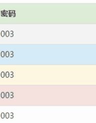
3、相应式表格:
将任何 .table 元素包裹在 .table-responsive 元素内,即可创建响应式表格,其会在小屏幕设备上(小于768px)水平滚动。当屏幕大于 768px 宽度时,水平滚动条消失。
代码:<div class="table-responsive"> <table class="table"> ... </table> </div>