1 margin-bottom:3000px; padding-bottom:3000px;
.container {
            overflow: hidden;
        }

        .container .left {
            float: left;
             100px;
            padding: 10px;
            background-color: blue;
            padding-bottom: 3000px;//增加left的高度,父元素的高度会被撑开
            margin-bottom: -3000px;//减小父元素的高度,最终的效果就是父元素的高度根据内容改变 见http://www.cnblogs.com/xiaofenguo/p/6088231.html
        }

        .container .right {
            margin-left: 10px;
            background-color: red;
            padding: 10px;
            height: 300px;
        }
<div class="container">
    <div class="left"></div>
    <div class="right"></div>
</div>
此例关键是给每个框设置大的底部内边距,然后用数值相似的负外边距消除这个高度。这会导致每一列溢出容器元素,如果把外包容器的overflow属性设为hidden,列就在最高点被裁切。
body,p{
        margin:0;
        padding:0;
    }
    #wrap{
        overflow:hidden;
        580px;
        margin:0 auto;
    }
    #left,#center,#right{
        margin-bottom:-200px;
        padding-bottom:200px;
    }
    #left {
        float:left;
        140px;
        background:#777;
    }
    #center {
        float:left;
        300px;
        background:#888;
    }
    #right {
        float:right;
        140px;
        background:#999;
    }
    p {color:#FFF;text-align:center}

<div id="wrap">
        <div id="left">
            <p style="height:50px">style="height:50px"</p>
        </div>
        <div id="center">
            <p style="height:100px">style="height:100px"</p>
        </div>
        <div id="right">
            <p style="height:200px">style="height:200px"</p>
        </div>
    </div>
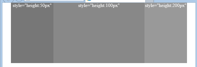
效果图:
2 display:table-cell
 .container {
            display: table;
            100%;
        }

        .container .left {
            display: table-cell;
             20%;
            padding: 10px;
            margin-right:-300px;
            background-color: blue;
        }

        .container .right {
            80%;
            display: table-cell;
            background-color: red;
            padding: 10px;
            height: 300px;
        }
3 absolute
.container {
            overflow: hidden;
            border: 1px solid #000;
             500px;
            margin: 0 auto;
            position: relative;
        }

        .container .left {
             20%;
            float: left;
            position: relative;
            background-color: #ccc;
        }

        .container .left .leftBorder {
            border-right: 1px solid red;
            position: absolute;
             100%;
            left:0;
            top:0;
            height: 999999em;
        }

        .container .left .leftInfo {
            position: relative;
            padding: 10px;
            z-index: 1;

        }

        .container .right {
            padding: 10px;
            position: relative;
            background-color: beige;
             70%;
            float: right;
        }

        h4 {
            padding: 10px;
        }
<div class="container">
    <div class="left">
        <div class="leftBorder"></div>
        <div class="leftInfo"></div>
    </div>
    <div class="right">
        <h4>②回流与渲染</h4>
        早先时候我曾翻译过两篇关于回流与重绘的文章,“最小化浏览器中的回流(reflow)”以及“回流与重绘:CSS性能让JavaScript变慢?”。
        我自己是没测过。不过根据上面这两篇文章的说法,以及一位口碑前端前辈的说法,使用absolute隐藏于显示元素是会产生重绘而不会产生强烈的回流。而使用display:none不仅会重绘,还会产生回流,DOM影响范围越广,回流越强烈。所以,就JavaScript交互的呈现性能上来讲,使用absolute隐藏是要优于display相关隐藏的。
        <h4>③配合JavaScript的控制</h4>
        说到元素的显示与隐藏,免不了与JavaScript的交互。例如display相关的隐藏于显示,就是display:block/inline/inline-block/...与display:none。
        要让元素隐藏,很简单,直接:
        dom.style.display = "none";
        但是,如果要显示隐藏的元素,咋办呢?因为不同的标签所处的display水平是不一样的,于是,我们很难有一个简单的统一的显示方法。例如,下面的代码可能使用于div,
        p标签,但是对于span等inline水平的元素,可能就会嗝屁了(原本单行显示结果换行)。
        dom.style.display = "block";
        况且,随着浏览器的不断进步,以后类似于display:table-cell,display:list-item会越来越多的使用。再想通过display实现通用的显隐方法难度又会增大些。
        这就是使用display属性控制元素显隐的局限性。顺带一提的是jQuery的显隐方法show()/hide()/toggle()就是基于display的,其会存储元素先前的display属性值,于是元素再显示的时候就可以准确地显示出之前的display值了
    </div>
</div>
其中,实现等高效果的核心CSS代码如下:
.leftBorder{100%; height:999em; position:absolute; left:0; top:0;}
同时,满足以下一些条件:
- 高度999em的绝对定位层位于侧栏容器内,侧栏
position为relative - 该栏实际元素内容用一个与absolute绝对定位层为兄弟关系的标签层包裹,
position为relative,z-index值1或其他 - 左右栏的父标签需设置
overflow:hidden,同时为了兼容IE6/7,需设置position为relative
来自:http://www.zhangxinxu.com/wordpress/2011/03/css-%E7%9B%B8%E5%AF%B9%E7%BB%9D%E5%AF%B9relativeabsolute%E5%AE%9A%E4%BD%8D%E7%B3%BB%E5%88%97%EF%BC%88%E4%B8%89%EF%BC%89/