样式属性 [注:黑色加粗部分比较重要,要留心】
一.背景:
background-color:背景色 *
background-image:url(路径) 背景图片*
background-repeat:背景图片的平铺方式 其中包括 no-repeat,不平铺;repeat,平铺;repeat-x,横向平铺;repeat-y,纵向平铺
另外背景图居中,设置背景图位置时,repeat必须为“no-repeat”
background-position:背景图片的位置 top bottom left right center 随意组合 如果要打开距离在单词后面加像素 例如:right top,表示把背景图放到右上角
background-position:right 20px top 20px 这里表示背景图离右边20像素,离上边20像素
background-attachment:背景图是否随着滚动条滚动 其中包括 fixed,背景图是固定的的,不随字体滚动;scroll,表示背景随字体滚动
background-size:400px 400px 表示背景图的大小为宽400像素,高400像素(一般先写宽,再写高)
<head>
        <meta http-equiv="Content-Type" content="text/html; charset=utf-8" />
        <title>无标题文档</title>
        <style type="text/css">
        #text{
             width:400px;
             height:1000px;
             background-color:#3FF;
             background-image:url(../../55c7607611ec9935_jpg!180x180.jpg);
             background-repeat:no-repeat;
             /*background-position:right 20px top 20px;*/
             background-attachment:scroll;
             background-size:400px 400px;
        </style>
    <body>
        <div id="text"> </div>
    </body>
效果图为

二.前景
一般我们指文字、字体
关于字体大部分都为<font></font>打头
字体:
font-size:14px 字体大小,用像素表示,网页里面一般规定 普通正文,14px;页脚字体,12px;稍大点,16px*
font-family:字体样式 网页里面的字体我们一般用宋体和微软雅黑 *
color:文字颜色 (在这里注意,这里没有font)*
font-weight:bold;加粗 *
font-style:italic;倾斜
text-decoration:underline下划线 ;overline 上划线 ; line-throuth 是删除线 ; none去掉下划线(重点注意)
<head>
        <meta http-equiv="Content-Type" content="text/html; charset=utf-8" />
        <title>无标题文档</title>
        <style type="text/css">
        #text{
             width:400px;
             height:1000px;
             font-size:30px;
             font-family:微软雅黑;
             color:#3F6;
             font-weight:bold;
             font-style:italic;
             text-decoration:underline;
         }
        </style>
    <body>
        <div id="text">测试文字</div>
        <a href="#" style="text-decoration:none">首页</a>     ————————————   这里就是去掉下划线的作用
    </body>
    </head>
三.对齐方式:
text-align:水平对齐方式 center居中 left左 right右 *
vertical-align:垂直对齐方式 middle居中 top上 bottom下 *
line-height:400px; 行高 *(注意:vertical-align和line-height要配合使用,同时存在,垂直对齐就必须存在行高)
text-indent:3px 首行缩进3像素,用像素表示 (用在<p></p>标签中做首行缩进)*
<head>
        <meta http-equiv="Content-Type" content="text/html; charset=utf-8" />
        <title>无标题文档</title>
        <style type="text/css">
        #text{
             width:400px;
             height:400px;
             background-color:#3FC;
             /*font-size:30px;
             font-family:微软雅黑;
             color:#3F6;
             font-weight:bold;
             font-style:italic;
             text-decoration:underline;*/
             text-align:center;
             vertical-align:middle;
             line-height:400px;
         }
        </style>
    <body>
        <div id="text">测试文字</div>
    </body>
    </head>
四.边界和边框
1.margin(表外间距)
margin: 20px 0px 0px 20px ; 顺序依次为上-右-下-左,四个外边框顺时针顺序
margin-top:10px; 表示 上边外边框宽度为10像素
margin-right:10px; 表示 右边外边框宽度为10像素
margin-bottom:10px; 表示 下边外边框宽度为10像素
margin-left:10px; 表示 左边外边框宽度为10像素
margin:10px; 表示 四边外边框宽度均为10像素
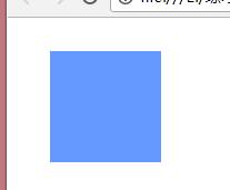
<style type="text/css">
        #test{
            width:100px;
            height:100px;
            background-color:#69F;
            margin-top:30px;
            margin-left:30px;
            }
        </style>

    <body>
         <div id="test"></div>
    </body>

效果为:


离上和左各30像素

 <style type="text/css">
        #test{
            width:100px;
            height:100px;
            background-color:#69F;
            margin:30px 0px 0px 30px;
            }
        </style>

    <body>
         <div id="test"></div>
    </body>


表示离上右下左分别为30、0、0、30像素
<style type="text/css">
        #test{
            width:100px;
            height:100px;
            background-color:#69F;
            margin:30px;
            }
        </style>

    <body>
         <div id="test"></div>
    </body>
表示离上右下左各为30像素
2.padding(内容与单元格间距)
padding: 10px 10px 10px 10px; 表示顺序依次为上-右-下-左,内容与边框的四边间距顺时针顺序
padding-top:10px; 表示内容与边框的上间距为10像素
padding-right:10px; 表示内容与边框的右间距为10像素
padding-bottom:10px; 表示内容与边框的下间距为10像素
padding-left:10px; 表示内容与边框的左间
paddlig:10px; 表示 内容与边框的四边间距均为10像素
<style type="text/css">
        #test{
            width:100px;
            height:100px;
            background-color:#69F;
            padding:30px 0px 0px 30px;
            }
        #erji{
            width:50px;
            height:50px;
            background-color:#F03;
            }
        </style>

    <body>
         <div id="test">
            <div id="erji"></div>
         </div>
    </body>
3.border 表格边框
border: 1px solid #69F; 表示边框粗细为1像素、样式为实线、颜色为蓝色
border-5px;
border-style:solid;
border-color:blue;
border-top(right、bottom、left):5px solid blue 表示上(右、下、左)边框:5像素、实线、蓝色
 #test{
            width:100px;
            height:100px;
            padding:30px;
            border:1px solid #69F
        }
        </style>

    <body>
         <div id="test"></div>
    </body>

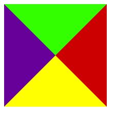
border另一个用途
<style type="text/css">
        #test{
            width:0px;
            height:0px;
            border-top:100px solid #3F0;
            border-right:100px solid #C00;
            border-bottom:100px solid #FF0;
            border-left:100px solid #609;

        }
        </style>

    <body>
         <div id="test"></div>
    </body>


效果为


所以,如果把其中三遍颜色变为白色,就只会显示出一边的颜色,这样我们就可以做一些不规则的东西
五.列表与方块
list-style:none; 取消序号,即没有列表样式
list-style:circle; 序号变为圆圈,样式相当于无序
list-style-image:url(图片地址); 列表前面加图片,相当于图片做序号
list-style-position:outside; 序号在内容外
list-style-position:inside; 序号跟内容在一块
六.格式与布局
position:
absolute; 绝对定位(相对于浏览器边界)
fixed 固定位置
relative 相对定位(相对于该元素本该出现的位置)
具体来看:
absolute; 绝对定位(相对于浏览器边界)
 <head>
        <meta http-equiv="Content-Type" content="text/html; charset=utf-8" />
        <title>无标题文档</title>
        <style type="text/css">
        #test{
            200px;
            height:200px;
            background-color:#66F;
            position:absolute;
            top:50px;
            right:50px;
            }
        .list{
            100px;
            height:500px;
            }
        </style>
    </head>

    <body>
    <div id="test"></div>

    <div class="list"></div>
    <div class="list"></div>
    <div class="list"></div>
    <div class="list"></div>
    <div class="list"></div>
    </body>
当我们拉动滚动条时,它的位置也会随之改变
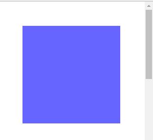
fixed 固定位置
 <head>
        <meta http-equiv="Content-Type" content="text/html; charset=utf-8" />
        <title>无标题文档</title>
        <style type="text/css">
        #test{
            200px;
            height:200px;
            background-color:#66F;
            position:fixed;
            top:50px;
            right:50px;
            }
        .list{
            100px;
            height:500px;
            }
        </style>
    </head>

    <body>
    <div id="test"></div>

    <div class="list"></div>
    <div class="list"></div>
    <div class="list"></div>
    <div class="list"></div>
    <div class="list"></div>
    </body>
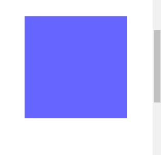
在fixed下我们拉动滚动条,滚动条的位置是不变的
relative 相对定位,相对于该元素本该出现的位置:
<head>
        <meta http-equiv="Content-Type" content="text/html; charset=utf-8" />
        <title>无标题文档</title>
        <style type="text/css">
        #test{
            200px;
            height:200px;
            background-color:#66F;
            position:relative;
            top:50px;
            left:50px;
            }

        </style>
    </head>

    <body>
    这是一段话
    <span id="test">测试相对位置</span>
    </body>
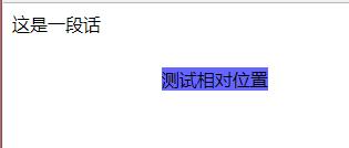
在原本应该出现的位置偏移了
注意,只要加了position,该元素就和其他元素不在同一层了,原本被挤下去下面的元素就会浮上来
*{
           0px auto;
           height:0px;
          }
只要写上这句话,那么网页里的<div></div>就可以居中了
七.流式布局
做网页布局
 <style type="text/css">
        *{
           0px auto;
           height:0px;
           }
        #menu{
            900px;
            height:35px;
            margin-top:20px;
            }
        .list{
            100px;
            height:35;
            float:left;
            text-align:center;
            line-height:35px;
            vertical-align:middle;
            }
        </style>
    </head>

    <body>
    <div id="menu">
         <div class="list">首页</div>
         <div class="list">产品中心</div>
         <div class="list">新闻中心</div>
         <div class="list">关于我们</div>
         <div class="list">联系我们</div>
    </div>
    </body>
float:left; right;
截断流:
<div style="clear:both"></div>
z-index:层级,数字越大越靠上