流式布局(百分比布局)
- 流式布局,就是百分比布局,也称非固定像素布局。
- 通过盒子的宽度设置成百分比来根据屏幕的宽度来进行延伸,不受固定像素的限制,内容向两侧填充。
- 流式布局方式是移动web开发使用的比较常见的布局方式
<!DOCTYPE html>
<html lang="en">
<head>
    <meta charset="UTF-8">
    <meta name="viewport" content="width=device-width, initial-scale=1.0">
    <title>流式布局</title>
    <style>
        * {
            margin: 0;
            padding: 0;
        }

        section {
             100%;
        }

        section div {
            float: left;
             50%;
            height: 400px;
        }

        section div:nth-child(1) {
            background-color: pink;
        }

        section div:nth-child(2) {
            background-color: red;
        }
    </style>
</head>
<body>
    <section>
        <div></div>
        <div></div>
    </section>
</body>
</html>
- max-width 最大宽度(max-height最大高度)
- min-width 最小宽度(min-height最小高度)
flex布局
- 传统布局与flex布局
传统布局
兼容性好
布局繁琐
局限性,不能再移动端很好的布局
flex布局:
操作方便。布局极为简单,移动端应用很广泛
PC端浏览器支出情况较差
IE11或更低版本,不支持或部分支持
布局原理
flex是flexible Box的缩写,意为"弹性布局",用作盒装模型提供最大的灵活性,任何一个容器都可以指定为flex布局。
当我们为父盒子设为flex布局以后,子元素的float,clear和vertical-align属性将失效。
伸缩布局 = 弹性布局 = 伸缩布局 = 弹性盒布局 = flex布局
采用flex布局的元素,成为flex容器(flex container),简称容器,它的所有子元素自动成为容器成员,成为flex项目(flex item)简称"项目".
- 体验中div就是flex的父容器
- 体验中span就是子容器flex项目
- 子容器可以通过横向排列也可以纵向排列
总结flex布局原理:
就是通过给父盒子添加flex属性,来控制盒子的位置和排列方式
常见的父项属性
以下由6个属性是对父元素设置的
- flex-direction:设置主轴的方向
- justify-content: 设置主轴上的子元素排列方式
*flew-wrap: 设置子元素是否换行 - align-content: 设置侧轴上的子元素的排列方式(多行)
- align-items: 设置侧轴上的子元素排列方式(单行)
- flex-flow:复合属性,相当于同时设置了flex-direction和flex-wrap
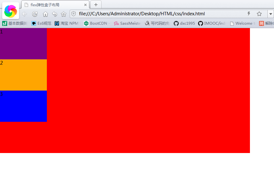
flex-direction设置主轴的方向
1.主轴与侧轴
在flex布局中,是分为主轴和侧轴两个方向,同样的叫法有:行和列,x轴与y轴
- 默认主轴方向就是x轴方向 水平向右
- 默认侧轴方向就是y轴方向,水平向下
2.属性值
flex-direction属性决定主轴的方向(即项目的排列方向)
注意:主轴和侧轴是会变化的,就看flex-direction设置的主轴,剩下的就是侧轴,而我们的子元素是跟着主轴来排列的
| 属性值 | 说明 |
|---|---|
| row | 默认值从左到右 |
| row-reverse | 从右到左 |
| column | 从上到下 |
| column-reverse | 从下到上 |
<!DOCTYPE html>
<html lang="en">
<head>
    <meta charset="UTF-8">
    <meta name="viewport" content="width=device-width, initial-scale=1.0">
    <title>flex弹性盒子布局</title>
    <style>
        * {
            margin: 0;
            padding: 0
        }

        div {
            display: flex;
             800px;
            height: 400px;
            background-color: red;
            /* 默认的主轴是x轴 行 row 那么y轴就是侧边轴*/
            /* 我们的元素就是跟着主轴是排列的 */
            /* flex-direction: row*/
            /*flex-direction: row-rerverse; */
            /* 我们可以把我们的主轴设置为y轴 那么x轴就成了侧轴 */
            flex-direction: column;
        }

        div span {
             150px;
            height: 100px;
        }

        div span:nth-child(1) {
            background-color: purple;
        }

        div span:nth-child(2) {
            background-color: orange;
        }

        div span:nth-child(3) {
            background-color: blue;
        }
    </style>
</head>
<body>
    <div>
        <span>1</span>
        <span>2</span>
        <span>3</span>
    </div>
</body>
</html>
justify-content设置主轴子元素排列
- justify-content属性定义了项目在主轴上的对齐方式
注意:使用属性之前一定要选好主轴是哪个
| 属性值 | 说明 |
|---|---|
| flex-start | 默认值是从头部开始,如果主轴是x轴,则从左到右 |
| center | 从主轴居中对齐(如果主轴是x轴则水平居中) |
| space-around | 平分剩余空间 |
| space-between | 先两边贴边,再平分剩余空间(重要) |
<!DOCTYPE html>
<html lang="en">
<head>
    <meta charset="UTF-8">
    <meta name="viewport" content="width=device-width, initial-scale=1.0">
    <title>justify-content设置主轴子元素排列</title>
    <style>
        * {
            margin: 0;
            padding: 0;
        }

        div {
            display: flex;
             800px;
            height: 300px;
            background-color: pink;
            flex-direction: row;
            /* justify-content: 是设置主轴上子元素的排列方式 */
            /*justify-content: flex-start;*/
            /* 让我们子元素居中对齐 */
            /*justify-content: center;*/
            /* 让子元素平均分配*/
            /*justify-content: space-around;*/
            /*选两边贴边 在分配的空间*/
            justify-content: space-between;
        }

        div span {
             150px;
            height: 100px;
            background-color: purple;
        }
    </style>
</head>
<body>
    <div>
        <span>1</span>
        <span>2</span>
        <span>3</span>
        <span>4</span>
    </div>
</body>
</html>

<!DOCTYPE html>
<html lang="en">
<head>
<meta charset="UTF-8">
<meta name="viewport" content="width=device-width, initial-scale=1.0">
<title>justify-content设置主轴子元素排列</title>
<style>
* {
margin: 0;
padding: 0;
}
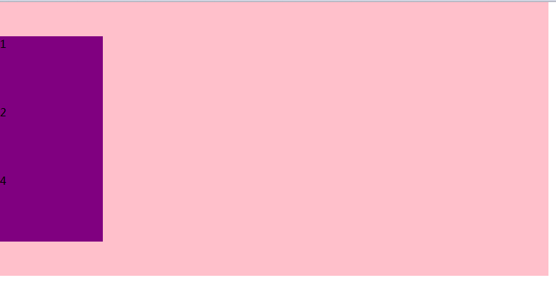
div {
display: flex;
800px;
height: 400px;
background-color: pink;
flex-direction: column;
/* 主轴y轴居中 */
justify-content: center;
}
div span {
150px;
height: 100px;
background-color: purple;
}
</style>
</head>
<body>
<div>
<span>1</span>
<span>2</span>
<span>4</span>
</div>
</body>
</html>
flex-wrap是否换行
默认情况下,项目都排在一条线上(又称轴线)上,flex-wrap属性定义,flex布局中默认是不换行的。
| 属性值 | 说明 |
|---|---|
| nowrap | 默认不换行 |
| wrap | 换行 |
align-items设置侧轴上的子元素排列方式(单行)
该属性是控制子项在侧轴(默认是y轴)上的排列方式,在子项为单项的时候使用
| 属性值 | 说明 |
|---|---|
| flex-start | 从上到下 |
| flex-end | 从下到上 |
| center | 挤在一起居中(垂直居中) |
| stretch | 拉伸(默认值) |
<!DOCTYPE html>
<html lang="en">
<head>
    <meta charset="UTF-8">
    <meta name="viewport" content="width=device-width, initial-scale=1.0">
    <title>align-items</title>
    <style>
        * {
            margin: 0;
            padding: 0;
        }

        div {
            display: flex;
             800px;
            height: 400px;
            background-color: pink;
            /* 默认的主轴是x轴row */
            justify-content: center;
            /* 我们需要一个侧轴居中 */
            align-items: center;
        }

        div span {
             150px;
            height: 100px;
            background-color: purple;
        }
    </style>
</head>
<body>
    <div>
        <span>1</span>
        <span>2</span>
        <span>3</span>
        <span>3</span>
    </div>
</body>
</html>
align-content设置侧轴上的子元素的排列方式(多行)
设置子项在侧轴上的排列方式并且只能用于子项出现换行的情况(多行),在单行下是没有效果的。
| 属性值 | 说明 |
|---|---|
| flex-start | 默认从侧轴的头部开始排列 |
| flex-end | 在侧轴的尾部开始排列 |
| content | 在侧轴中间显示 |
| space-around | 子轴在侧轴平分剩余空间 |
| space-between | 子项在侧轴先分布在两头,再平分剩余空间 |
| stretch | 设置子项元素高度平分父元素高度 |
<!DOCTYPE html>
<html lang="en">
<head>
    <meta charset="UTF-8">
    <meta name="viewport" content="width=device-width, initial-scale=1.0">
    <title>align-content设置侧轴子元素排列</title>
    <style>
        * {
            margin: 0;
            padding: 0;
        }

        div {
            display: flex;
             800px;
            height: 400px;
            background-color:pink;
            flex-direction: row;
            flex-wrap: wrap;
            /* 因为有了换行,此时我们侧轴上控制子元素的对齐方式我们用align-content */
            /*align-content: flex-start;*/
            /*align-content: center;*/
            /*align-content: space-between;*/
            align-content: space-around;
        }

        div span {
             150px;
            height: 100px;
            background-color: purple;
            color: #fff;
            margin: 10px;
        }
    </style>
</head>
<body>
    <div>
        <span>1</span>
        <span>2</span>
        <span>3</span>
        <span>4</span>
        <span>5</span>
        <span>6</span>
        <span>7</span>
        <span>8</span>

    </div>
</body>
</html>
align-content 和 align-items区别
- align-items 适用于单行情况下,只有上对齐、下对齐、居中和拉伸
- align-content适用于换行(多行)的情况下(单行情况下无效)可以设置上对齐、下对齐、居中、拉伸以及平均分配剩余空间等属性值。
- 总结就是单行找align-items多行找align-content
flex-flow
flex-flow属性是flex-direction和flex-wrap属性的复合属性
/*flex-direction: column;
flex-wrap: wrap;*/
flex-flow: column wrap;
总结
- flex-direction:设置主轴的方向
- justify-content: 设置主轴上的子元素排列方式
- flex-wrap: 设置子元素是否换行
- align-content: 设置侧轴的子元素的排列方式(多行)
- align-items: 设置侧轴上的子元素排列方式(单行)
- flex-flow: 复合属性,相当于同时设置了flex-direction和flex-wrap
flex布局子项常见的属性
- flex子项目占的份数
- align-self控制子项自己在侧轴的排列方式
- order属性定义子项的排列顺序(前后顺序)
flex属性
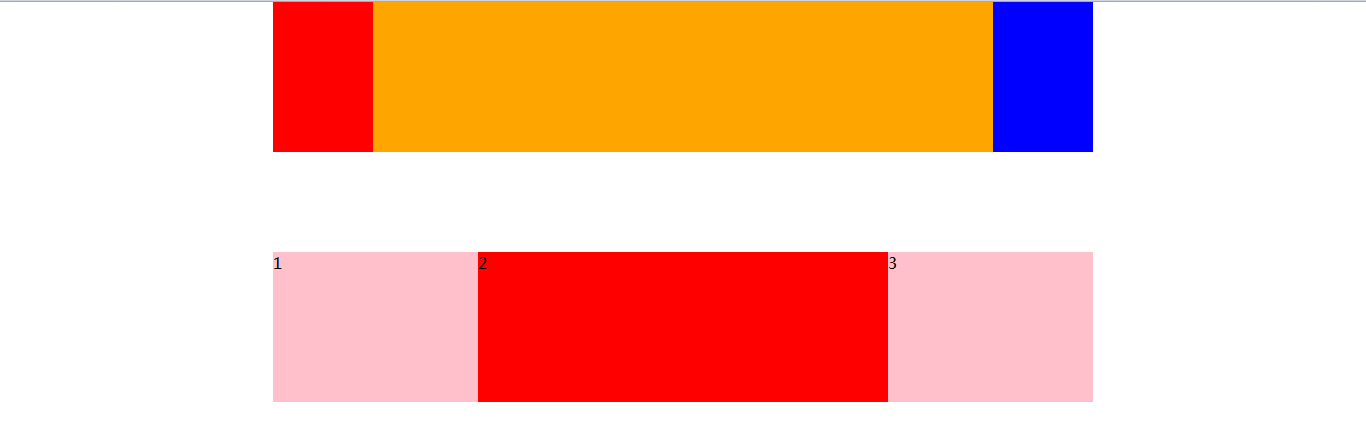
flex属性定义子项目分配剩余空间,用flex来表示占多少份
.item {
   flex:<number>; /* default 0*/
}

```javascript
<!DOCTYPE html>
<html lang="en">
<head>
    <meta charset="UTF-8">
    <meta name="viewport" content="width=device-width, initial-scale=1.0">
    <title>Document</title>
    <style>
        * {
            margin: 0;
            padding: 0;
        }

        section {
            display: flex;
             60%;
            height: 150px;
            background-color: pink;
            margin: 0 auto;
        }

        section div:nth-child(1) {
             100px;
            height: 150px;
            background-color: red;
        }

        section div:nth-child(2) {
            flex: 1;
            background-color: orange;
        }

        section div:nth-child(3) {
             100px;
            height: 150px;
            background-color: blue;
        }

        p {
            display: flex;
             60%;
            height: 150px;
            background-color: pink;
            margin: 100px auto;
        }

        p span {
            flex: 1;
        }

        p span:nth-child(2) {
            flex: 2;
            background-color: red;
        }


    </style>
</head>
<body>
    <section>
        <div></div>
        <div></div>
        <div></div>
    </section>
    <p>
        <span>1</span>
        <span>2</span>
        <span>3</span>
    </p>
</body>
</html>
## align-self控制子项自己在侧轴上的排列方式
align-slef属性允许每个项目与其他项目不一样的对齐方式,可覆盖align-items属性
默认为auto,表示继承元素的align-items属性,如果没有父元素,则等于stretch

```javascript
<!DOCTYPE html>
<html lang="en">
<head>
    <meta charset="UTF-8">
    <meta name="viewport" content="width=device-width, initial-scale=1.0">
    <title>Document</title>
    <style>
        div {
            display: flex;
             80%;
            height: 300px;
            background-color: pink;
        }

        div span {
             150px;
            height: 100px;
            background-color: purple;
            margin-right: 5px;
        }

        div span:nth-child(3) {
            /* 设置自己在侧轴上的排列方式 */
            align-self: flex-end;
        }
    </style>
</head>
<body>
    <div>
        <span>1</span>
        <span>2</span>
        <span>3</span>
        <span>4</span>
        <span>5</span>
    </div>
</body>
</html>
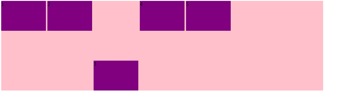
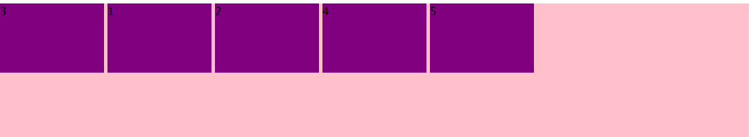
order属性定义项目的排列顺序
数值越少,排列越靠前默认为0,
注意:z-index不一样
<!DOCTYPE html>
<html lang="en">
<head>
    <meta charset="UTF-8">
    <meta name="viewport" content="width=device-width, initial-scale=1.0">
    <title>Document</title>
    <style>
        div {
            display: flex;
             80%;
            height: 300px;
            background-color: pink;
        }

        div span {
             150px;
            height: 100px;
            background-color: purple;
            margin-right: 5px;
        }

        div span:nth-child(3) {
            order: -1;
        }
    </style>
</head>
<body>
    <div>
        <span>1</span>
        <span>2</span>
        <span>3</span>
        <span>4</span>
        <span>5</span>
    </div>
</body>
</html>