幽灵按钮:
也叫透明按钮,顾名思义,也就是在设计网页中的按钮时,不在设计复杂色彩、样式、和纹理,而是外仅以线框示意轮廓,内只用文字示意功能,背景透出,与整个页面/背景合而为一的设计方式。国外的设计师称之为“幽灵按钮”(Ghost Buttons),盛赞这种按钮通透简约,贴合整体风格又不失神韵,别具魅力。这种按钮的设计早已有之,但是在ios和安卓双双风格转向之后,成了网页设计的新趋势,拥有类似设计的网页设计作品如雨后春笋一般,映入眼帘。
下面是我用html css jQuery 简单做得一个幽灵按键。
首先是body内容
<div class="box">
        <div id="mission" class="link link-mission" >
            <span class="icon"></span>
            <a href="#" class="button" data-text=" MY missoin is clear ">
                <span class="line line-top"></span>
                <span class="line line-left"></span>
                <span class="line line-right"></span>
                <span class="line line-bottom"></span>
                MISSION
                <img src="arrow.png" class="arrow" alt="arrow">
            </a>
        </div>
        <div id="play" class="link link-play" >
            <span class="icon"></span>
            <a href="#" class="button" data-text="This is my playground">
                <span class="line line-top"></span>
                <span class="line line-left"></span>
                <span class="line line-right"></span>
                <span class="line line-bottom"></span>
                PLAY
                <img src="arrow.png" class="arrow" alt="arrow">
            </a>
        </div>
        <div id="touch" class="link link-touch">
            <span class="icon"></span>
            <a href="#" class="button" data-text="Lets do something together">
                <span class="line line-top"></span>
                <span class="line line-left"></span>
                <span class="line line-right"></span>
                <span class="line line-bottom"></span>
                TOUCH
                <img src="arrow.png" class="arrow" alt="arrow">
            </a>
        </div>
        <div class="tooltip">
            <em></em>
            <span></span>
        </div>
    </div>
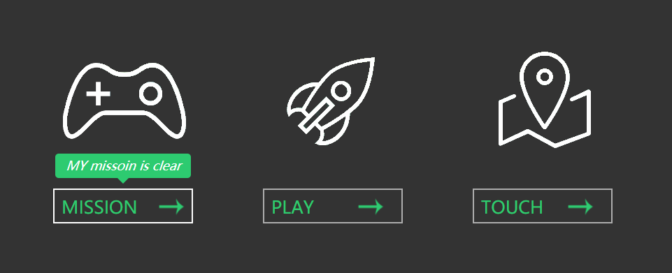
这个图片是实现之后的截图 , 上方有三个div 分别存放这三块内容,最后一个div是当鼠标悬浮在图片下边的按钮上时显现出来的一个tip。当鼠标放到上面三个图片上时,这三个图片会旋转360度,并且会稍微放大一点,当鼠标移入下面的按钮时,按钮的四个角会有四条线出现并移动到按钮的四条边上,并且按钮中的箭头会向右移动微小距离。
接下来是样式的设计,css代码
/*样式的初始化*/
* {
    margin: 0;
    padding: 0;
}

body {
    background-color: #333;
}
/*设置整个盒子*/
.box {
    width: 1000px;
    height: 220px;
    margin: 200px auto;
}
/*设置三块内容的公共样式*/
.box .link {
    width: 200px;
    height: 300px;
    float: left;
    margin-left: 100px;
}
/*旋转图标样式*/
.box .link .icon {
    width: 200px;
    height: 150px;
    display: block;
    margin-bottom: 50px;
    background-repeat: no-repeat;
    background-position: center center;
    transition: 0.4s linear;
    -webkit-transition: 0.4s linear;
    -moz-transition: 0.4s linear;
    -o-transition: 0.4s linear;
}
.box .link-mission .icon {
    background-image: url(missoin2.png);

}
.box .link-play .icon {
    background-image: url(play2.png);
}
.box .link-touch .icon {
    background-image: url(touch2.png);

}
.box .link .icon:hover {
    transform:rotate(360deg) scale(1.2);
    -webkit-transform:rotate(360deg) scale(1.2);
    -moz-transform:rotate(360deg) scale(1.2);
    -o-transform:rotate(360deg) scale(1.2);
}


/*方块按钮样式*/
.box .link .button {
    position: relative;
    display: block;
    width: 200px;
    height: 50px;
    line-height: 50px;
    font-size: 25px;
    box-sizing: border-box;
    padding-left: 10px;
    text-decoration: none;
    color: #2ecc71;
    border: 2px solid rgba(255,255,255,.6);
}
.box .link .button .arrow {
    position: absolute;
    right:20px;
    width: 50px;
    height: 50px;
    transition: 0.1s linear;
}
.box .link .button:hover {
    border: :2px solid rgba(255,255,255,0);
}
.box .link .button:hover .arrow {
    right: 5px;
}
.box .link .button .line {
    position: absolute;
    display: block;
    background:none;
    transition: 0.4s ease;
    -webkit-transition: 0.4s ease;
}

.box .link .button .line-top {
    left: -100%;
    top: -2px;
    width: 0;
    height: 2px;
}
.box .link .button:hover .line-top {
    width: 200px;
    left: -2px;
    background-color: #ffffff;
}

.box .link .button .line-bottom {
    right: -100%;
    bottom: -2px;
    width: 0;
    height: 2px;
}
.box .link .button:hover .line-bottom {
    width: 200px;
    right: -2px;
    background-color: #ffffff;
}

.box .link .button .line-left {
    left: -2px;
    bottom: -100%;
    width: 2px;
    height: 0;
}
.box .link .button:hover .line-left {
    bottom: -2px;
    height: 50px;
    background-color: #ffffff;
}

.box .link .button .line-right {
    right: -2px;
    top: -100%;
    width: 2px;
    height: 0;
}
.box .link .button:hover .line-right {
    top: -2px;
    height: 50px;
    background-color: #ffffff;
}

/*悬浮在按钮上时上面出现的提示框的样式*/
.box .tooltip {
    position: absolute;
    width: auto;
    padding: 0 15px;
    height: 35px;
    line-height: 35px;
    background-color: #2dcb70;
    font-size: 18px;
    color: #ffffff;
    border-radius: 5px;
    display: none;
}
.box .tooltip span {
    position: absolute;
    display: block;
    width: 0;
    height: 0;
    border: 8px solid transparent;
    border-top-color:#2dcb70;
    left: 50%;
    margin-left: -8px;
}
css样式的设计我就不细说的,哪一块代码设计哪里的样式都注释上了
最后就是jQuery代码了
$(function(){
        $(".button").mouseenter(function(){
            var tiptext = $(this).attr("data-text"); //动态获取内容并添加到tooltip的em中
            // console.log(tiptext);
            $(".tooltip em").text(tiptext);
            var leftLoc = $(this).offset().left;
            var cutLeft = ($(".tooltip").outerWidth()-$(this).outerWidth())/2;     //计算上面悬浮块与下面按钮宽度之差,方便将悬浮块放到按钮的正中间
            $(".tooltip").css({
                left:leftLoc - cutLeft,
                top:300,
                display:"block"
            }).animate({
                top:350,
            },30)
            }).mouseleave(function(){
                $(".tooltip").css({
                    display:"none"
                });
            });
        })
是不是很简单,记得在编写jQuery代码前先引入jQuery哦,好了今天就到这里了。