知识点:css 画箭头,transform: rotate(-135deg),旋转角度
说几句:写着玩,也没多大用,手动版的轮播图。
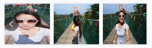
效果图:
jsx部份:
import React, { Component } from "react";
import "./RotationChart.less";
import imgOne from "../../../assets/imgs/2.jpg"
import imgTwo from "../../../assets/imgs/3.jpg"
import imgThree from "../../../assets/imgs/4.jpg"
import imgFour from "../../../assets/imgs/5.jpg"

const imgList = [
  { picUrl: imgOne },
  { picUrl: imgTwo },
  { picUrl: imgThree },
  { picUrl: imgFour }
]

// 轮播图
class RotationChart extends Component {
  constructor() {
    super();
    this.state = {
      imgIndex: 0,
      imgsLeft: 0,
    }
  }

  componentDidMount() {

  }

  scrollLeft = () => {
    const { imgsLeft } = this.state;
    let { imgIndex } = this.state;
    const oneIMgWidth = getComputedStyle(this.mayimgs.childNodes[0]).width.split("p")[0];
    const newLeft = imgsLeft - Number(oneIMgWidth) - 13;
    this.setState({
      imgsLeft: newLeft,
      imgIndex: ++imgIndex
    })
  }

  scrollRight = () => {
    const { imgsLeft } = this.state;
    let { imgIndex } = this.state;
    const oneIMgWidth = getComputedStyle(this.mayimgs.childNodes[0]).width.split("p")[0];
    const newLeft = imgsLeft + Number(oneIMgWidth) + 13;
    this.setState({
      imgsLeft: newLeft,
      imgIndex: --imgIndex
    })
  }


  render() {
    const { imgsLeft, imgIndex } = this.state;
    console.log(imgIndex)
    return (
      <div className="RotationChart">
        <div className="img_scroll_box">
          <div className="position_box">
            <div className="scroll_left" style={{ display: imgIndex < (imgList.length - 3) ? "block" : "none" }}>
              <div className="icon" onClick={() => this.scrollLeft()}></div>
            </div>
            <div className="scroll_right" style={{ display: imgIndex ? "block" : "none" }}>
              <div className="icon" onClick={() => this.scrollRight()}></div>
            </div>
            <div className="imgs_father">
              <ul ref={(ref) => { this.mayimgs = ref }} style={{ left: `${imgsLeft}Px` }}>
                {
                  imgList.map((item, index) => {
                    return <li key={index}>
                      <img src={item.picUrl || "#"}></img>
                    </li>
                  })
                }
              </ul>
            </div>
          </div>
        </div>
      </div>
    )
  }
}

export default RotationChart;
less 部份:
.RotationChart{
  border: 1px solid #d9d9d9;
   100%;
  height: 100%;
  // overflow: hidden;
  // position: relative;
  padding: 2px;
  .img_scroll_box{
     100%;
    height: 100%;
    // position: absolute;
    // height: calc(100% - 40px);
    //  calc(100% -40px);
    // // top: 50%;
    // left: 50%;
    // transform: translate(-50%, -50%);
    .position_box{
      position: relative;
      height: 100%;
       100%;
      display: flex;
      justify-content: space-between;
      flex-flow: nowrap;
      .icon{
        display: inline-block;
        height: 50px;
        line-height: 50px;
         50px;
        background: rgba(0,0,0,0);
        text-align: center;
        border-radius: 100%;
        transition: all 0.3s ease;
        cursor: pointer;
      }
      .scroll_left{
        position: absolute;
        top: 0;
        left: 0;
        height: 100%;
         50%;
        z-index: 10;
        &:hover{
          .icon{
            background: rgba(0,0,0,0.5);
          }
          .icon::after{
            opacity: 1;
          }
        }
        .icon{
          position: absolute;
          top: 50%;
          left: 10%;
          transform:  translate(-50%, -50%);
        }
        .icon::after{
          content: "";
          position: absolute;
          top: 0;
          bottom: 0;
          left: 6px;
          margin: auto 15px;
           15px;
          height: 15px;
          transform: rotate(-135deg);
          border-top: 2px solid #fff;
          border-right: 2px solid #fff;
          opacity: 0;
        }
      }
      .scroll_right{
        position: absolute;
        top: 0;
        right: 0;
        height: 100%;
         50%;
        z-index: 10;
        &:hover{
          .icon{
            background: rgba(0,0,0,0.5);
          }
          .icon::after{
            opacity: 1;
          }
        }
        .icon{
          position: absolute;
          top: 50%;
          right: -10%;
          transform:  translate(-50%, -50%);
        }
        .icon::after{
          content: "";
          position: absolute;
          top: 0;
          bottom: 0;
          right: 6px;
          margin: auto 15px;
           15px;
          height: 15px;
          transform: rotate(45deg);
          border-top: 2px solid #fff;
          border-right: 2px solid #fff;
          opacity: 0;
        }
      }
      .imgs_father{
        height: 100%;
         100%;
        overflow: hidden;
        position: relative;
        ul{
          position: absolute;
          height: 100%;
           100%;
          white-space: nowrap;
          top: 0;
          left: 0;
          transition: all 0.3s ease;
          li{
            display: inline-block;
            height: 100%;
             32%;
            margin-right: 13px;
            img{
               100%;
              height: 100%;
            }
          }
          li:last-child{
            margin-right: 0;
          }
        }
      }
    }
  }
}