步骤构思:
1、利用checkbox选中和取消的特性
2、隐藏默认样式,扩大label点击热区
3、用after、before两个伪类元素实现动画
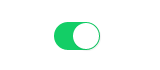
IosButton绿色按钮
实现效果
代码如下:
<!-- HTML代码 -->
<div class="switch-box">
    <input id="switchButton" type="checkbox" class="switch" />
    <label for="switchButton"></label>
</div>


/* CSS代码 */
.switch-box {
     48px;
}
.switch-box .switch {
    /* 隐藏checkbox默认样式 */
    display: none;
}
.switch-box label {
    /* 通过label扩大点击热区 */
    position: relative;
    display: block;
    margin: 1px;
    height: 28px;
    cursor: pointer;
}
.switch-box label::before {
    /* before设置前滚动小圆球 */
    content: '';
    position: absolute;
    top: 50%;
    left: 50%;
    margin-top: -13px;
    margin-left: -14px;
     26px;
    height: 26px;
    border-radius: 100%;
    background-color: #fff;
    box-shadow: 1px 1px 1px 1px rgba(0, 0, 0, 0.06);
    /* 通过transform、transition属性控制元素过渡进而形成css3动画 */
    -webkit-transform: translateX(-9px);
    -moz-transform: translateX(-9px);
    transform: translateX(-9px);
    -webkit-transition: all 0.3s ease;
    -moz-transition: all 0.3s ease;
    transition: all 0.3s ease;
}
.switch-box .switch:checked~label::before {
    /* 语义:被选中的类名为"switch"元素后面的label元素里的伪类元素,进行更改css样式 */
    /* 形成伪类结构选择器:":"冒号加布尔值"checked" */
    /* " Ele1 ~ Ele2 "波浪号在css的作用:连接的元素必须有相同的父元素,选择出现在Ele1后的Ele2(但不必跟在Ele1,也就是说可以并列)  */
    -webkit-transform: translateX(10px);
    -moz-transform: translateX(10px);
    transform: translateX(10px);
}
.switch-box label::after {
    /* after设置滚动前背景色 */
    content: "";
    display: block;
    border-radius: 30px;
    height: 28px;
    background-color: #dcdfe6;
    -webkit-transition: all 0.3s ease;
    -moz-transition: all 0.3s ease;
    transition: all 0.3s ease;
}
.switch-box .switch:checked~label::after {
    background-color: #13ce66;
}
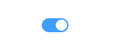
ToggleButton绿色按钮
实现效果
代码如下:
<!-- HTML代码 -->
<div class="switch-box">
    <input id="switchButton" type="checkbox" class="switch" />
    <label for="switchButton"></label>
</div>


/* CSS代码 */
.switch-box {
    margin: 100px auto;
     40px;
}
.switch-box .switch {
    /* 隐藏checkbox默认样式 */
    display: none;
}
.switch-box label {
    /* 通过label扩大点击热区 */
    position: relative;
    display: block;
    margin: 1px;
    height: 20px;
    cursor: pointer;
}
.switch-box label::before {
    /* before设置前滚动小圆球 */
    content: '';
    position: absolute;
    top: 50%;
    left: 50%;
    margin-top: -8px;
    margin-left: -8px;
     16px;
    height: 16px;
    border-radius: 100%;
    background-color: #fff;
    box-shadow: 1px 1px 1px 1px rgba(0, 0, 0, 0.06);
    /* 通过transform、transition属性控制元素过渡进而形成css3动画 */
    -webkit-transform: translateX(-9px);
    -moz-transform: translateX(-9px);
    transform: translateX(-9px);
    -webkit-transition: all 0.3s ease;
    -moz-transition: all 0.3s ease;
    transition: all 0.3s ease;
}
.switch-box .switch:checked~label::before {
    /* 语义:被选中的类名为"switch"元素后面的label元素里的伪类元素,进行更改css样式 */
    /* 形成伪类结构选择器:":"冒号加布尔值"checked" */
    /* " Ele1 ~ Ele2 "波浪号在css的作用:连接的元素必须有相同的父元素,选择出现在Ele1后的Ele2(但不必跟在Ele1,也就是说可以并列)  */
    -webkit-transform: translateX(9px);
    -moz-transform: translateX(9px);
    transform: translateX(9px);
}
.switch-box label::after {
    /* after设置滚动前背景色 */
    content: "";
    display: block;
    border-radius: 10px;
    height: 20px;
    background-color: #dcdfe6;
    -webkit-transition: all 0.3s ease;
    -moz-transition: all 0.3s ease;
    transition: all 0.3s ease;
}
.switch-box .switch:checked~label::after {
    background-color: #409eff;
}
特别说明
1、形成伪类结构选择器:元素+冒号+布尔值(例"input:checked")
2、" Ele1 ~ Ele2 "波浪号在css的语义:作为选择器【选择出现在Ele1后的Ele2(但不必跟在Ele1,也就是说可以并列),连接的前后元素必须有相同的父元素】